SHP Services
A bright service brand built around care, clarity and a simple smile
The SHP Services brand identity turns an everyday cleaning service into a positive experience. A simple smile gives the brand its friendly and recognisable character. Teal communicates freshness, while yellow adds warmth and optimism. Clear messages make each service easy to understand. The result is practical, memorable and designed for daily use.
Creative Direction · Brand Identity · Campaign Design · Motion Design · Digital Communication · Operational Branding · Customer Experience
Building a friendly identity around a simple smile
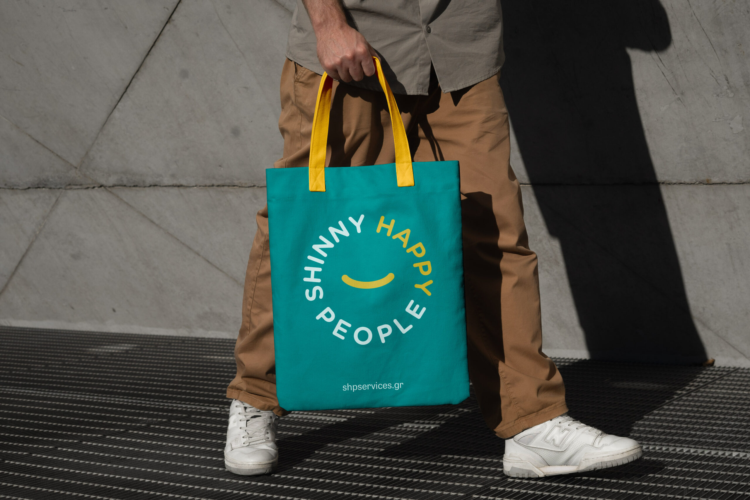
The logo transforms the letter H into a simple smile. That small gesture defines the tone of the whole brand. The colour system feels fresh, warm and easy to recognise. Simple shapes help the identity remain consistent across every format. As a result, the brand feels approachable without losing professionalism.
Turning everyday cleaning into a bold campaign voice
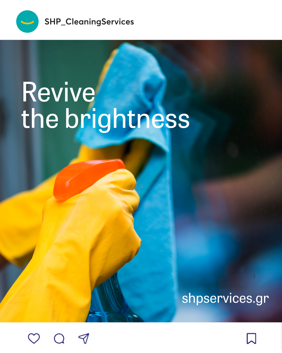
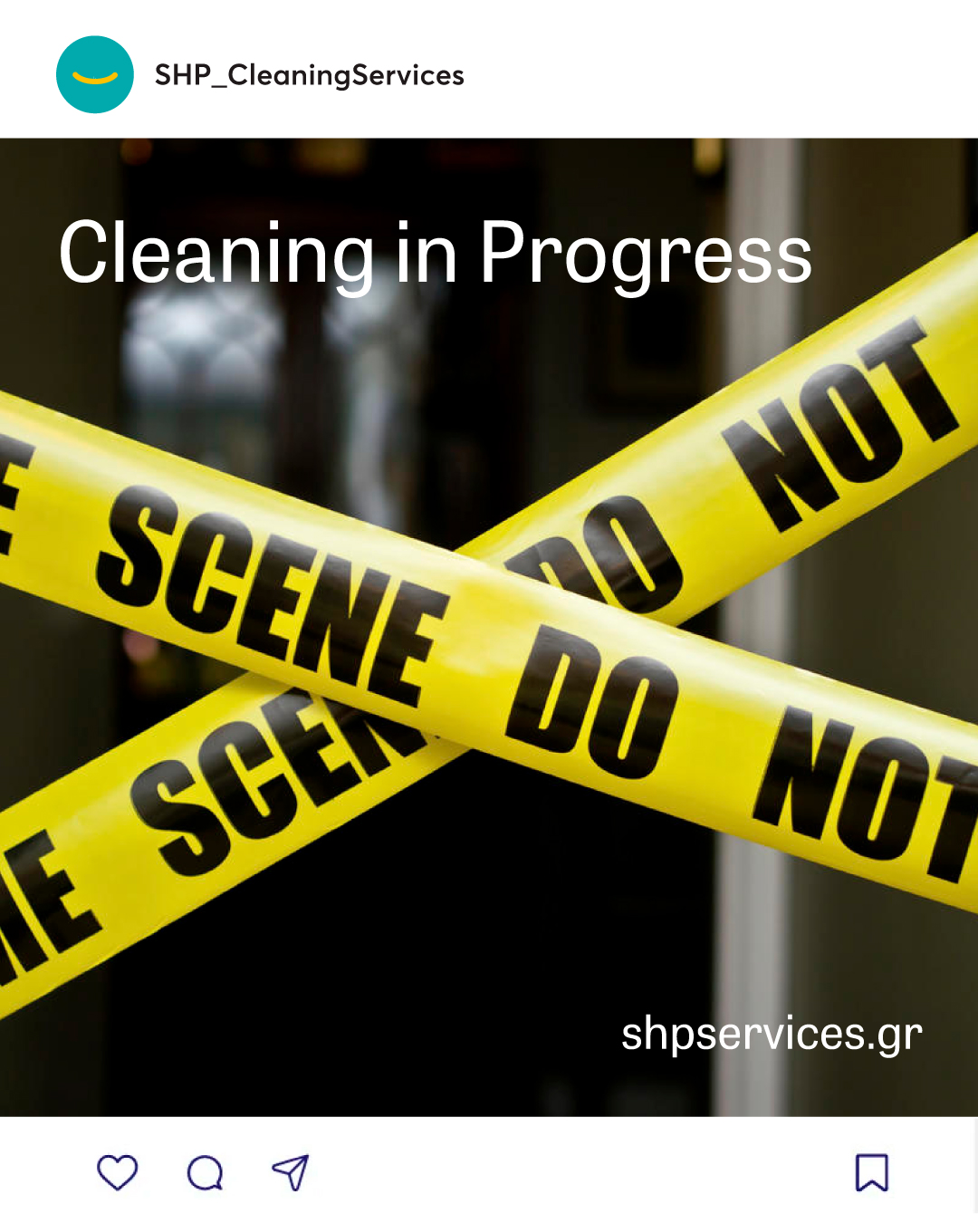
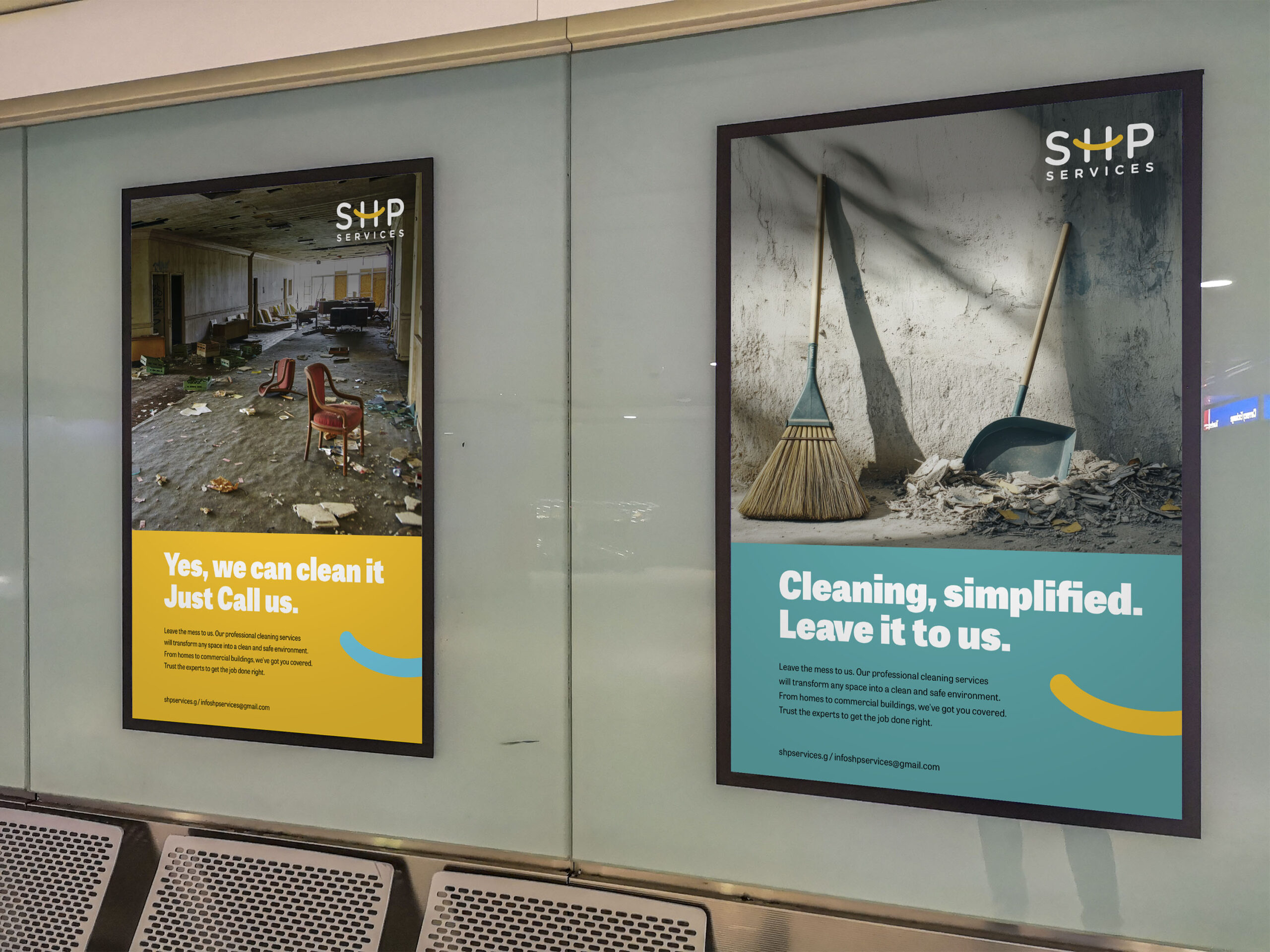
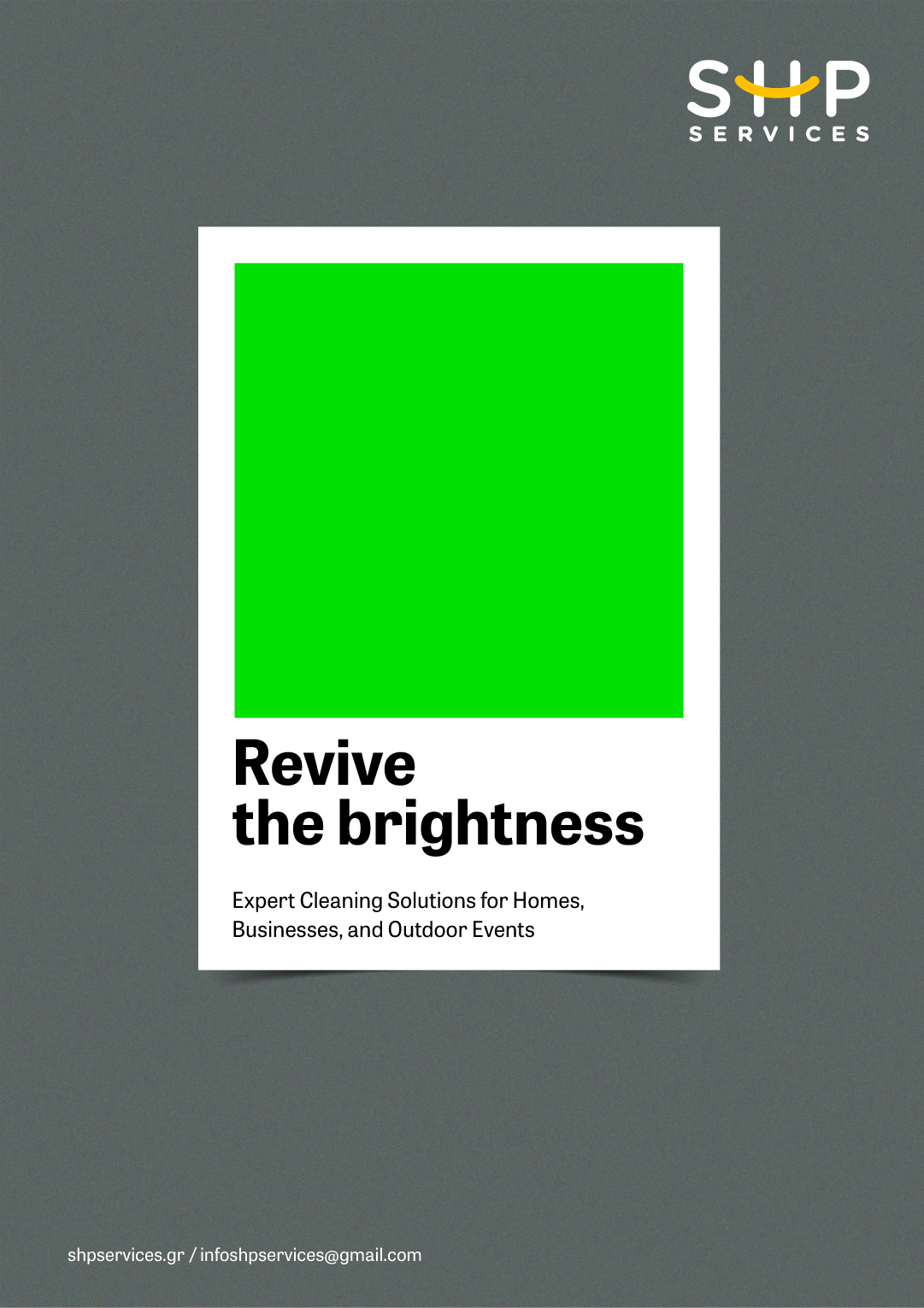
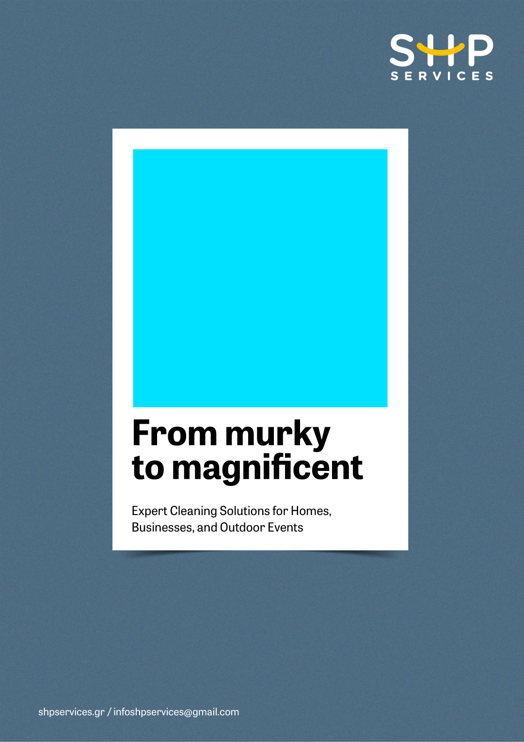
Cleaning communication is often functional and predictable. SHP uses short messages to make it brighter and more engaging. Photography and flat graphics create a flexible campaign language. Meanwhile, the smile connects every application to the identity. The system works across social media, posters and large outdoor formats.
Making the service visible at every step
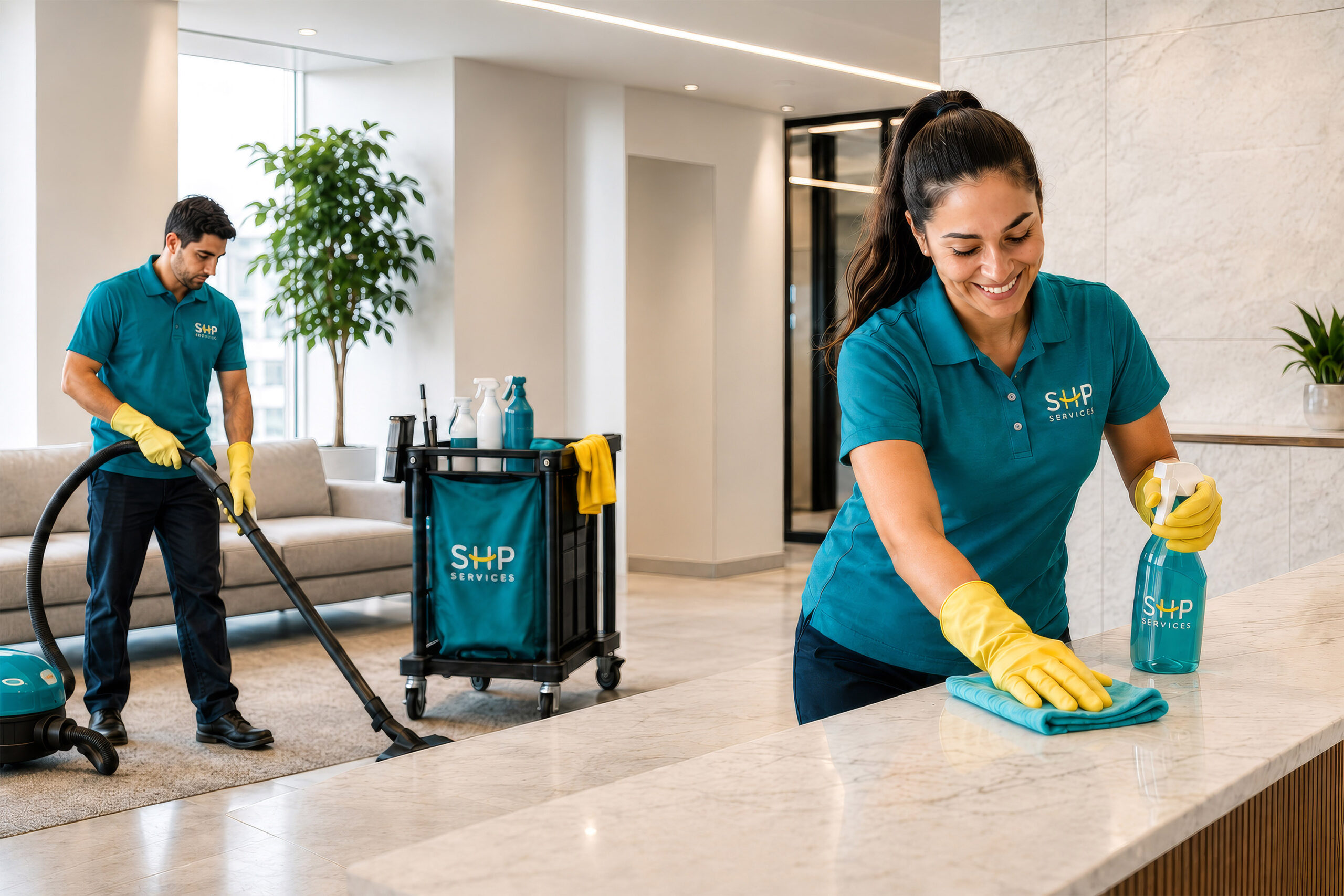
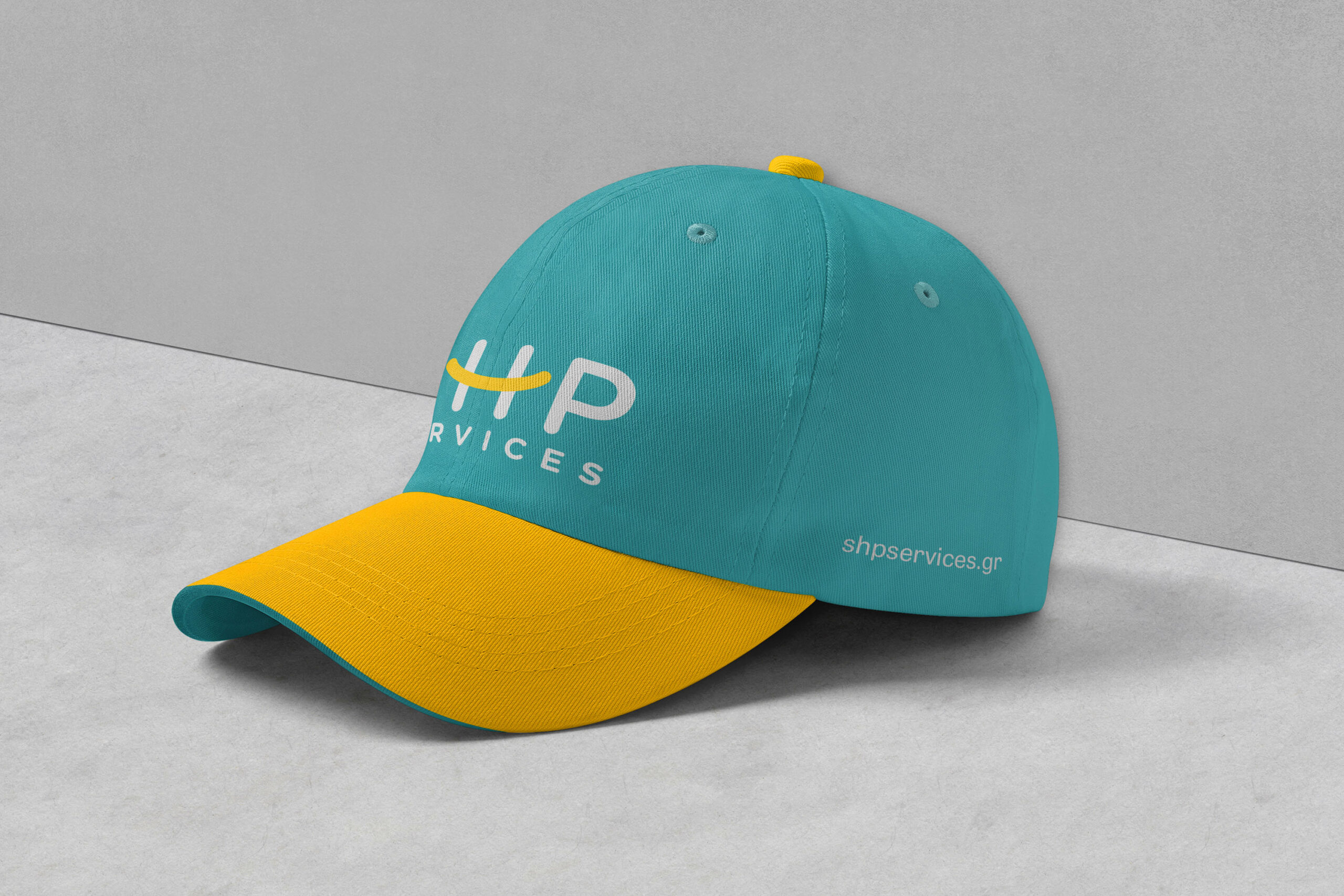
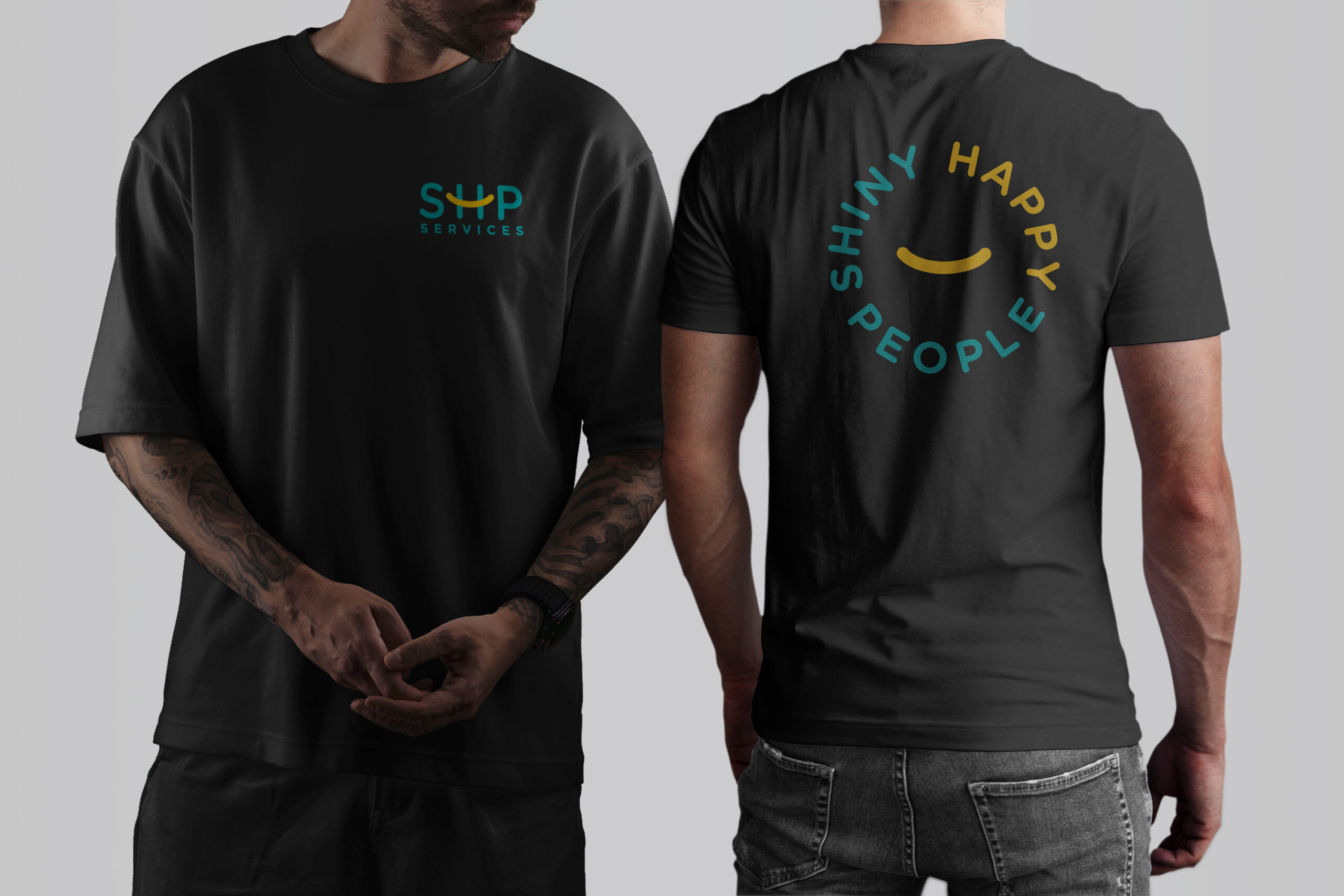
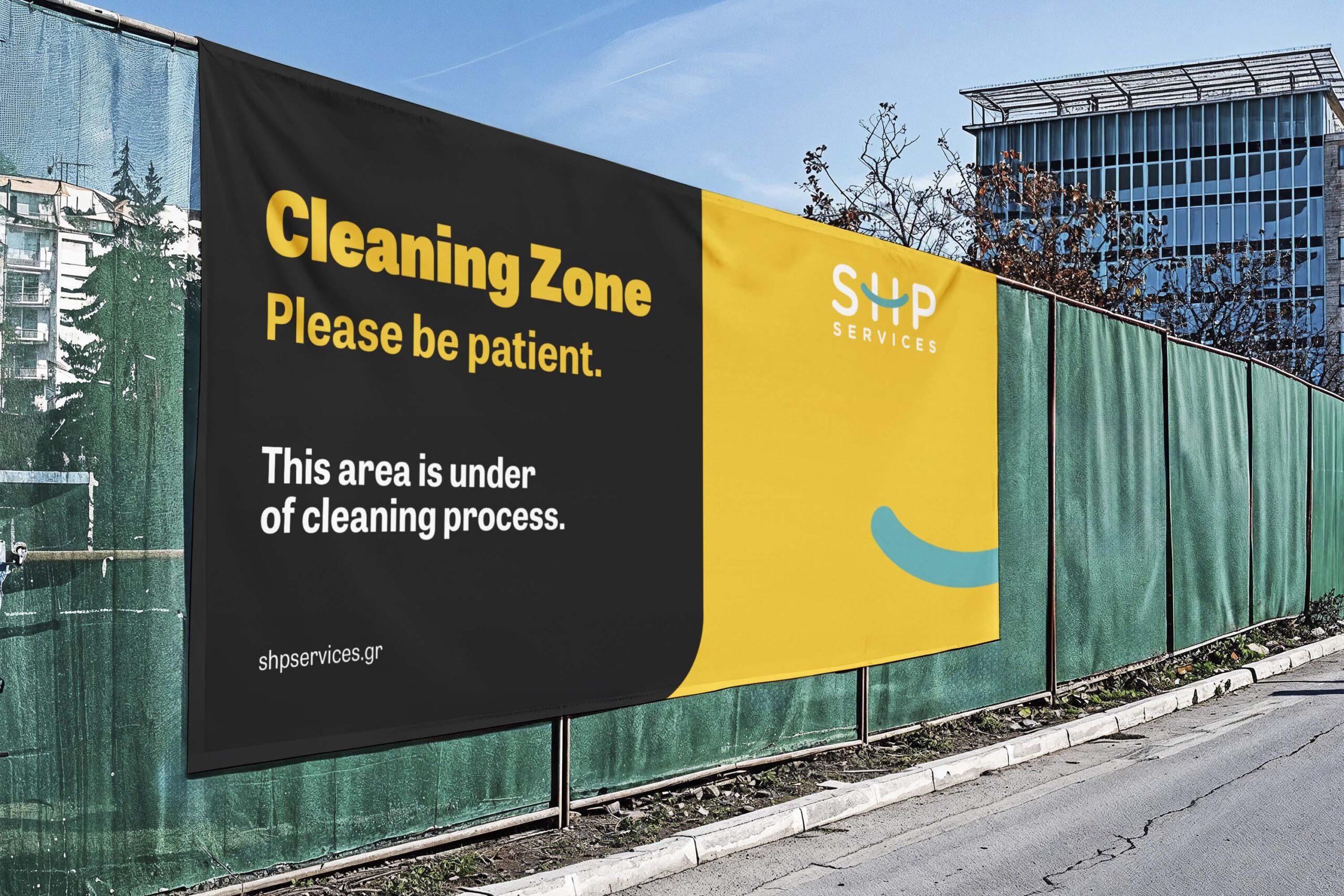
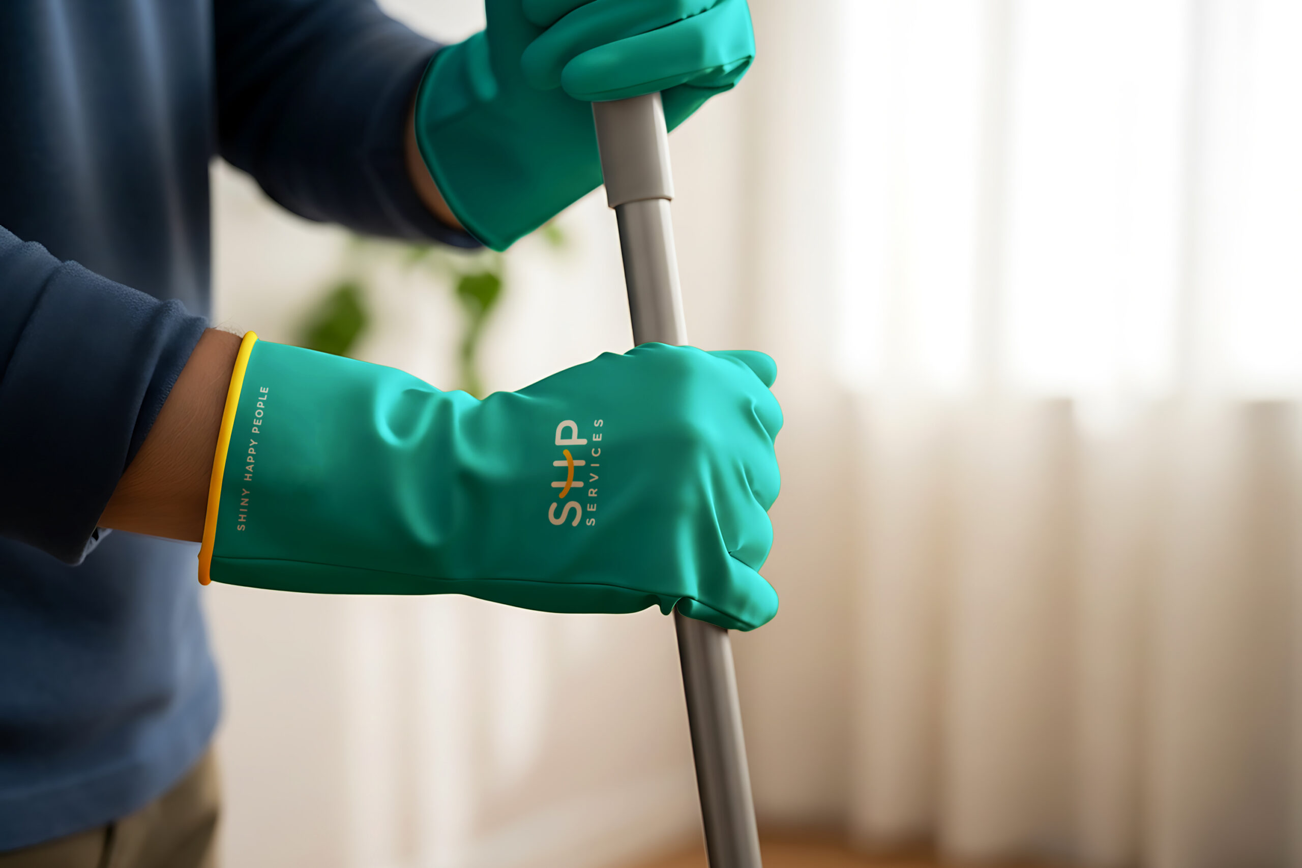
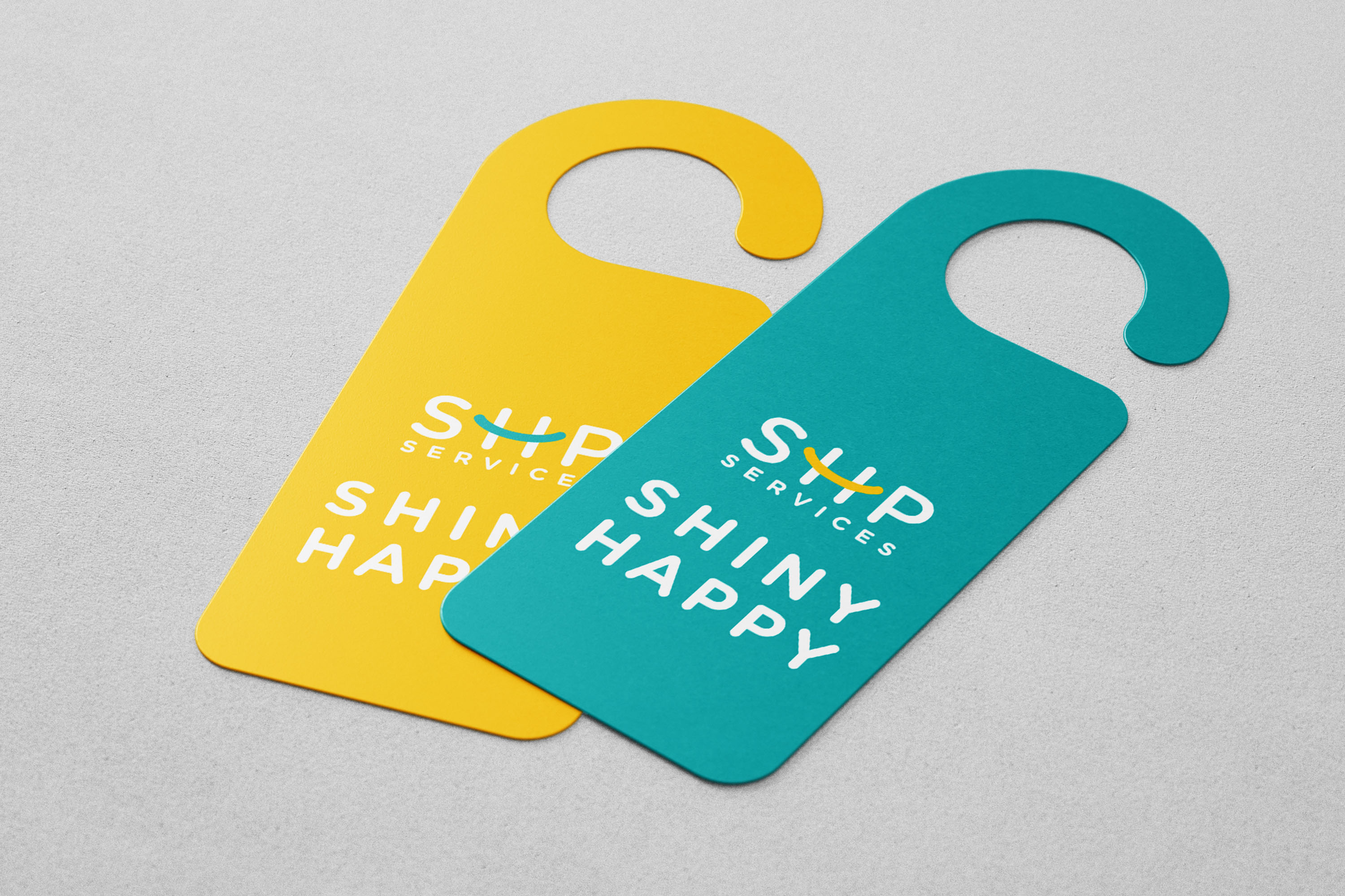
The identity also supports the team during real work. Branded clothing and equipment create a clear presence on site. Simple signs explain when a service is in progress. Vehicle graphics extend the brand beyond the workplace. Together, these touchpoints make SHP feel organised and dependable.
From simple booking to a thoughtful finish
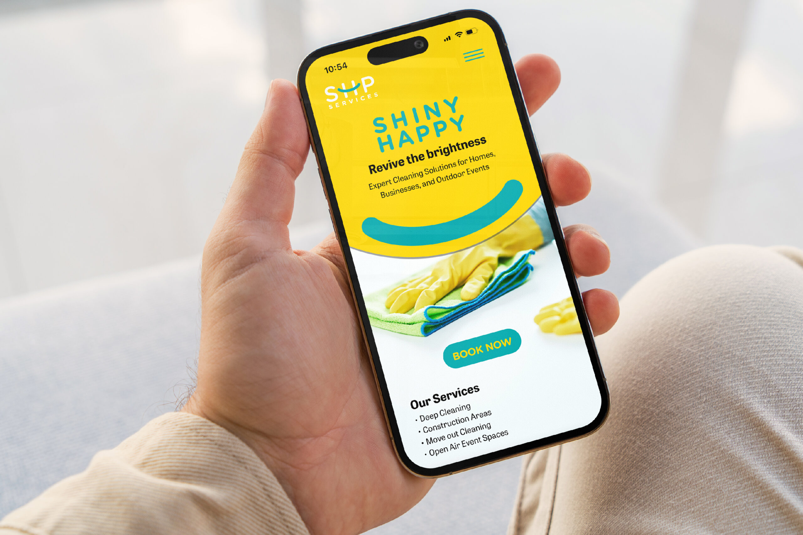
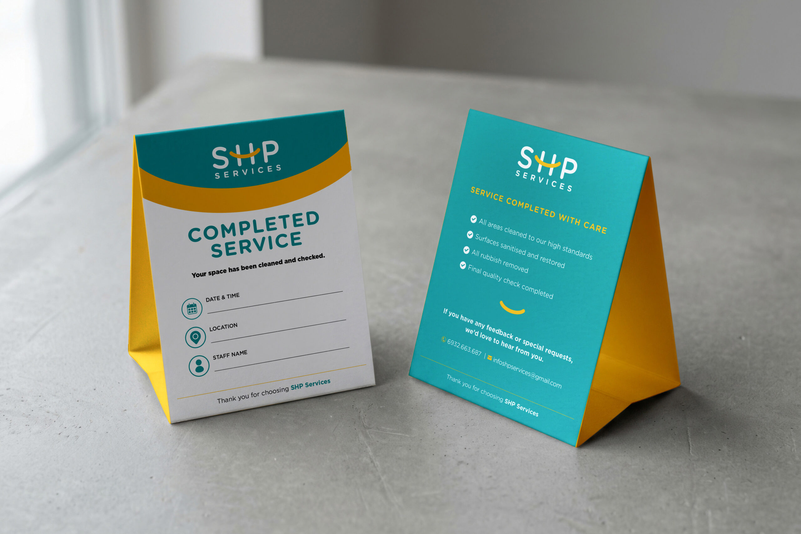
The customer journey starts with clear information and an easy booking path. The mobile experience explains the services and guides users toward action. The brochure supports sales conversations and service planning. After each visit, a completed-service card confirms the final quality check. Finally, small care details leave a positive and memorable impression.
A service brand designed to feel bright, clear and dependable
Across identity, campaign, operations and customer care, SHP follows one consistent idea. Every touchpoint is simple, visible and human. The system helps the company look professional without losing warmth. It turns a practical service into a distinctive and positive brand experience.
Brand Identity · Campaign Communication · Digital Experience · Operational Branding · Customer Journey · Motion Design