Antika
Brand identity for a contemporary antiquarian and curated objects store
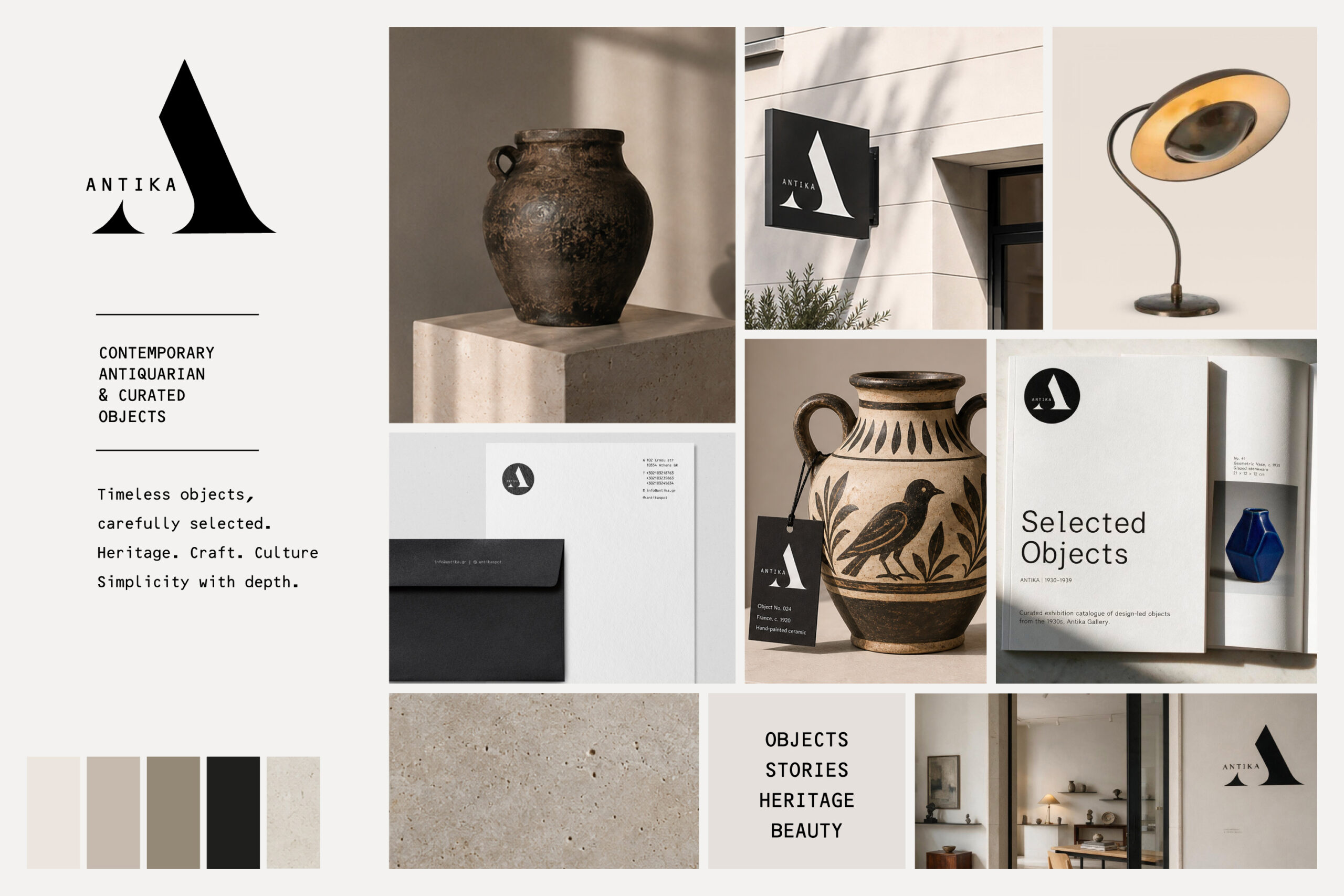
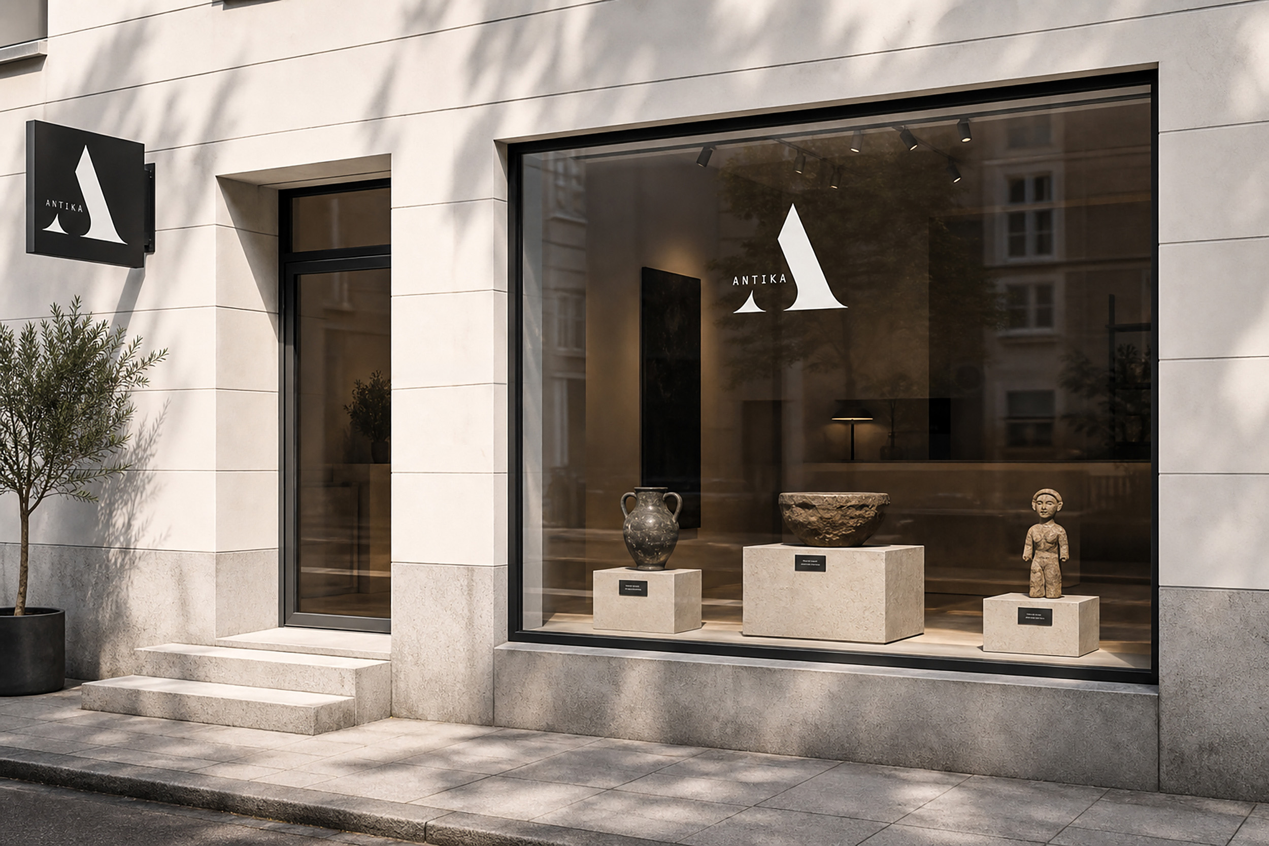
ANTIKA is a brand identity project for a contemporary antiquarian store in the centre of Athens. The brand brings together selected objects, design pieces and collectible finds from different periods. The identity needed to feel refined and timeless. At the same time, it had to avoid a traditional or overly nostalgic antique-store image. A distinctive monogram, black-and-white typography and a restrained visual system create a clear brand language. As a result, ANTIKA feels cultural, curated and contemporary.
Creative Direction · Brand Identity · Logo Design · Visual Systems · Retail Branding · Art Direction

A restrained identity built around form and contrast
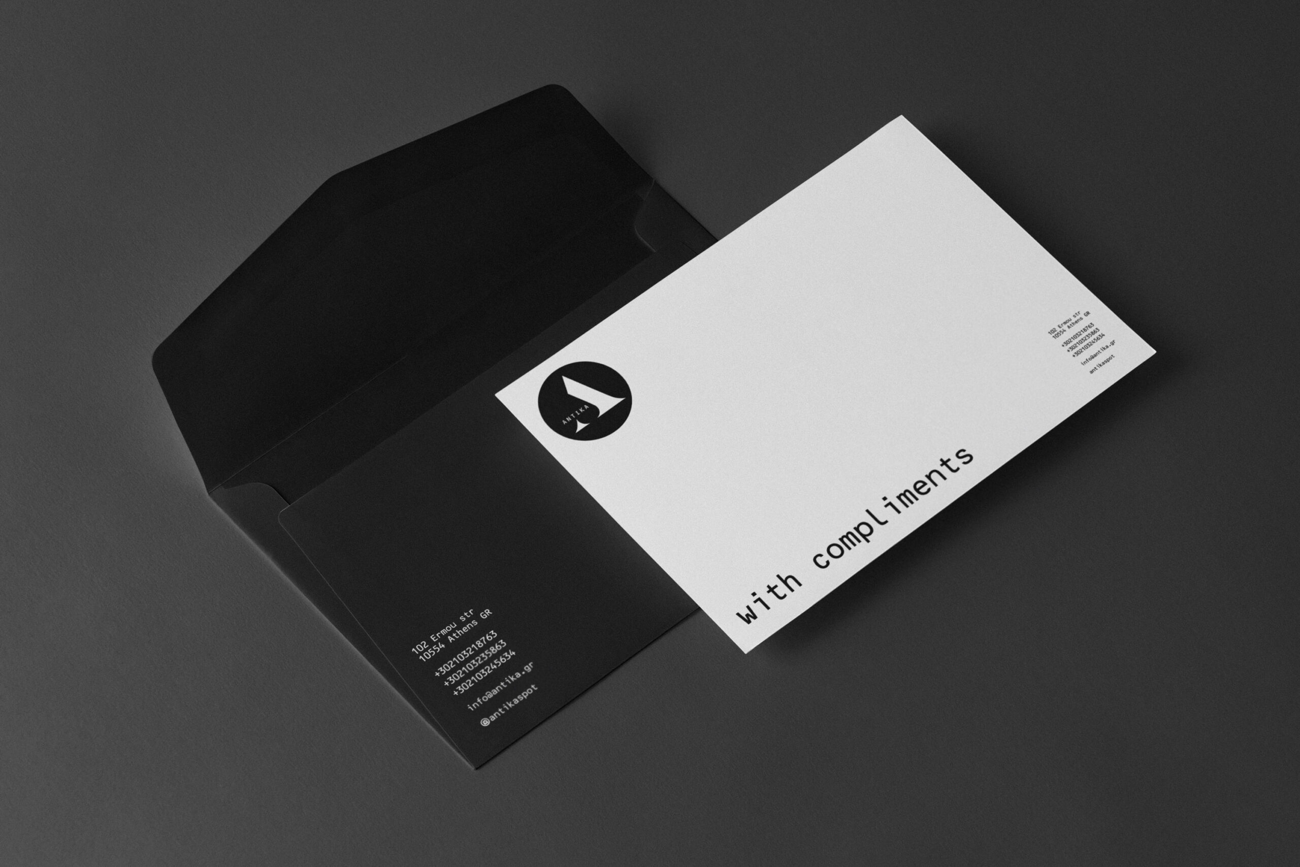
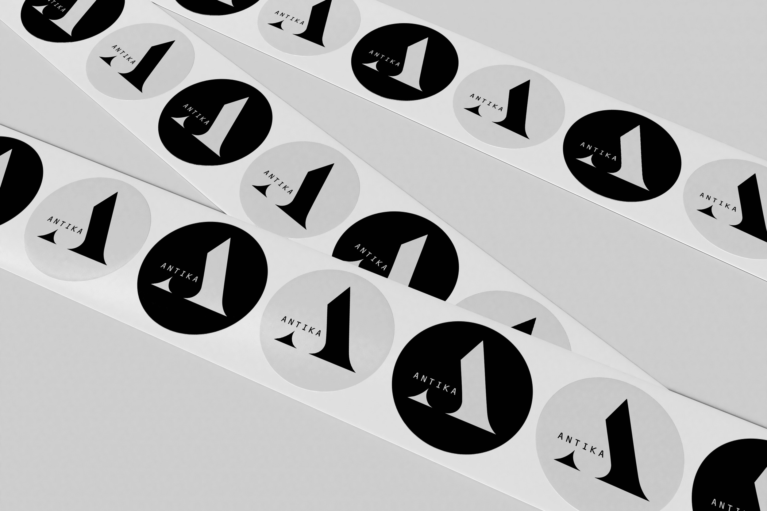
The visual identity centres on a stylised monogram. Its geometric form gives the brand a distinctive and recognisable signature. Black and white create a calm and timeless base. Meanwhile, the typography adds a more archival and precise character. The system works across stationery, printed material and small branded applications. Each element stays simple, so the identity feels consistent without becoming decorative.
Extending the identity into a curated retail experience
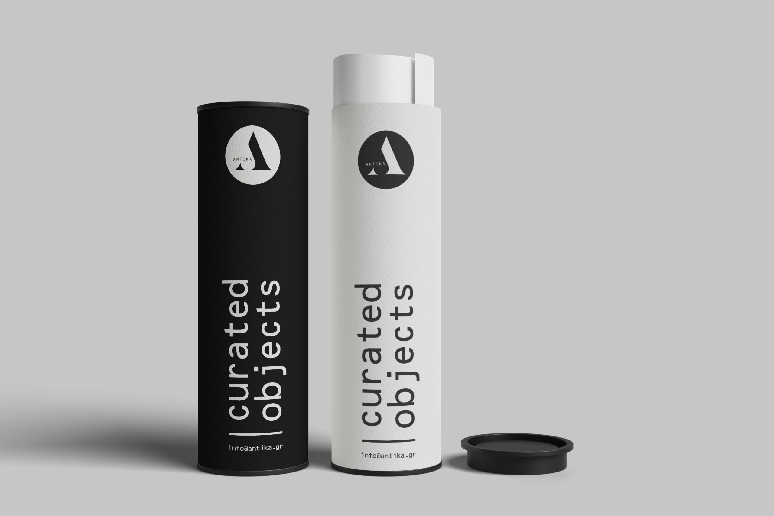
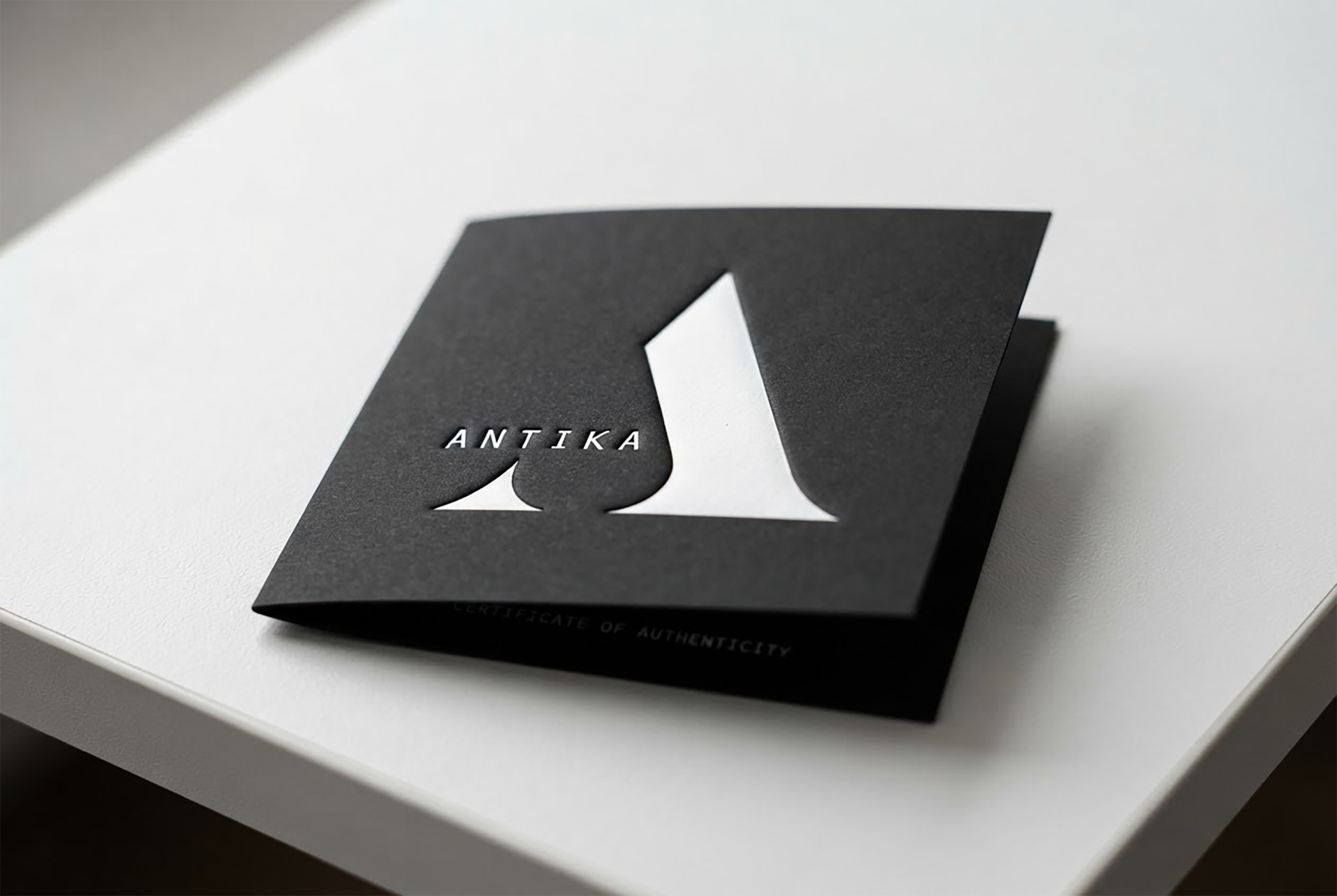
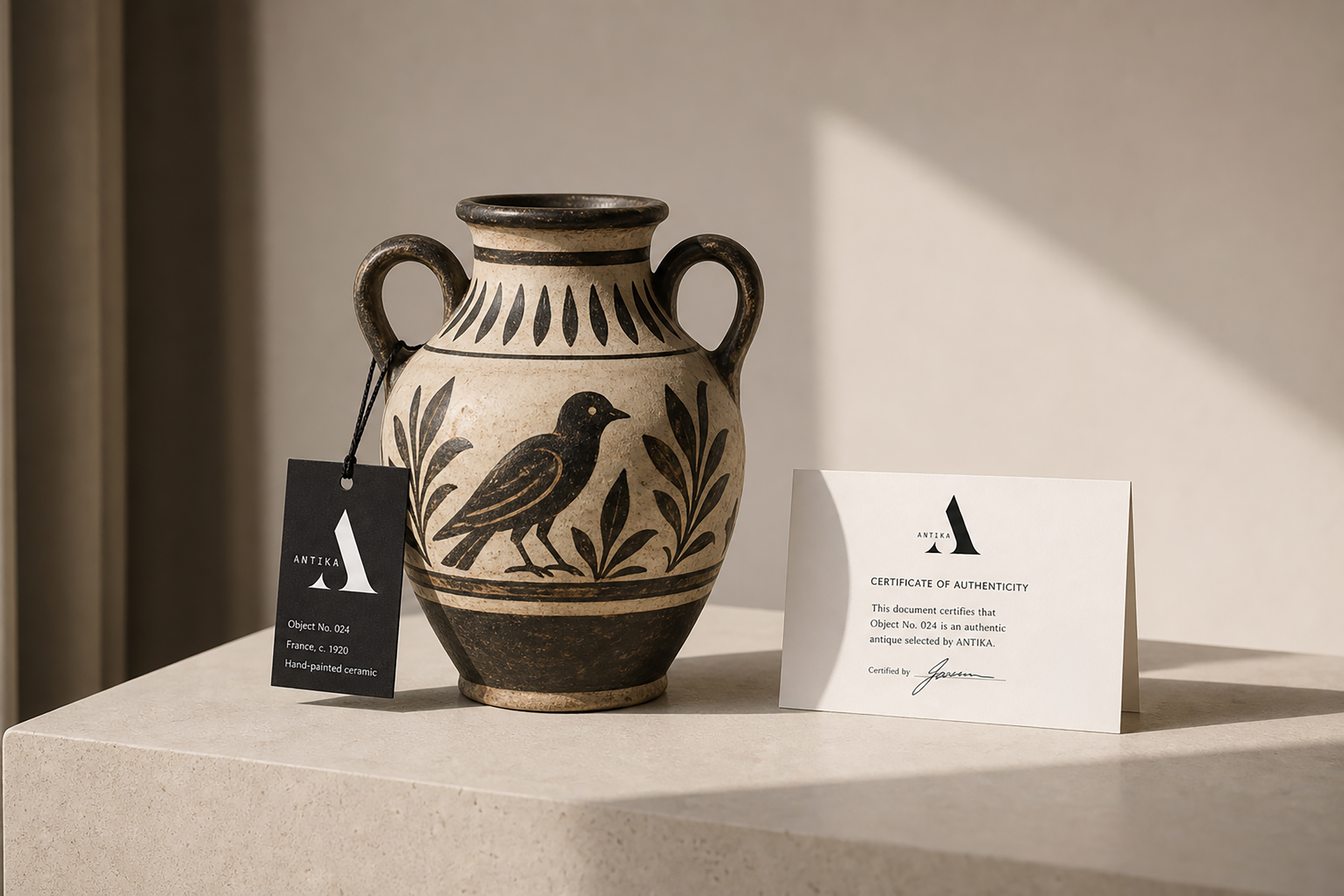
The identity extends into the physical experience of the store. Signage, object labels, authenticity cards and packaging support each stage of the customer journey. Small object tags provide clear information about origin, period and material. Therefore, each piece feels carefully selected rather than simply displayed. The shopping bags and wrapping system continue the same restrained visual language. Together, these details create a more complete and memorable retail experience.
Creating an editorial language for exhibitions and selected objects
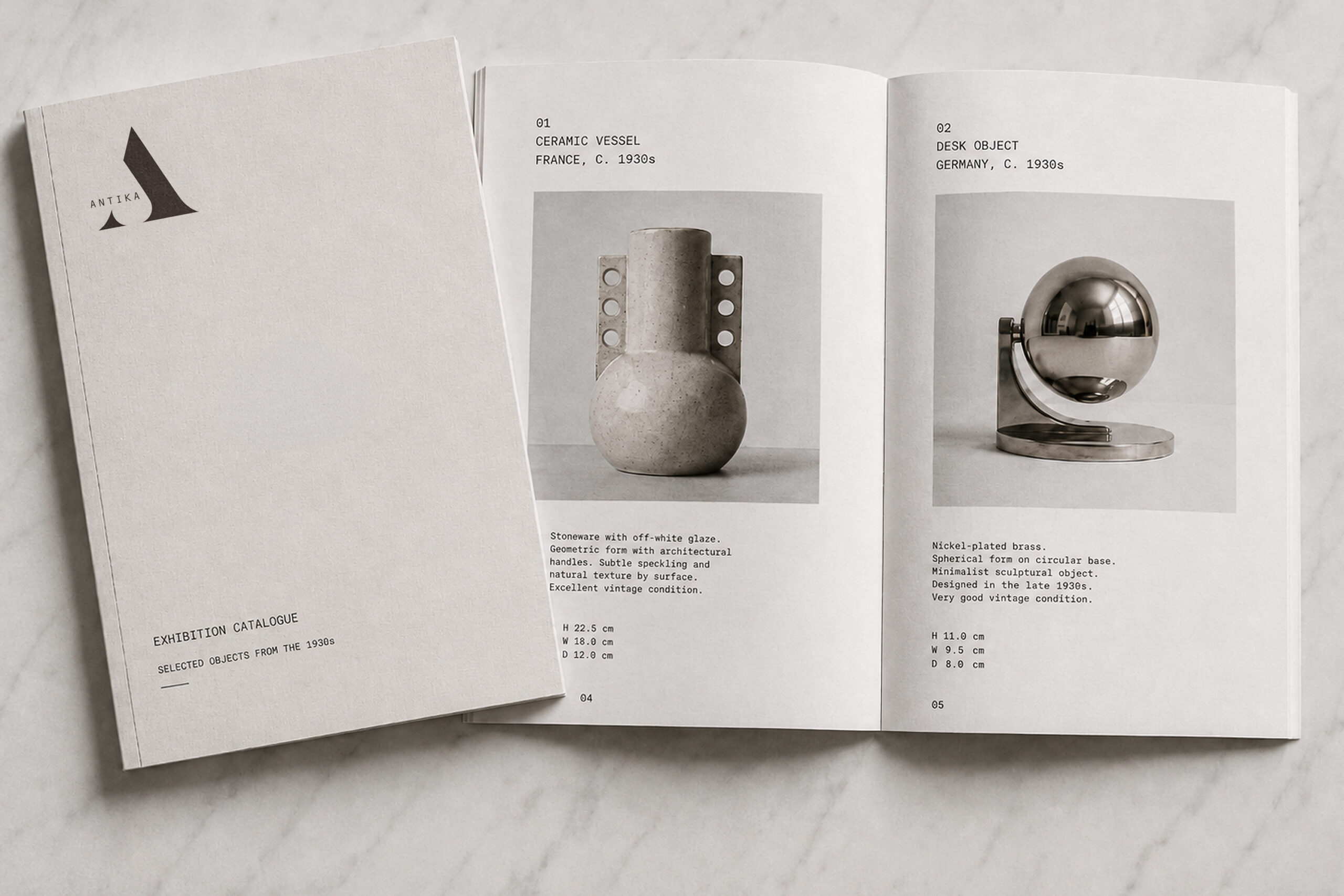
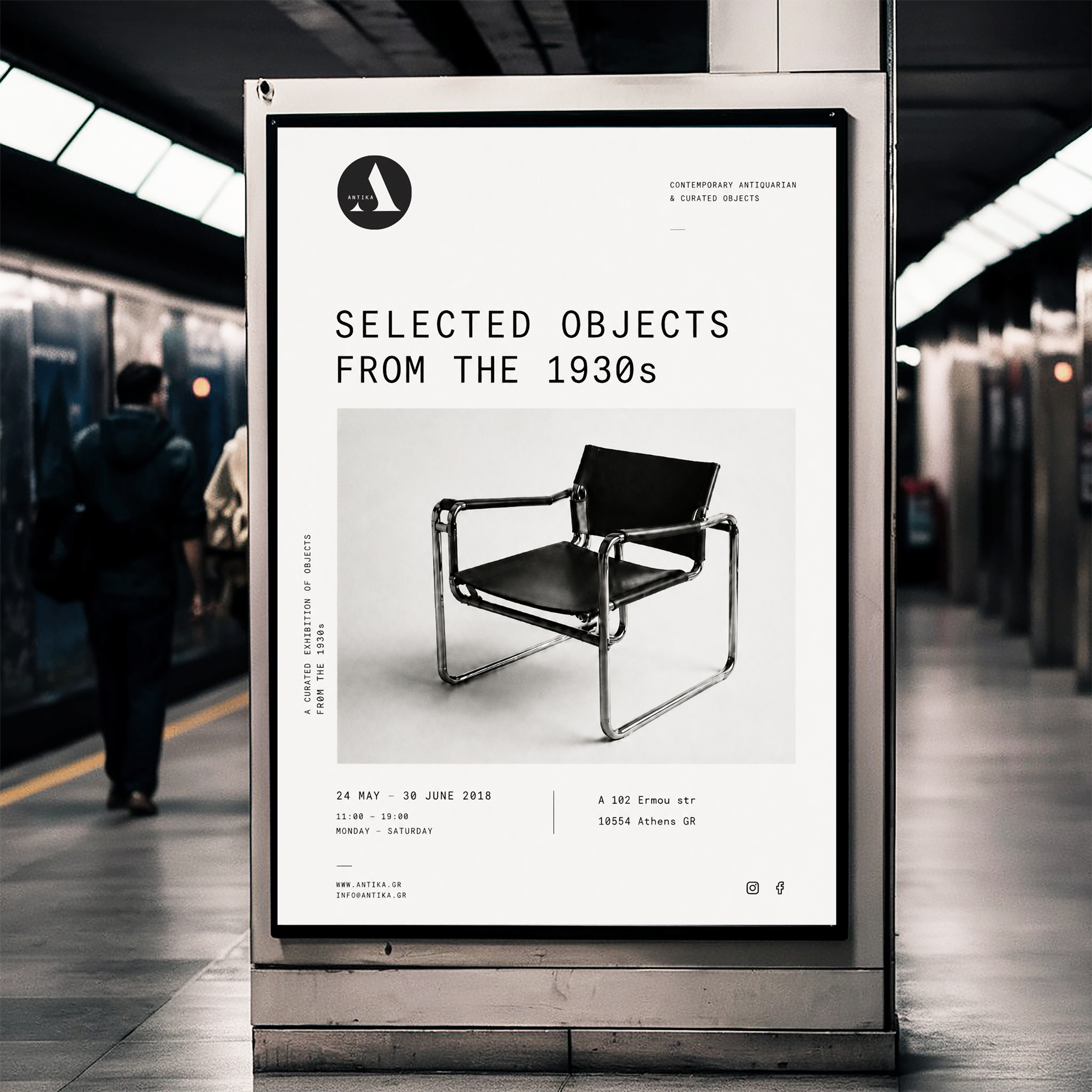
ANTIKA also needed a flexible system for exhibitions and curated collections. The communication had to present each object with clarity and respect. The exhibition catalogue uses generous space, matte paper and a precise editorial grid. OCR-inspired typography gives the layouts an archival yet contemporary tone. The posters use large object photography and simple information structures. As a result, each exhibition gains its own presence while staying connected to the ANTIKA identity.
A timeless identity for objects with history
The final identity gives ANTIKA a clear and consistent presence across print, retail and exhibition communication. The monogram, typography, packaging, object labels and editorial material work together as one restrained system. At the same time, the brand leaves enough space for each object to keep its own character. The result is a contemporary antiquarian identity that feels thoughtful, refined and easy to recognise.
Brand Recognition · Curated Retail · Cultural Identity · Editorial Systems · Physical Touchpoints · Timeless Design