aperitto
Brand identity and retail experience for a contemporary furniture store
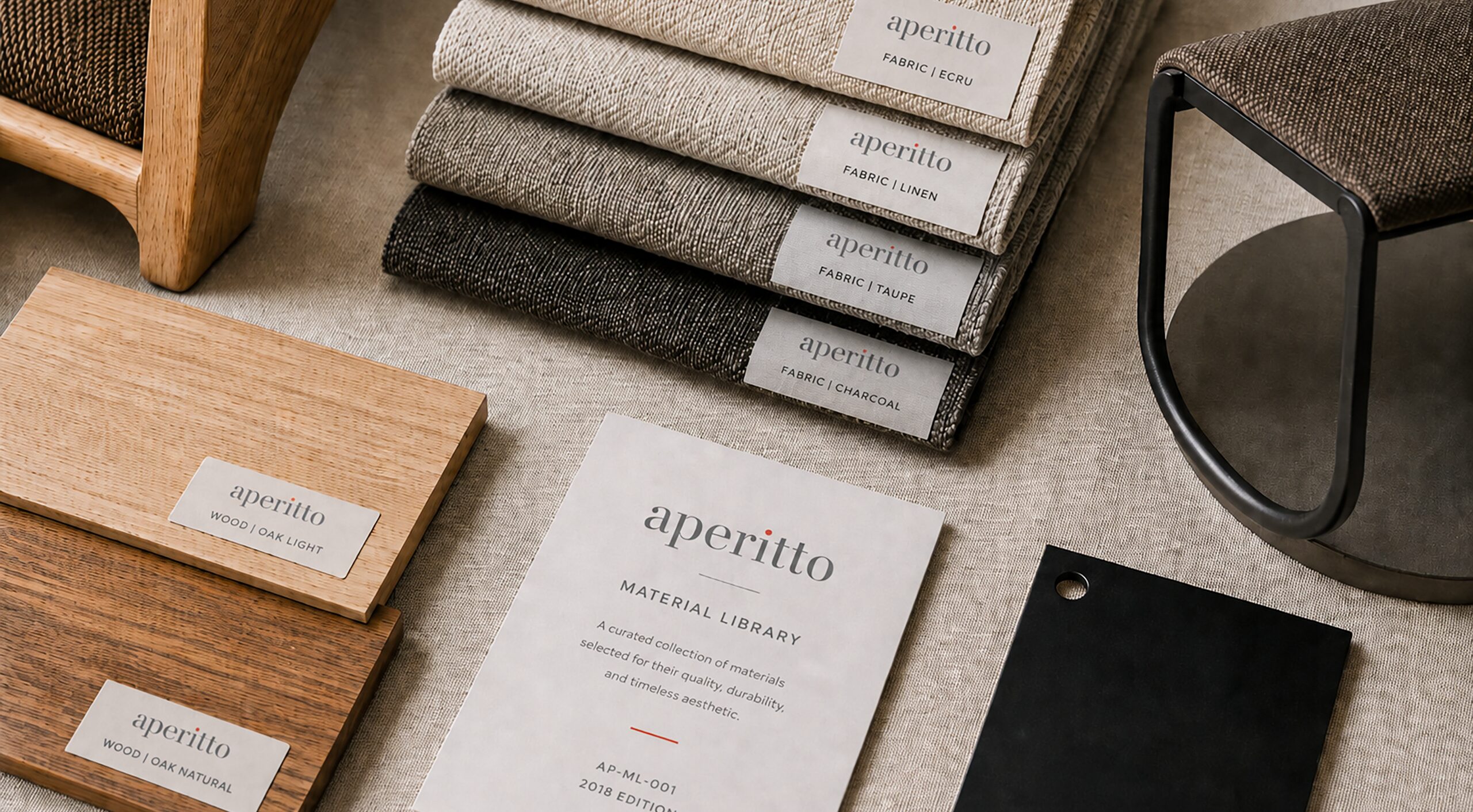
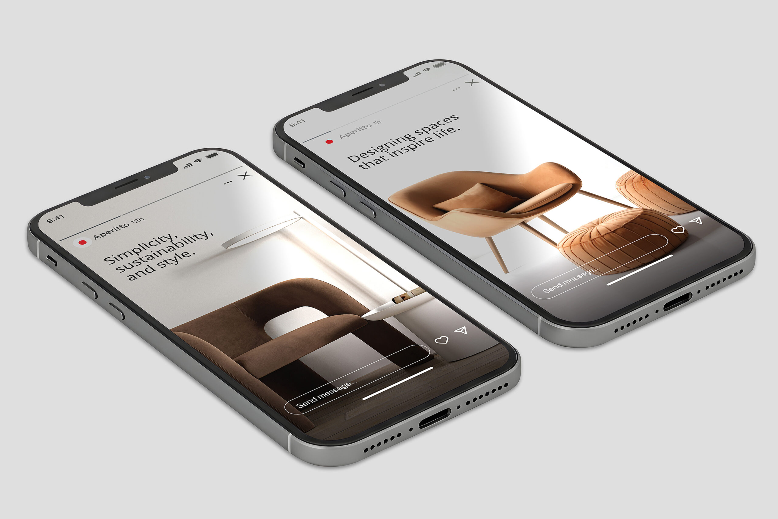
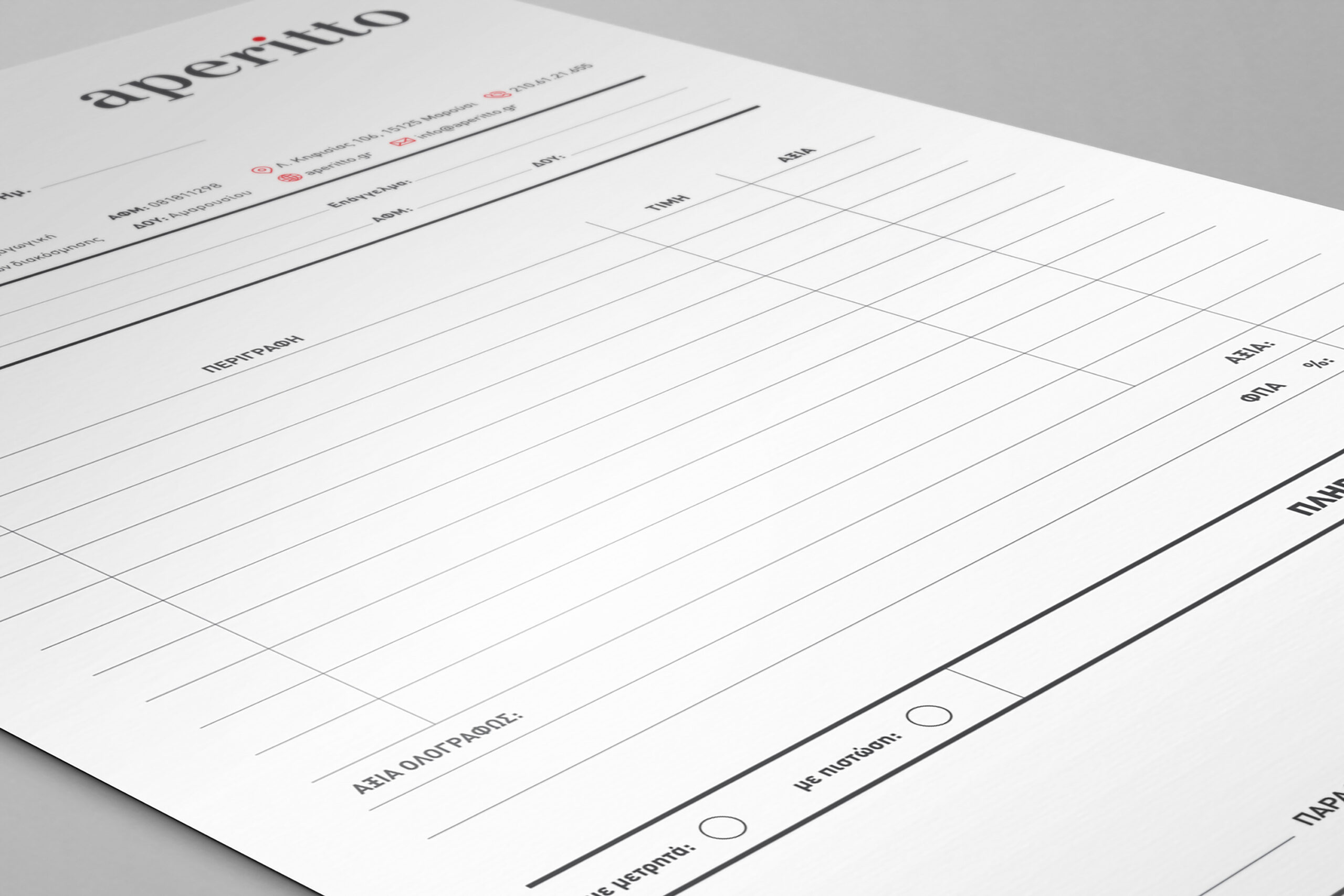
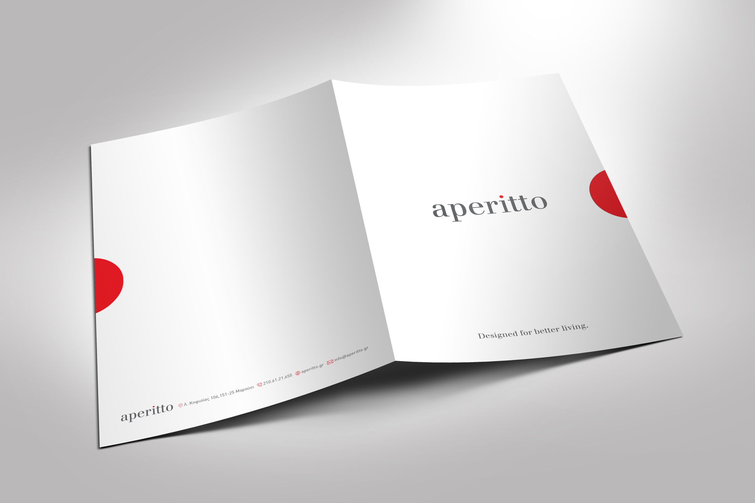
aperitto is a furniture store brand identity project for a contemporary retailer focused on modern design, quality materials and thoughtful living. The identity needed to feel refined and approachable. It also had to support both the digital and physical customer experience. A calm grey palette, generous white space and one red accent create a clear visual language. The small red dot gives the wordmark a distinctive and memorable detail. The system extends across the website, showroom, catalogues, product information and retail communication.
Creative Direction · Brand Identity · Retail Branding · Digital Design · Editorial · Environmental · Motion

A calm identity with one distinctive detail
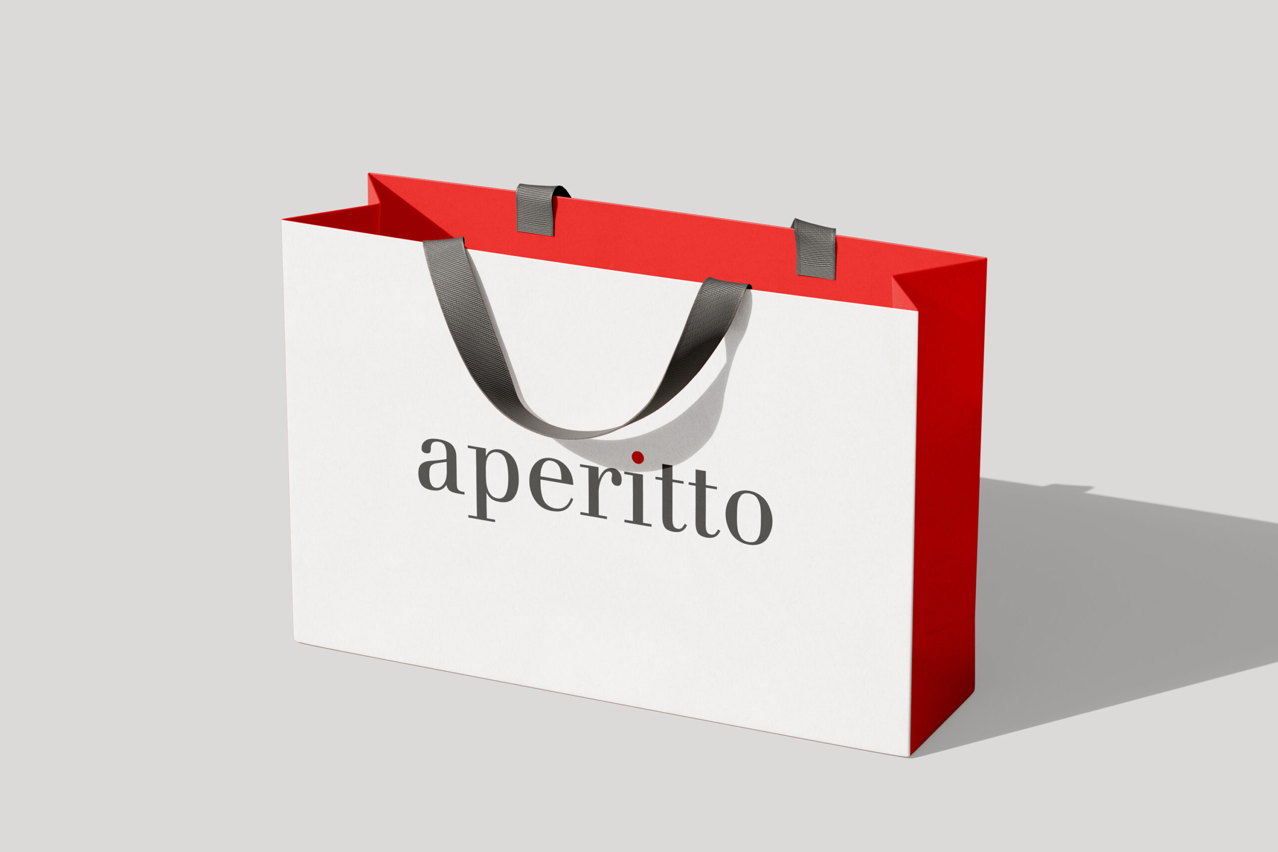
The identity is built around a refined serif wordmark. Its grey tone creates a quiet and premium character. The red dot above the “i” adds energy and recognition. It also becomes a flexible graphic element across motion and communication. The system uses clean layouts, simple typography and generous space. As a result, it remains consistent across web, social media and printed application
Bringing the identity into the showroom
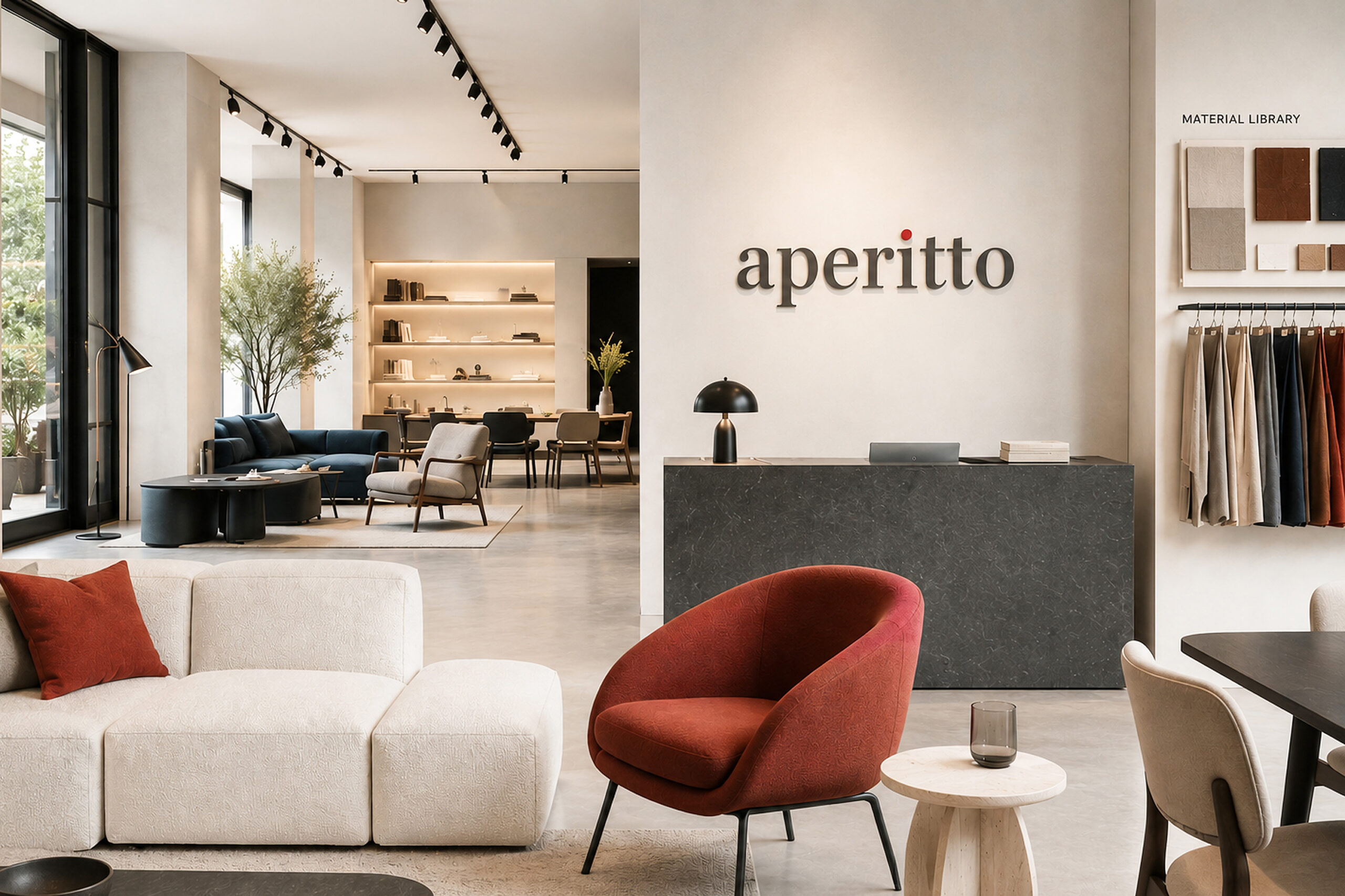
The brand extends into a calm and carefully curated showroom environment. Furniture, materials and lighting define clear zones within the space. Meanwhile, the aperitto logo appears as a subtle architectural signature. Neutral surfaces create a warm backdrop for the products. Small red accents connect the interior with the wider identity. The result feels more like a furniture gallery than a conventional retail floor.
Presenting furniture with clarity and character
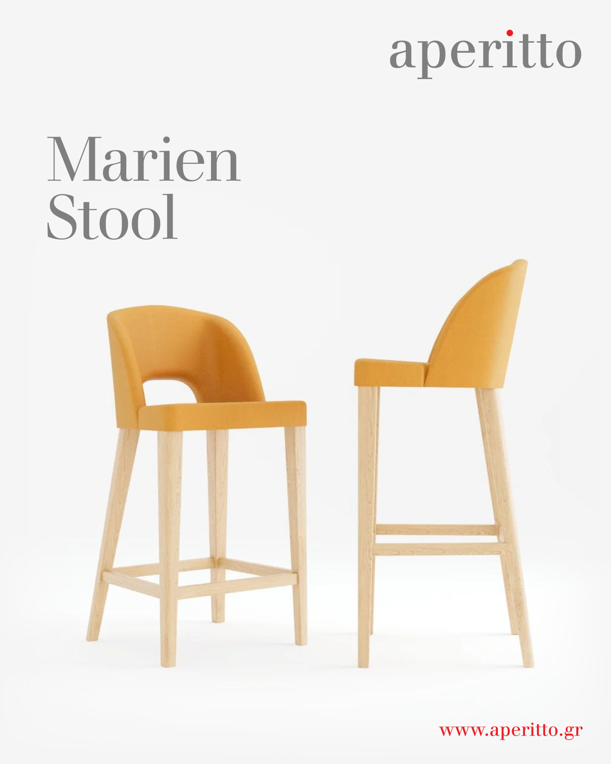
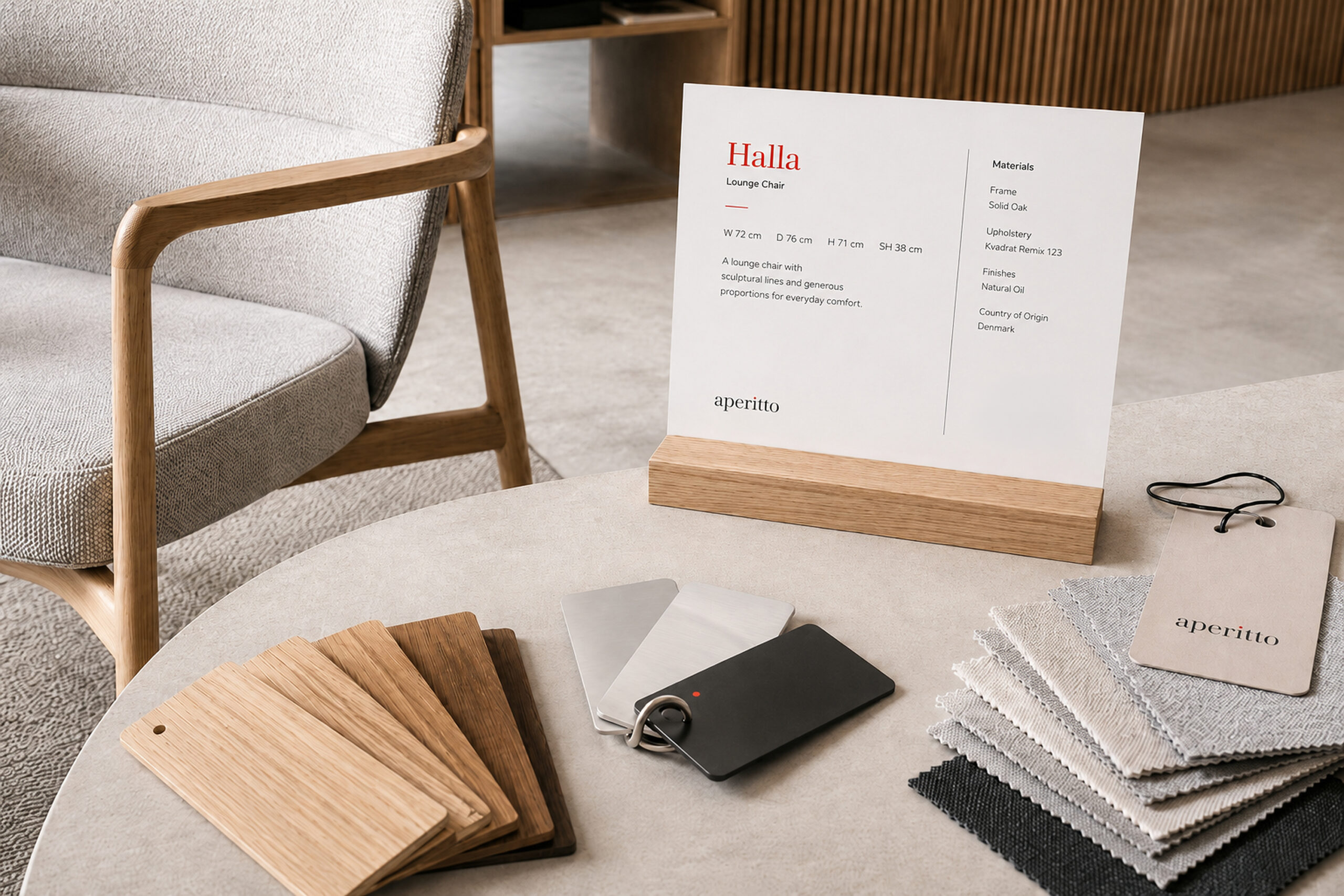
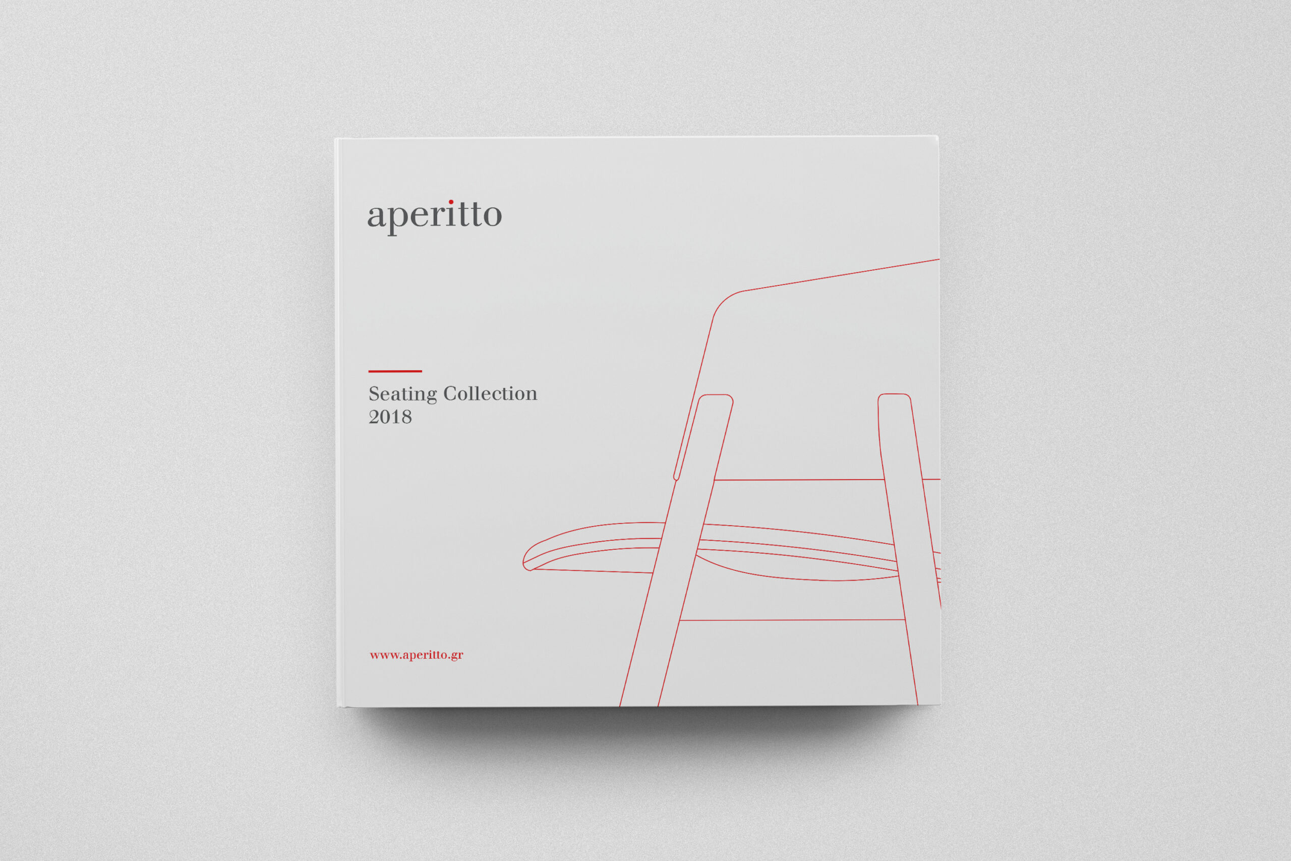
The product catalogue introduces each piece through a clear editorial system. Large lifestyle photography gives context and atmosphere. Product views, dimensions and short descriptions provide the essential information. The layout uses white space and small red details to guide the reader. Therefore, the catalogue feels informative without becoming technical or dense. The Halla and Holla chairs show how the system adapts to different forms, materials and finishes.
Extending the identity across campaign and retail touchpoints
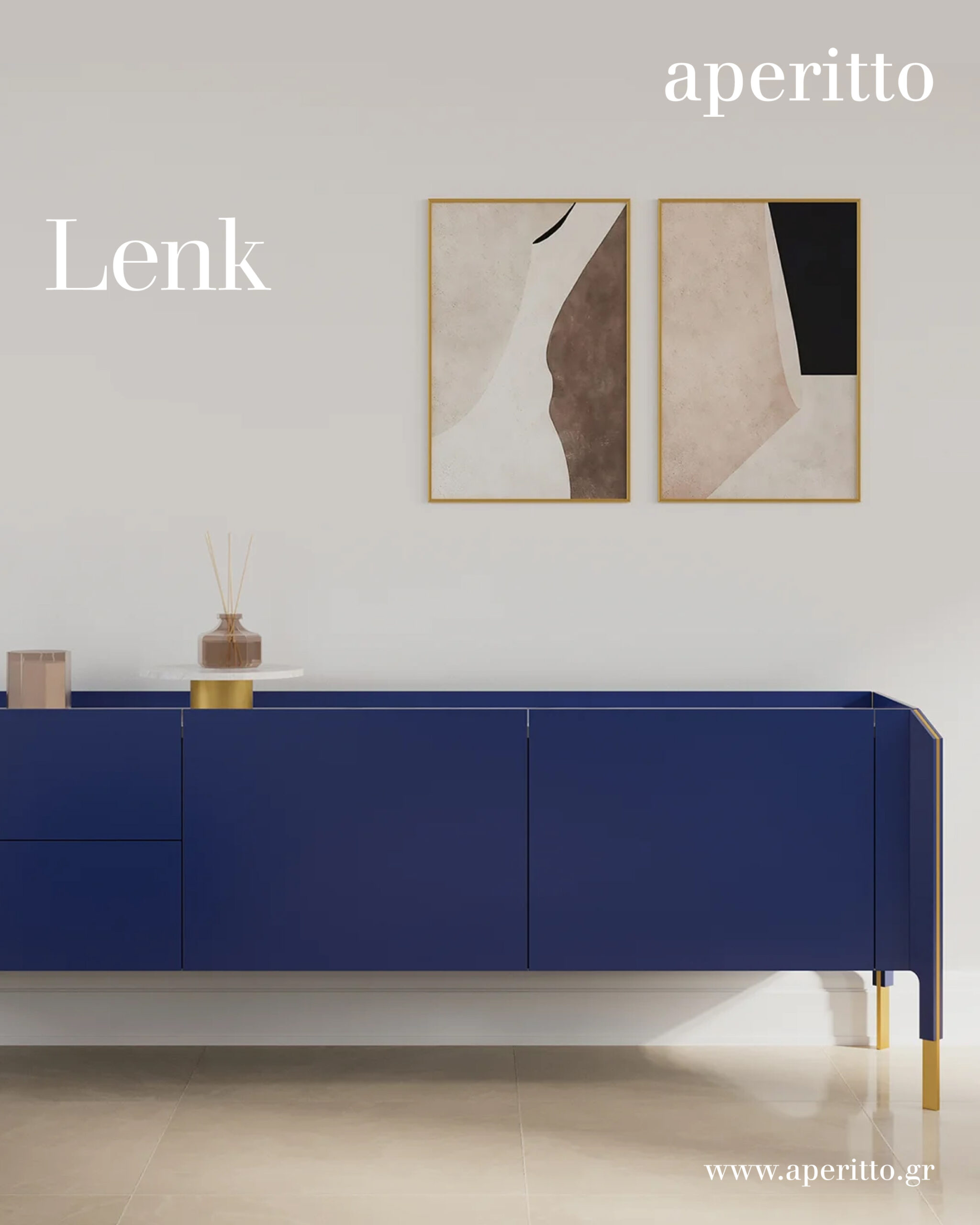
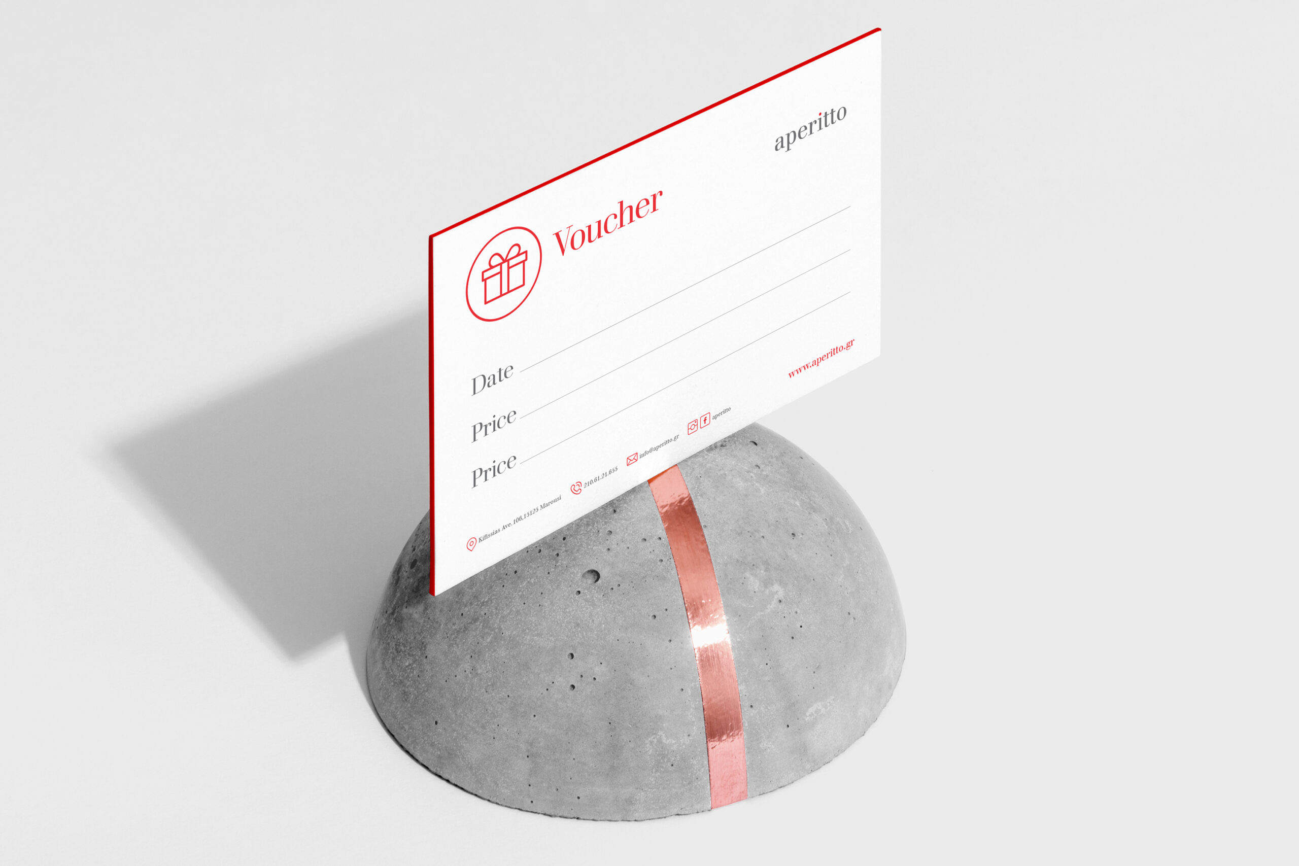
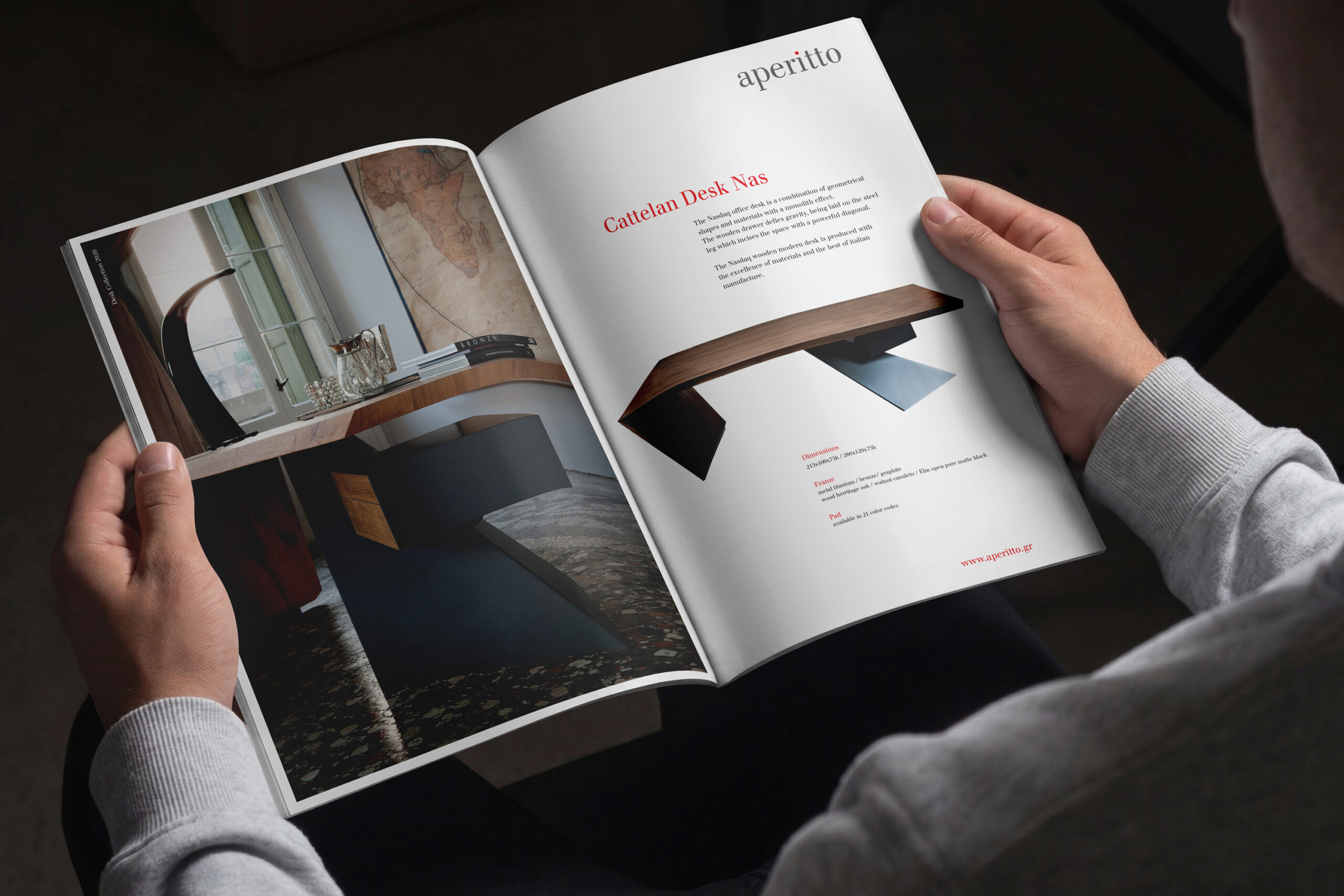
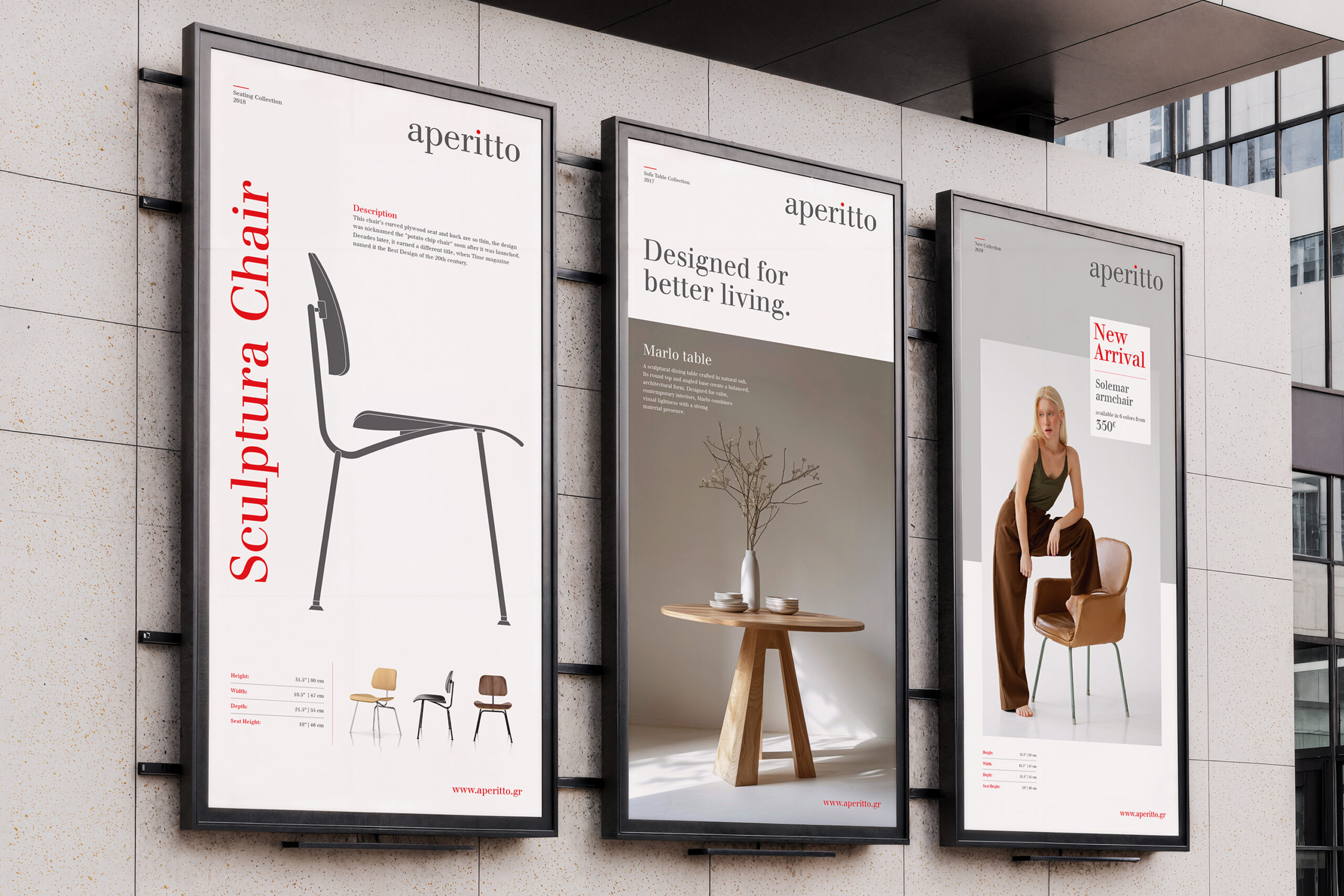
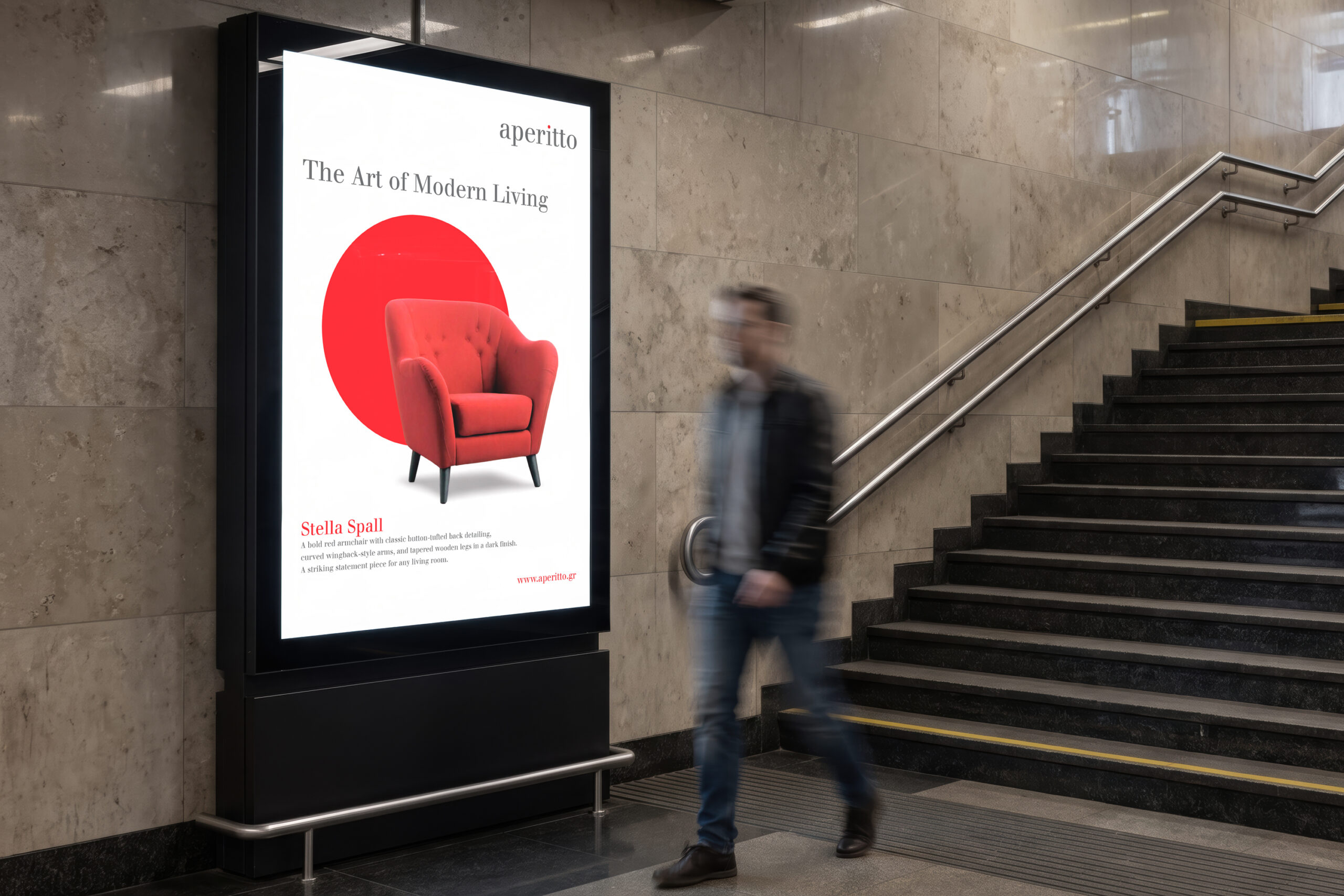
The aperitto identity also extends into campaign and promotional communication. Magazine advertising uses calm compositions, product-led imagery and concise messages. Posters and billboards create more impact through scale and contrast. At the same time, the voucher brings the same visual language into a smaller and more personal customer touchpoint. Together, these applications show how the identity can move from editorial communication to public space and retail experience.
A complete identity for contemporary living
The final system connects digital platforms, showroom branding, product communication and campaign design. Each application uses the same restrained visual language. However, the system remains flexible enough to support different products, collections and customer needs. The result is a contemporary furniture brand with clarity, warmth and a strong sense of design.
Campaign Design · Editorial Advertising · Outdoor Communication · Retail Touchpoints · Brand Recognition · Contemporary Living