Botanics

Wellness brand identity and packaging system for natural spa products

Spa Botanics is a wellness brand identity and packaging project for a natural spa product line. The brand needed to feel calm, tactile and premium. At the same time, each product had to keep its own character inside one clear visual system. Therefore, the design direction combines a botanical symbol, warm neutral tones, decorative patterns and refined typography. Together, these elements create a soft but structured brand language for packaging, retail touchpoints, campaign material and social communication.

Brand identity · Packaging design · Pattern system · Retail touchpoints · Campaign design · Social media assets · Wellness branding

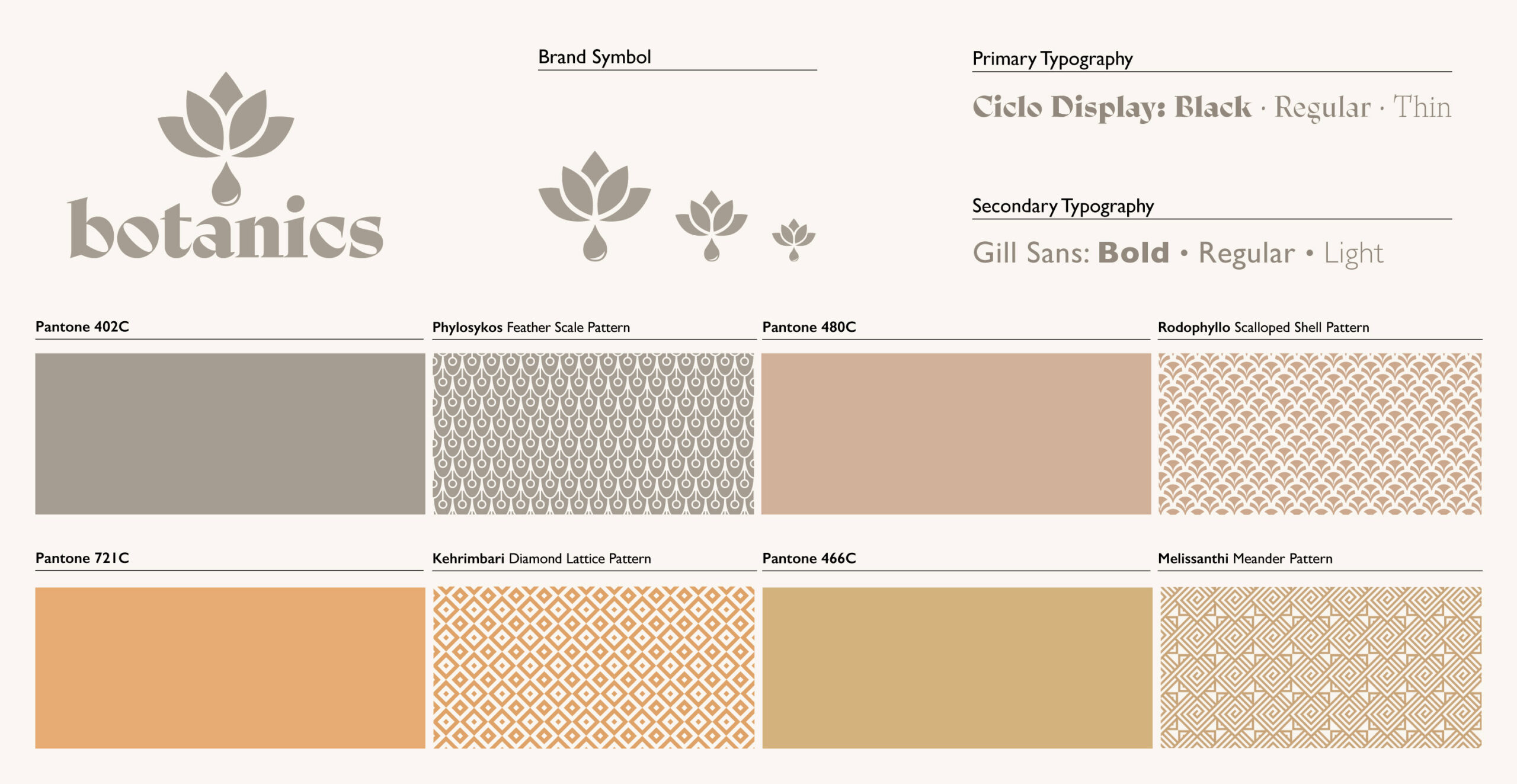
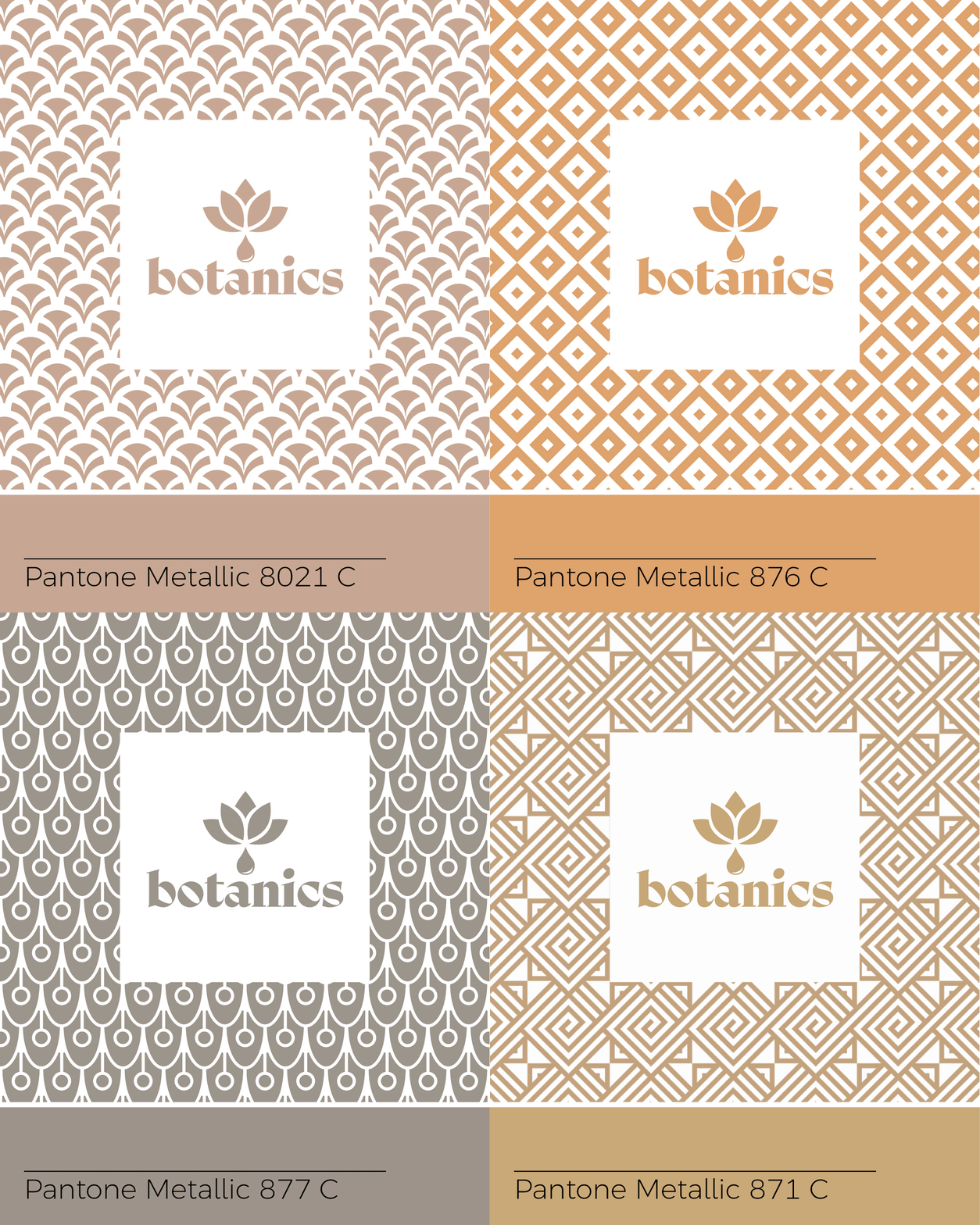
A collection of colors representing a botanical theme, including greens, browns, and soft floral shades.

Defining a calm visual language for natural spa products

The visual language centres on a botanical symbol, a warm earthy palette and a family of decorative patterns. Each pattern connects to a product line, so the packaging system gains variety without losing consistency. In addition, refined typography and muted colour combinations help the brand feel calm, natural and premium. As a result, the system can move from small product labels to larger retail and promotional applications with ease.

Packaging design across a natural product range

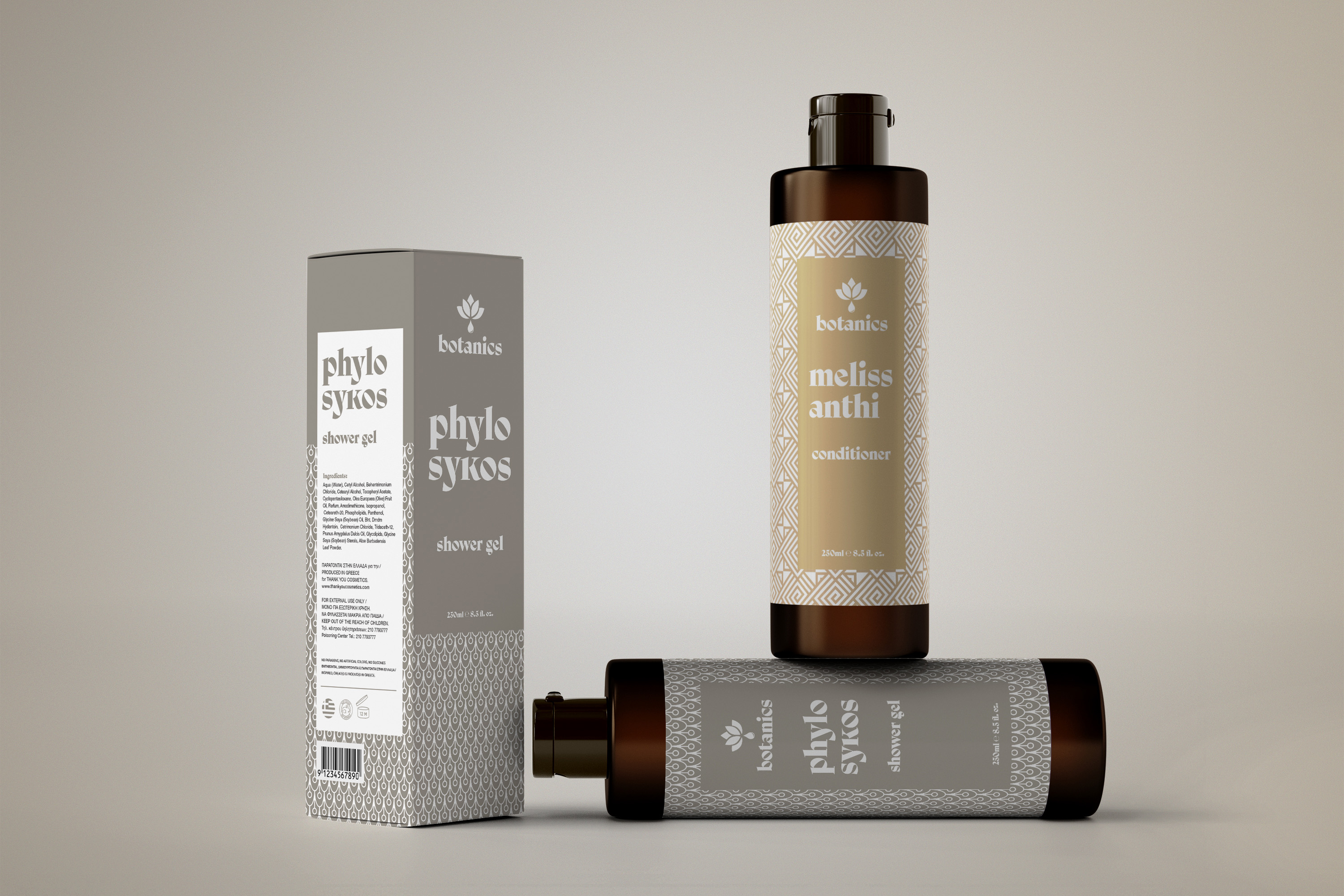
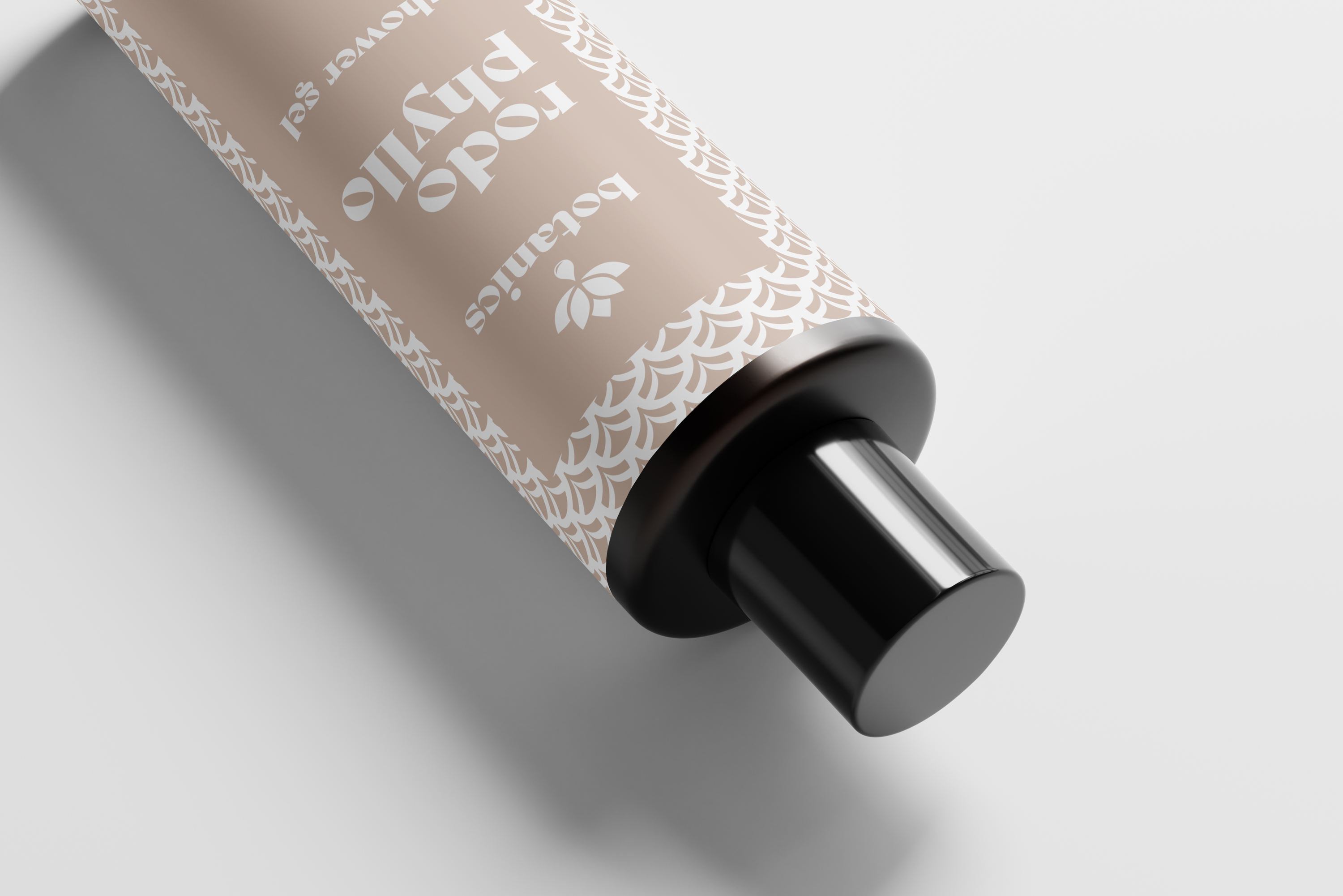
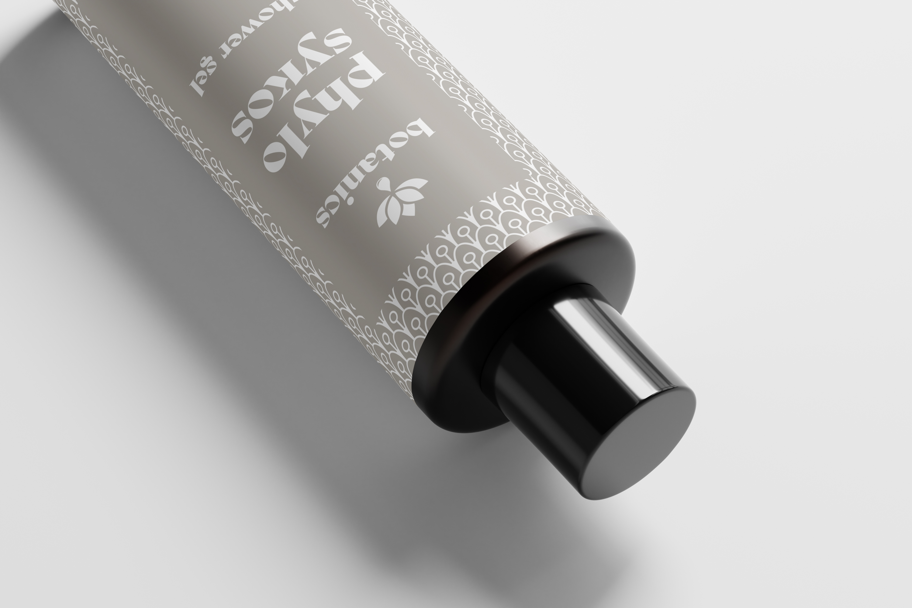
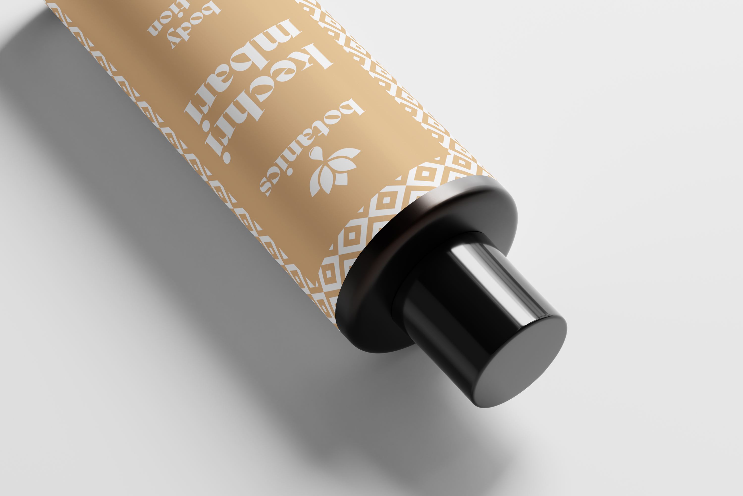
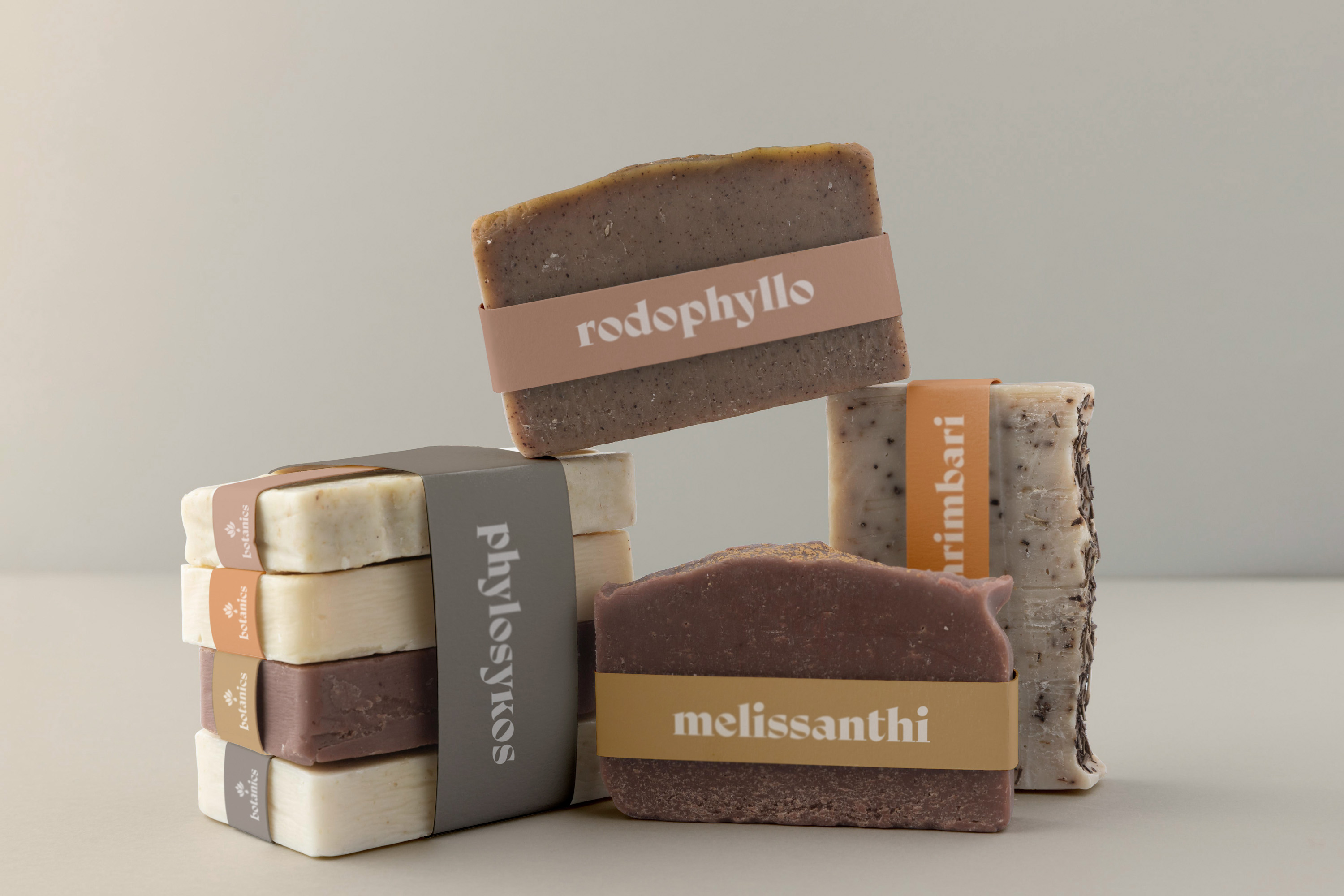
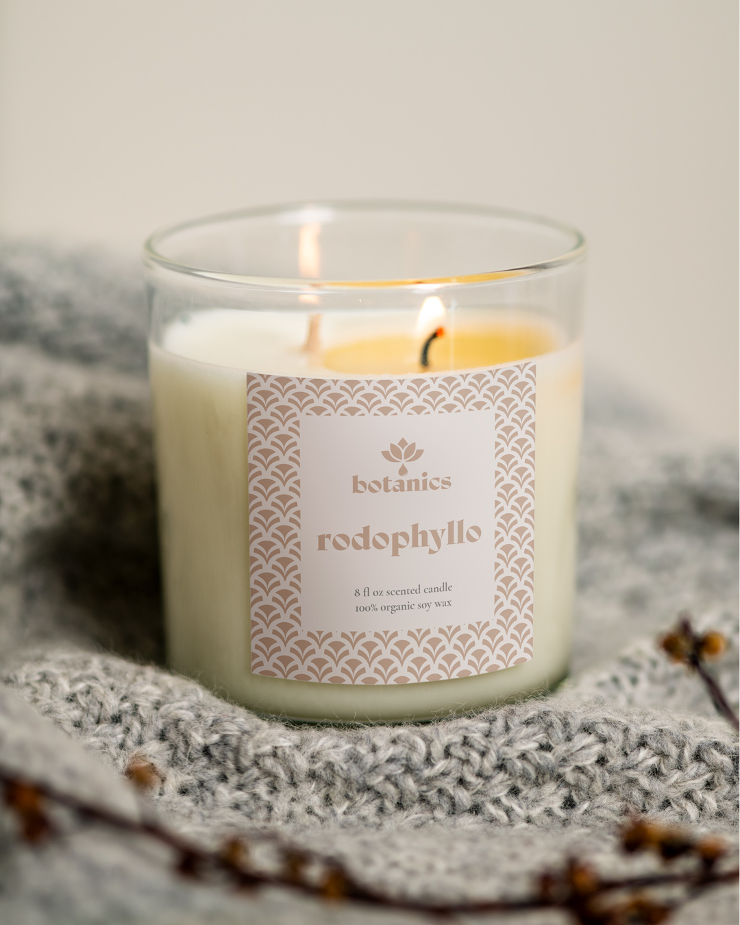
The packaging system gives each product a distinct identity while keeping the full range recognisable as part of the same brand. Colour, pattern and product naming create small differences between lines. However, the logo, typography and layout keep the overall expression consistent. The aim is to make the products feel natural and carefully crafted. At the same time, the design keeps the clarity needed for retail use. Labels, boxes, tubes and soap applications work as individual products and as a coherent family on shelf.

Extending the identity into retail touchpoints

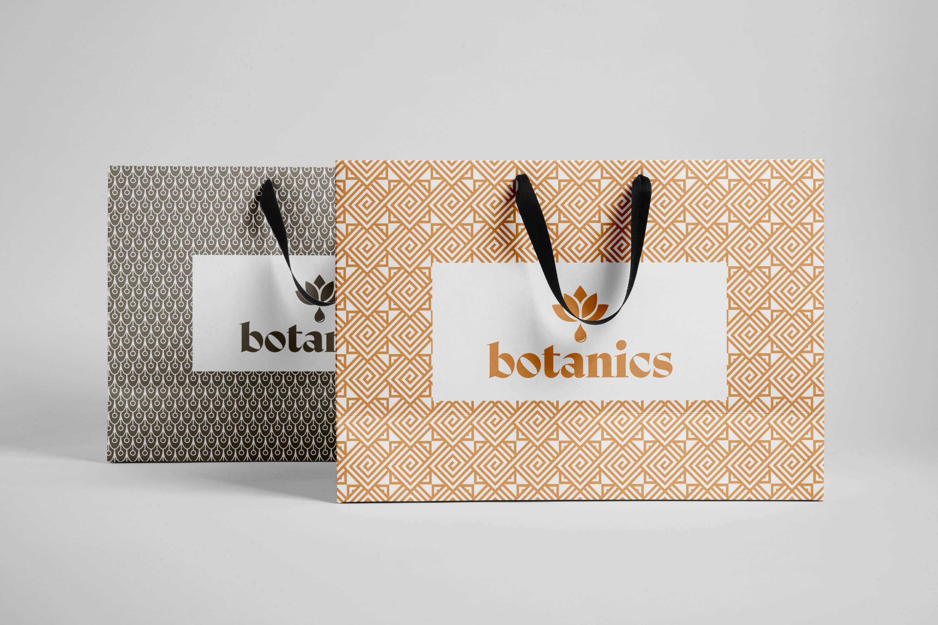
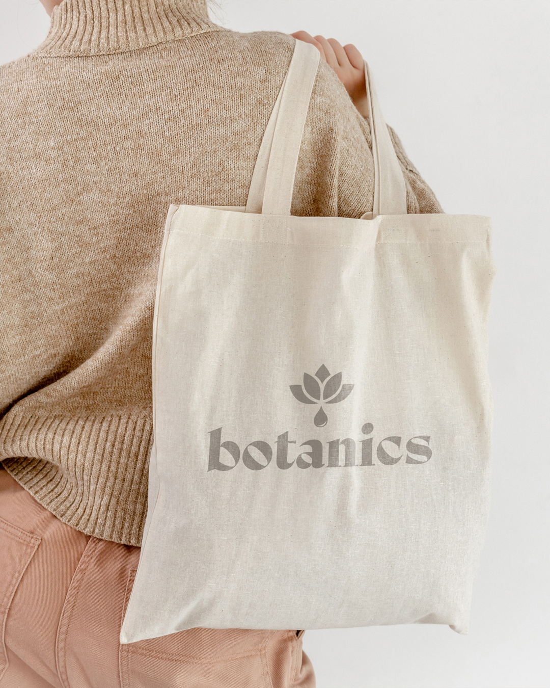
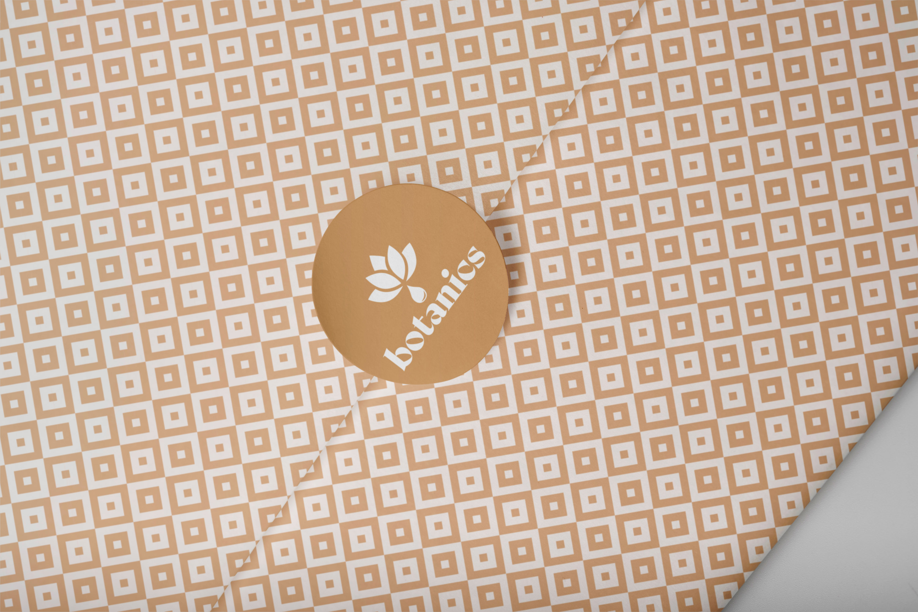
The patterns also play an important role in the brand’s retail presence. They appear across bags, wrapping details, stickers and fabric items. As a result, simple touchpoints become recognisable parts of the Spa Botanics experience. These applications make the identity feel more complete beyond the product packaging. In addition, the brand can appear in small moments of purchase, gifting and everyday use, while keeping the same soft and natural character.

A soft campaign language for beauty and wellness communication

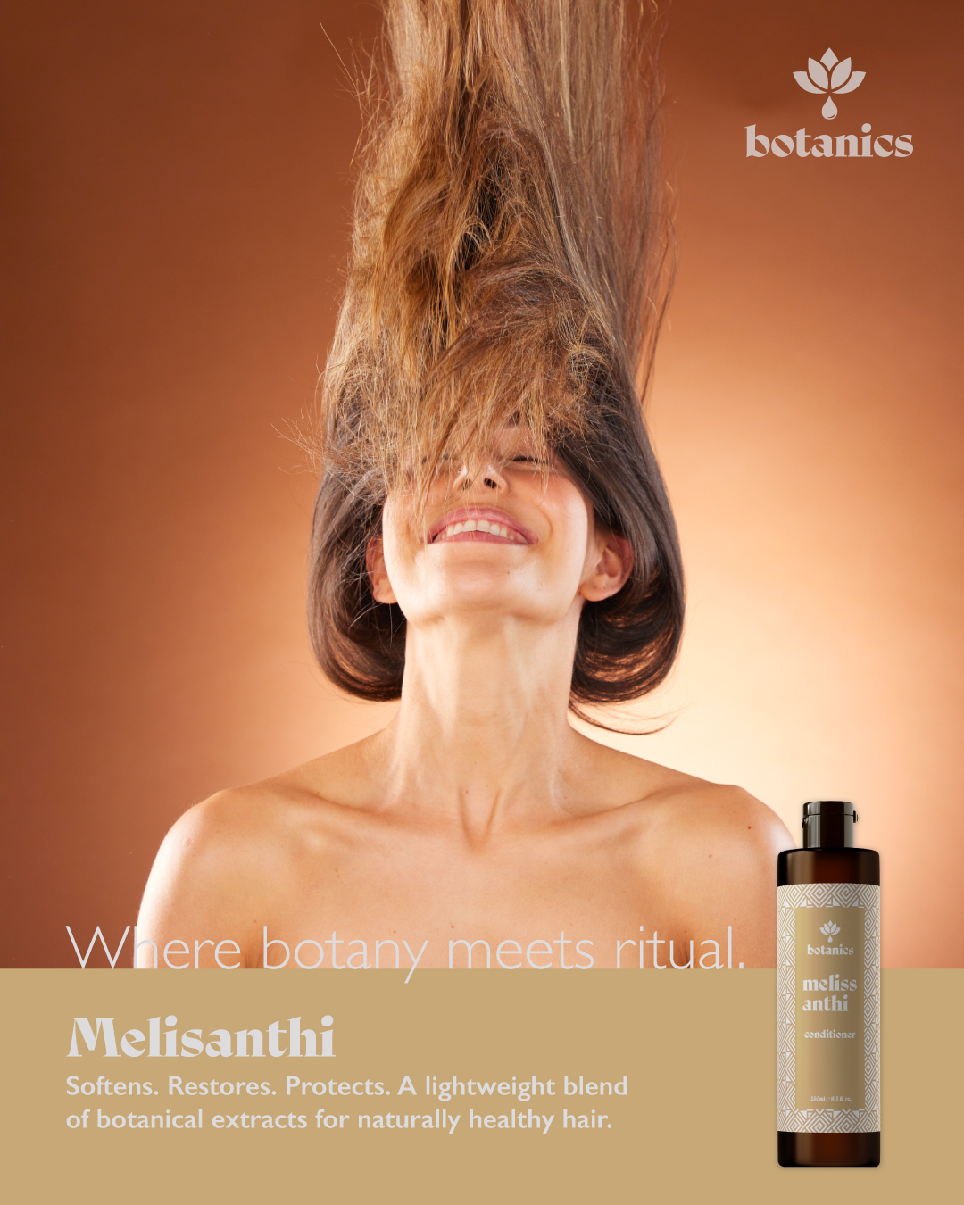
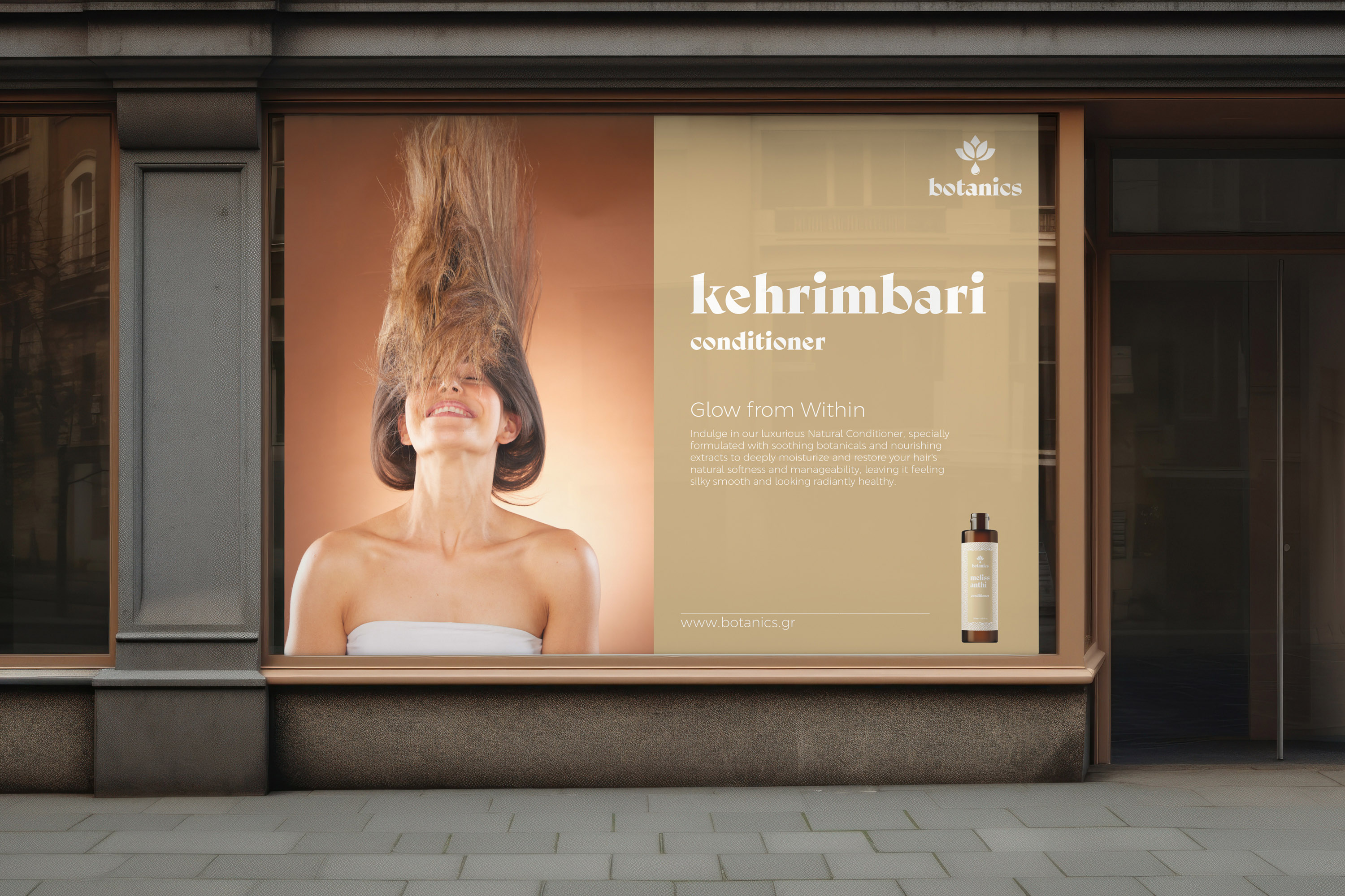
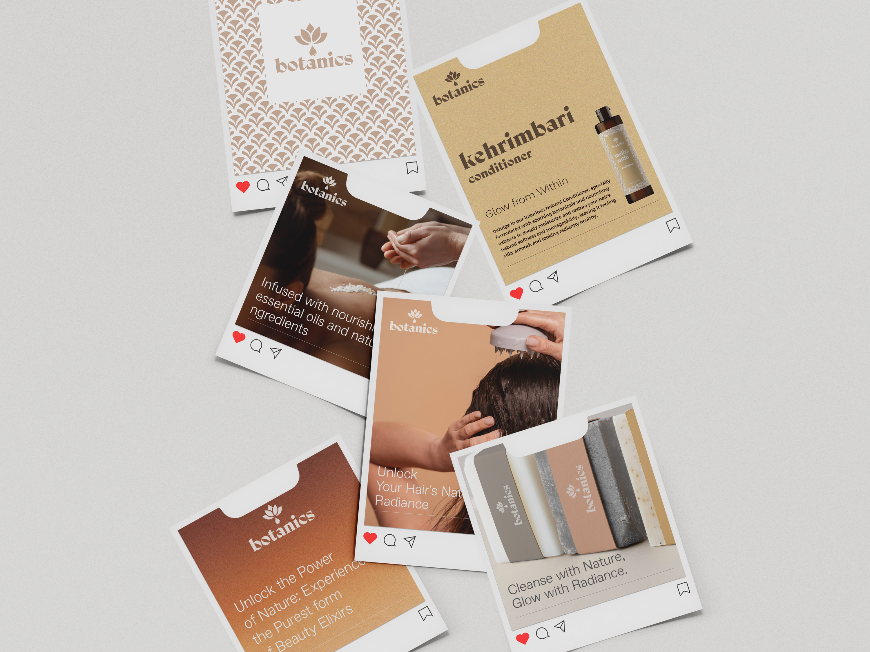
The promotional material turns the brand into a more expressive communication language. Product imagery, soft skin tones and warm colour gradients bring the campaign closer to the world of beauty and wellness. However, the visual tone avoids a clinical or generic look. Social media assets and campaign formats use the same visual elements as the packaging system. Therefore, the brand keeps a consistent voice across product promotion, seasonal communication and digital touchpoints.

A natural identity system for a complete wellness experience

The project gives Spa Botanics a complete visual identity for a natural wellness product line. Packaging, patterns, retail items, campaign material and social assets all follow the same calm and tactile design language. As a result, the brand gains a more premium and recognisable presence across physical and digital touchpoints. It feels natural, crafted and consistent, from the product shelf to social communication.

Wellness brand identity · Packaging system · Natural product line · Pattern design · Retail touchpoints · Social media assets