LH Logismiki
A clear B2B identity for a software and technology company
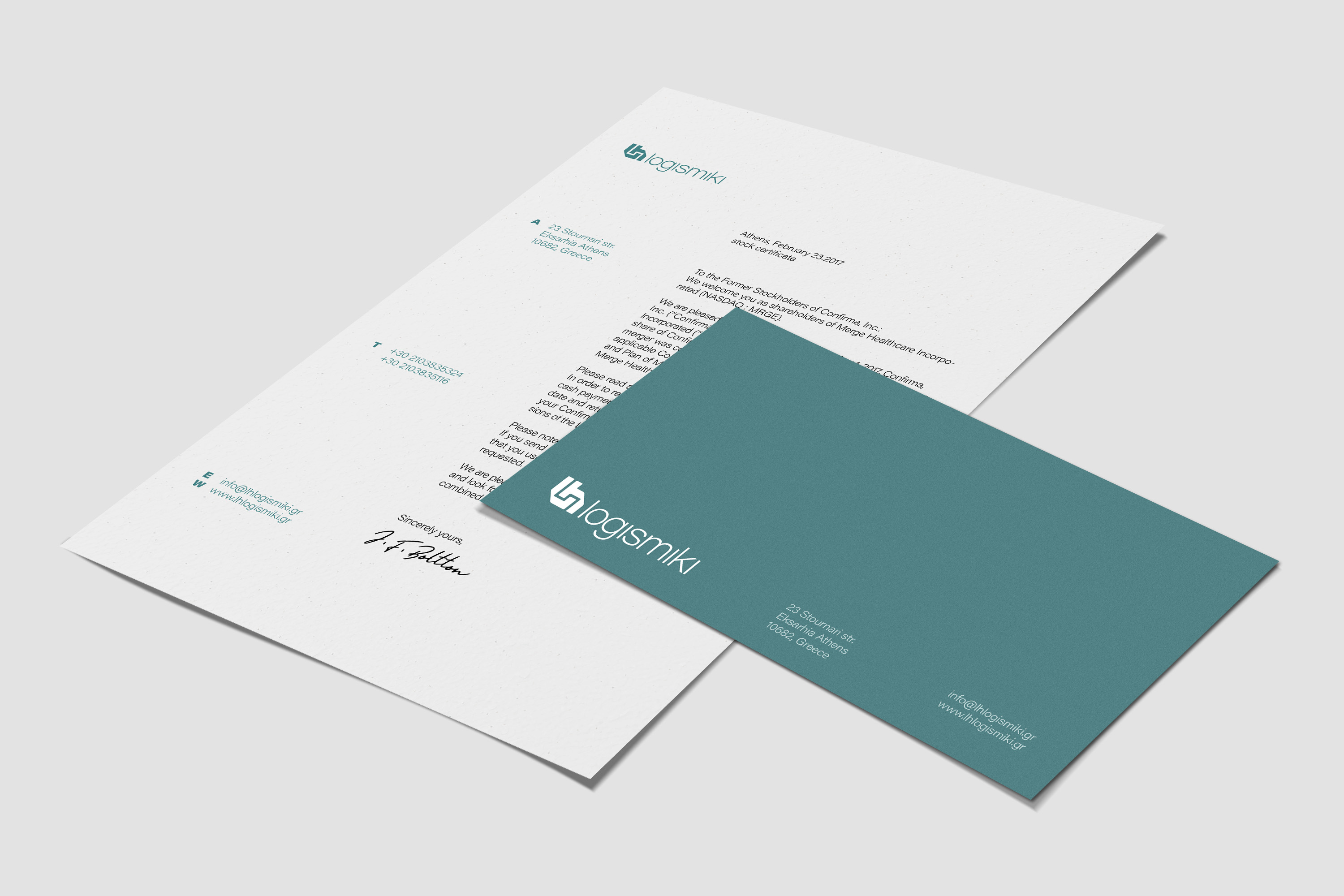
LH Logismiki needed a clear visual identity that could support its software products, corporate communication and sales materials. We developed a structured system that brings consistency across digital interfaces, product literature and presentations. The result is a professional and flexible identity designed for a technical B2B audience.
Brand Identity · B2B Communication · Software Branding · Digital Design · UI Design · Product Literature · Presentation Design · Packaging
Engineering a precise visual language for a software brand
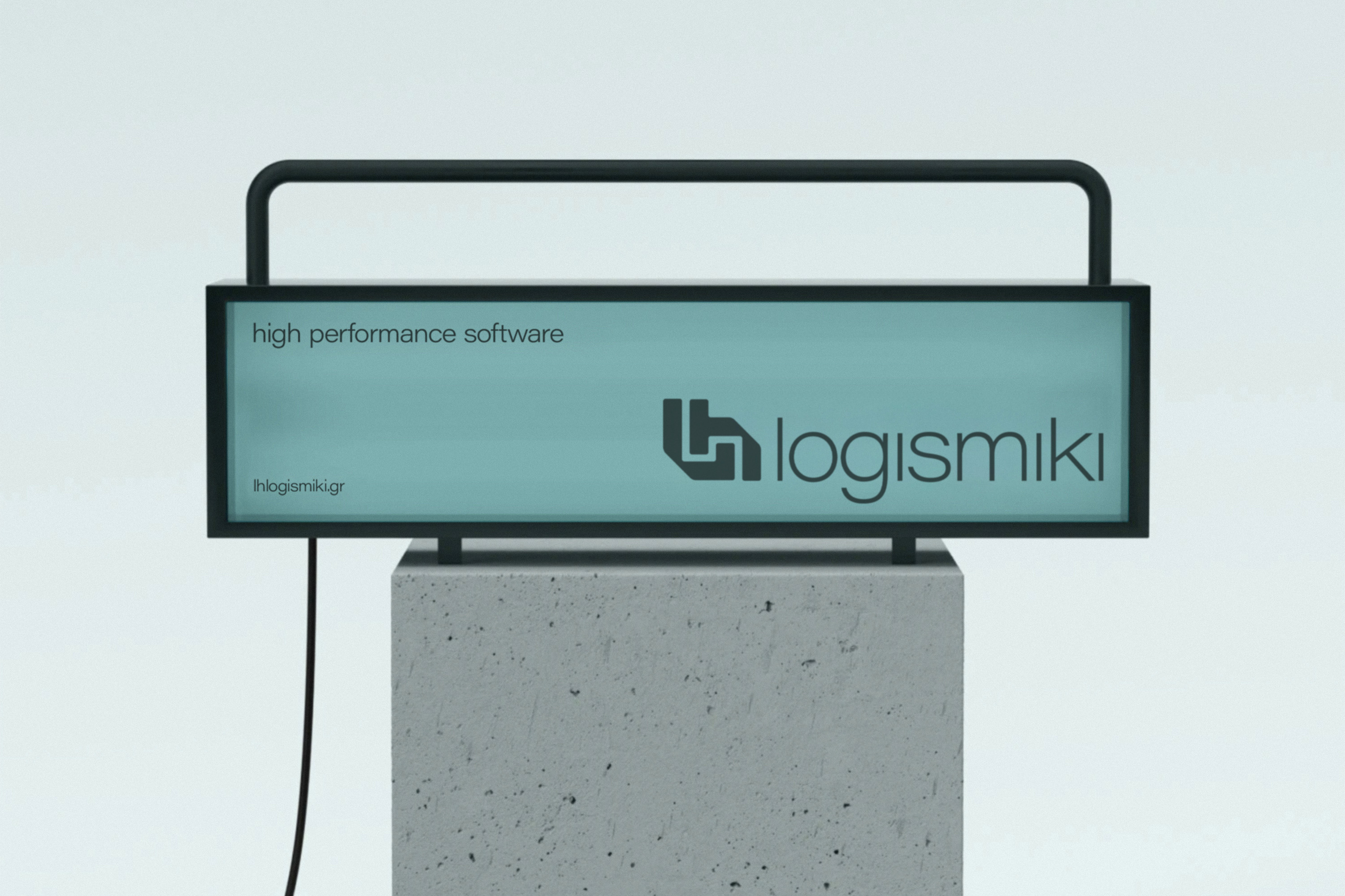
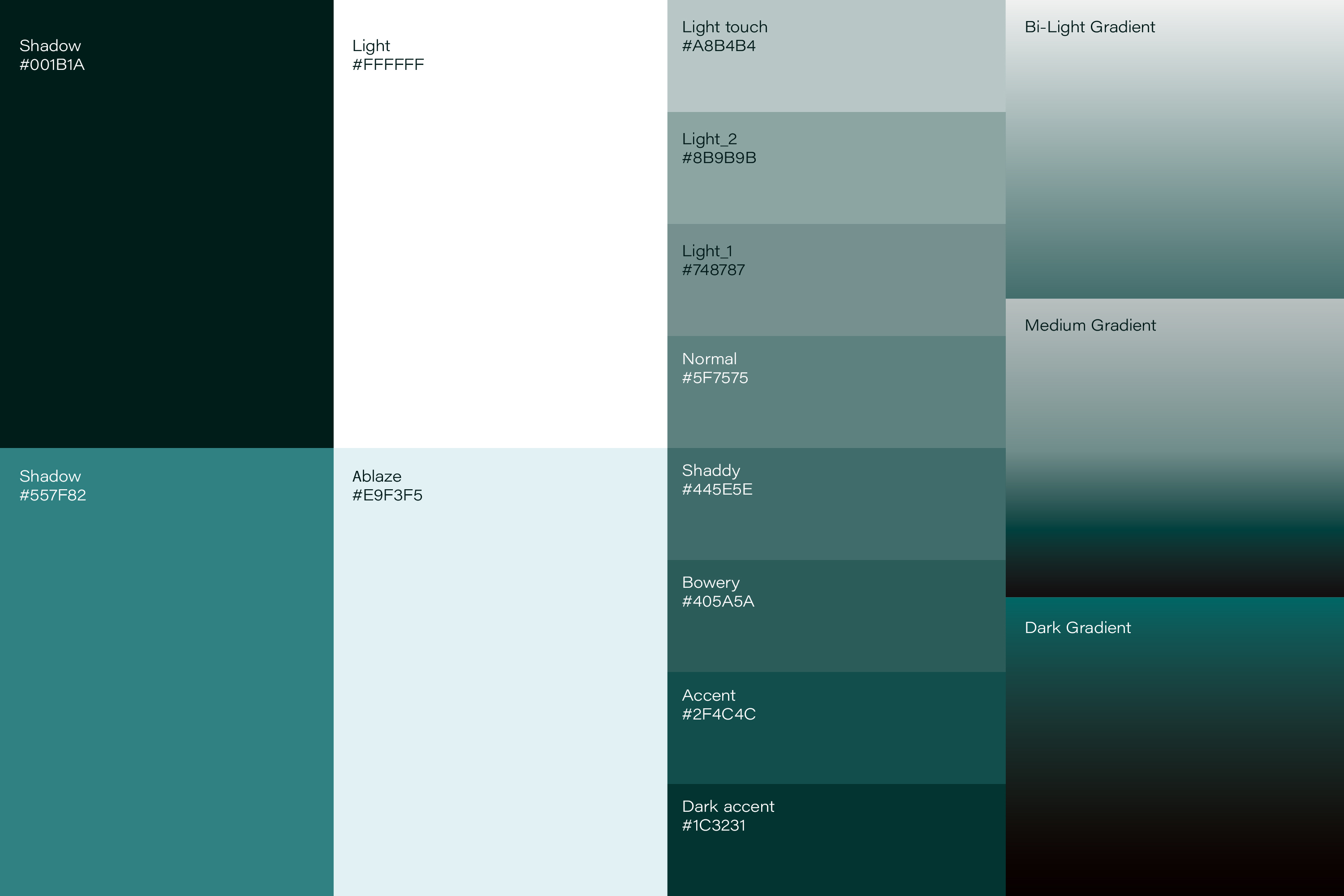
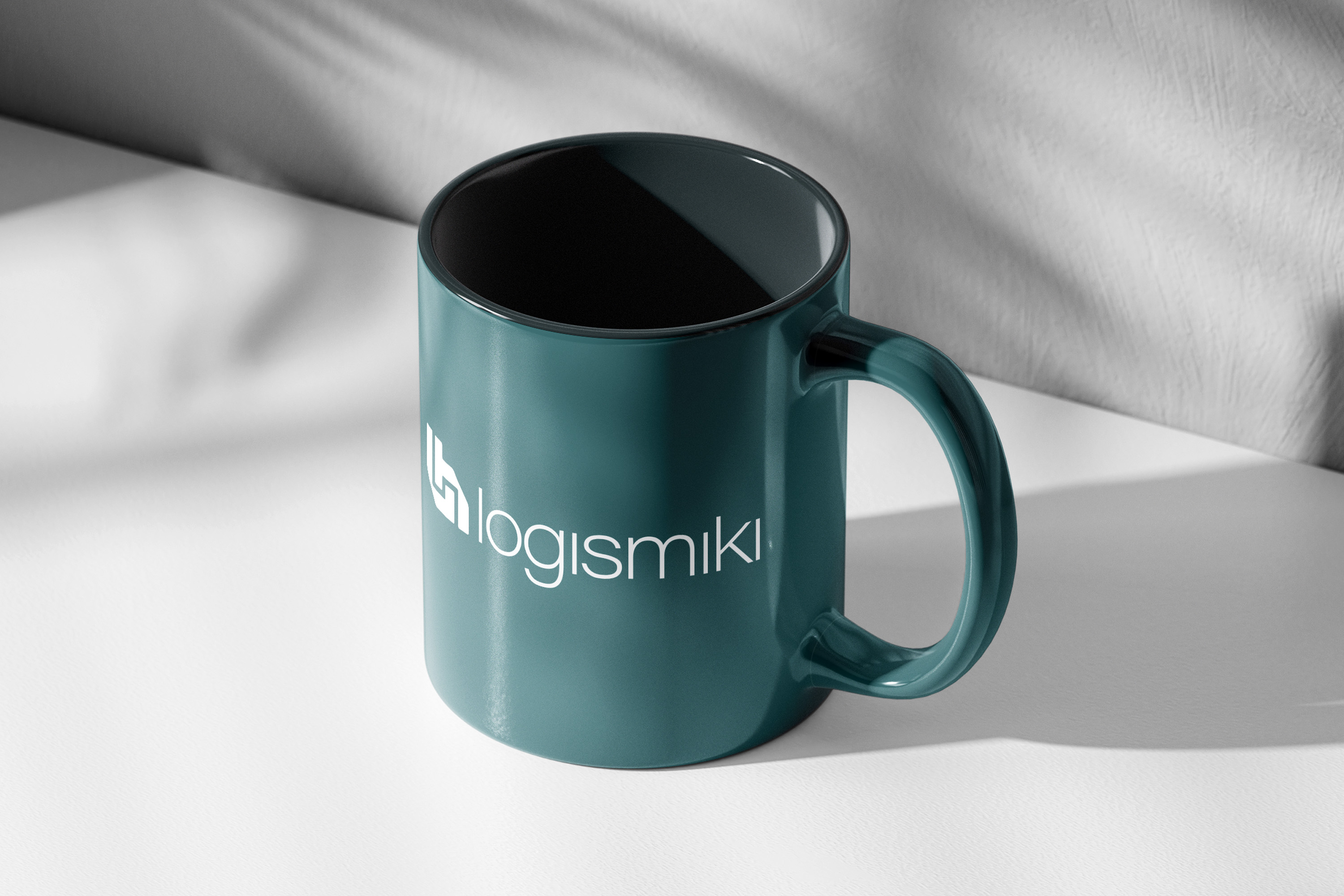
The identity was shaped to feel structured, reliable and technically fluent. A muted green-blue palette gave the brand a calm but distinctive presence, while the typography and layout system introduced a more disciplined way of organising information. Instead of relying on decorative elements, the visual language used clarity, proportion and technical restraint to reflect the company’s engineering background and make the brand easier to recognise across corporate and product-led communication.
Connecting specialised software products under one brand system
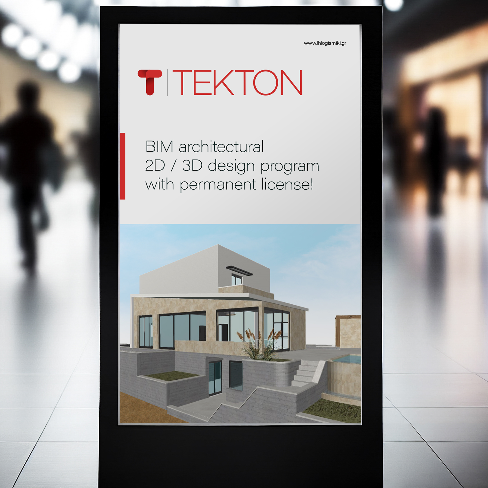
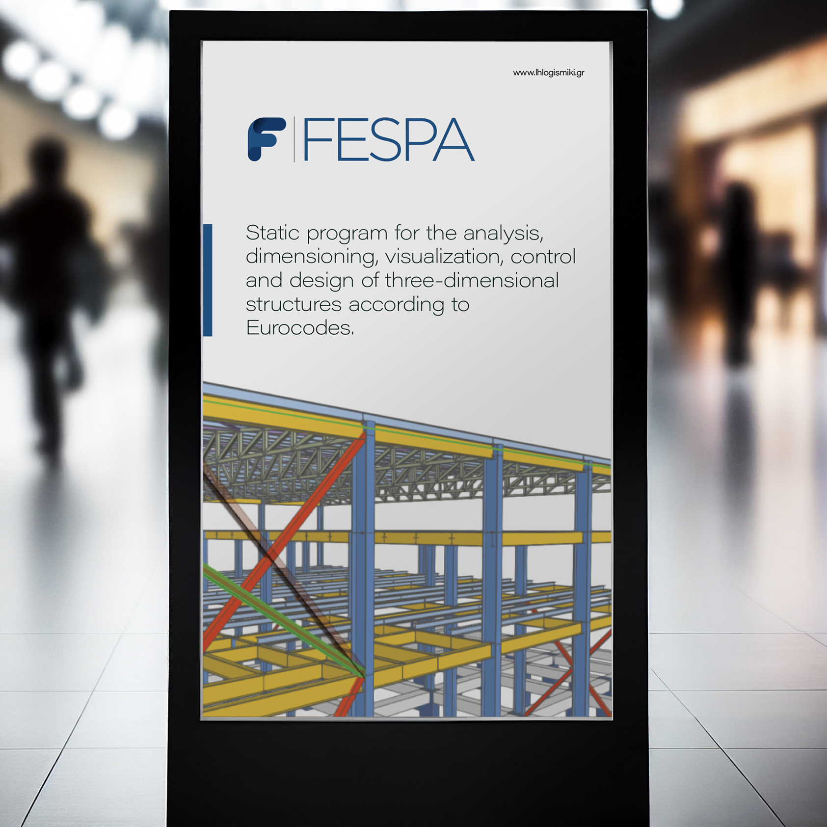
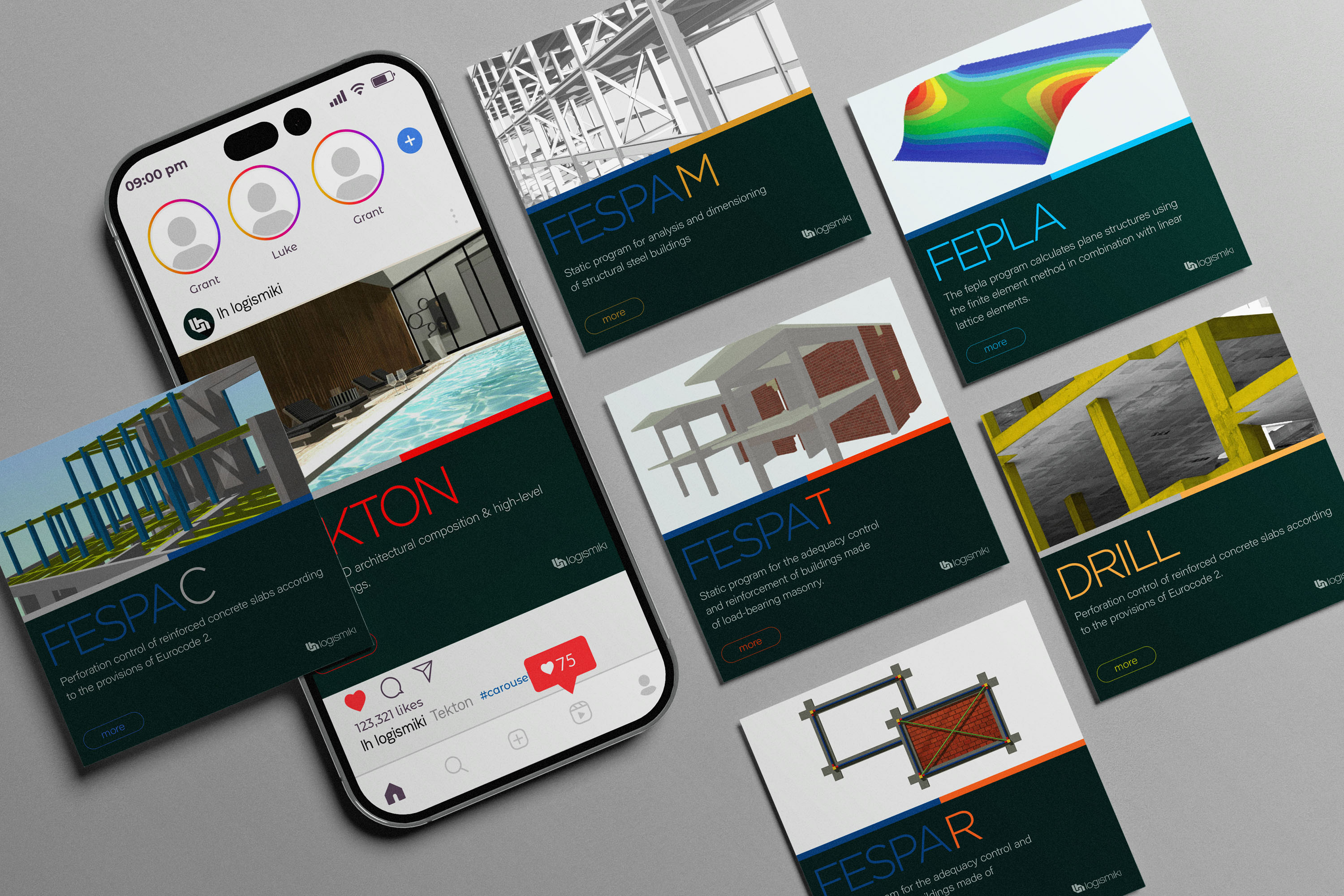
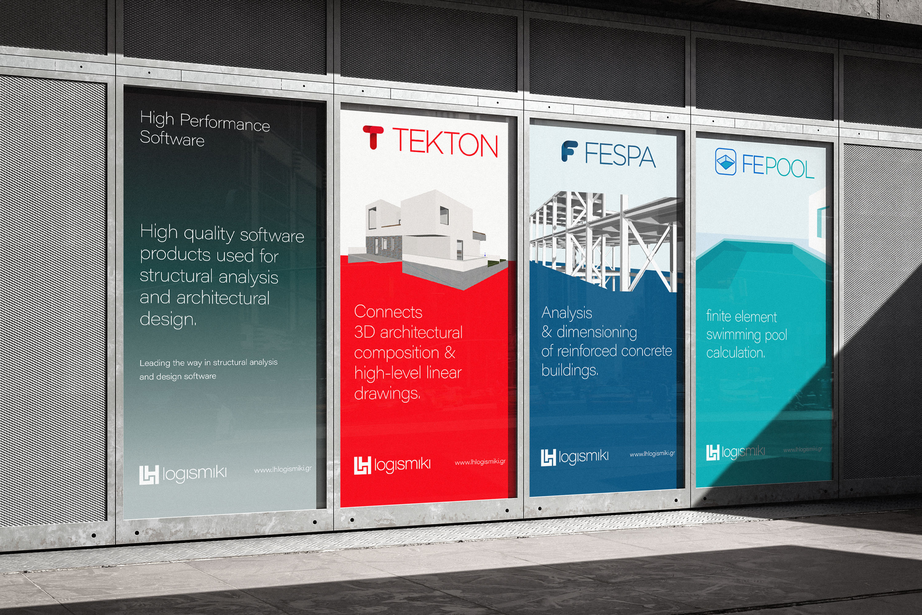
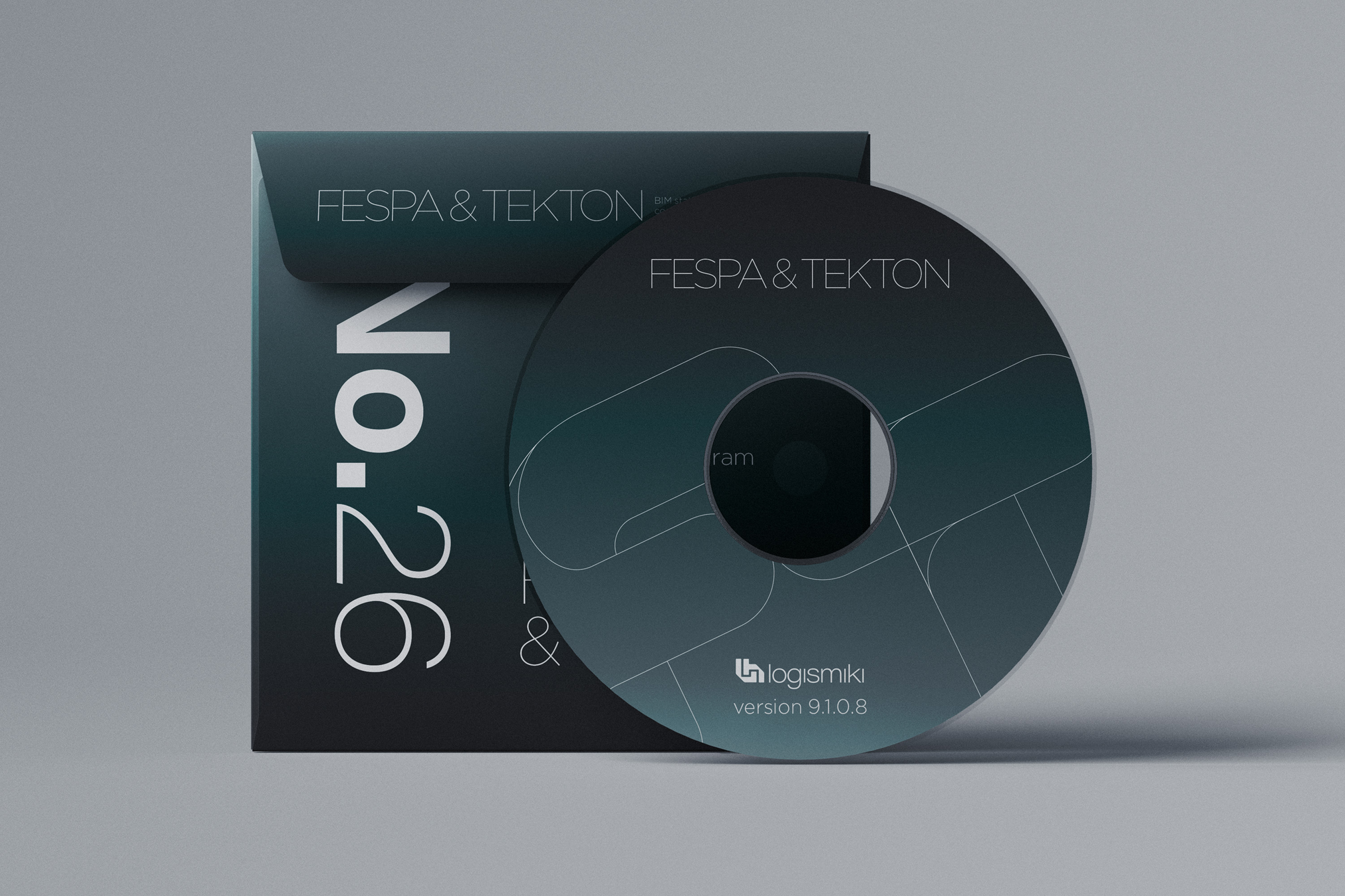
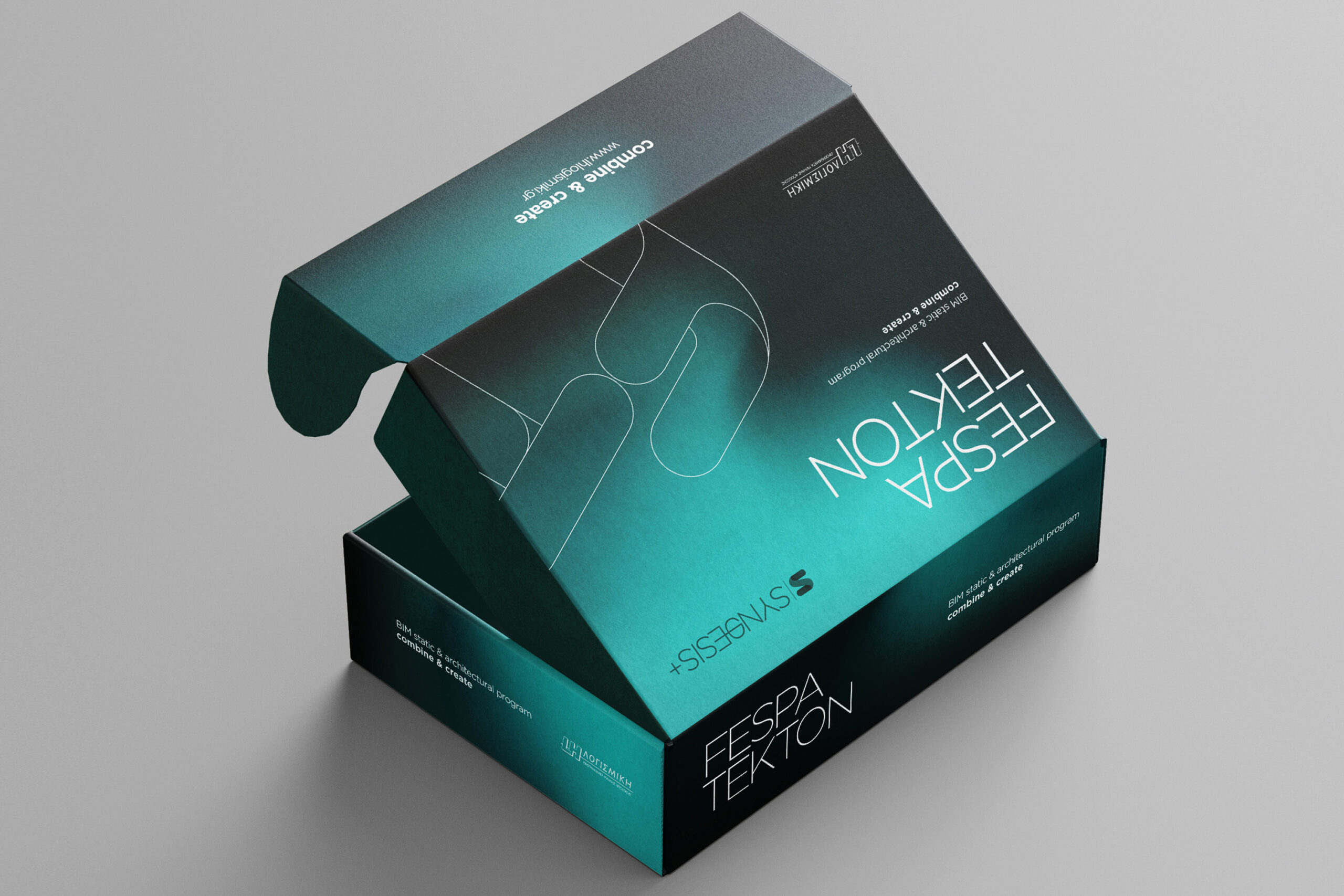
FESPA and TEKTON needed to retain their own product character while still feeling connected to LH Logismiki. The design system introduced a clearer visual relationship between the parent brand and its software solutions, using colour, layout and typography to separate product categories without fragmenting the overall identity. This helped each product communicate its own purpose while remaining part of a broader engineering software ecosystem.
Creating a clearer digital experience for engineering software
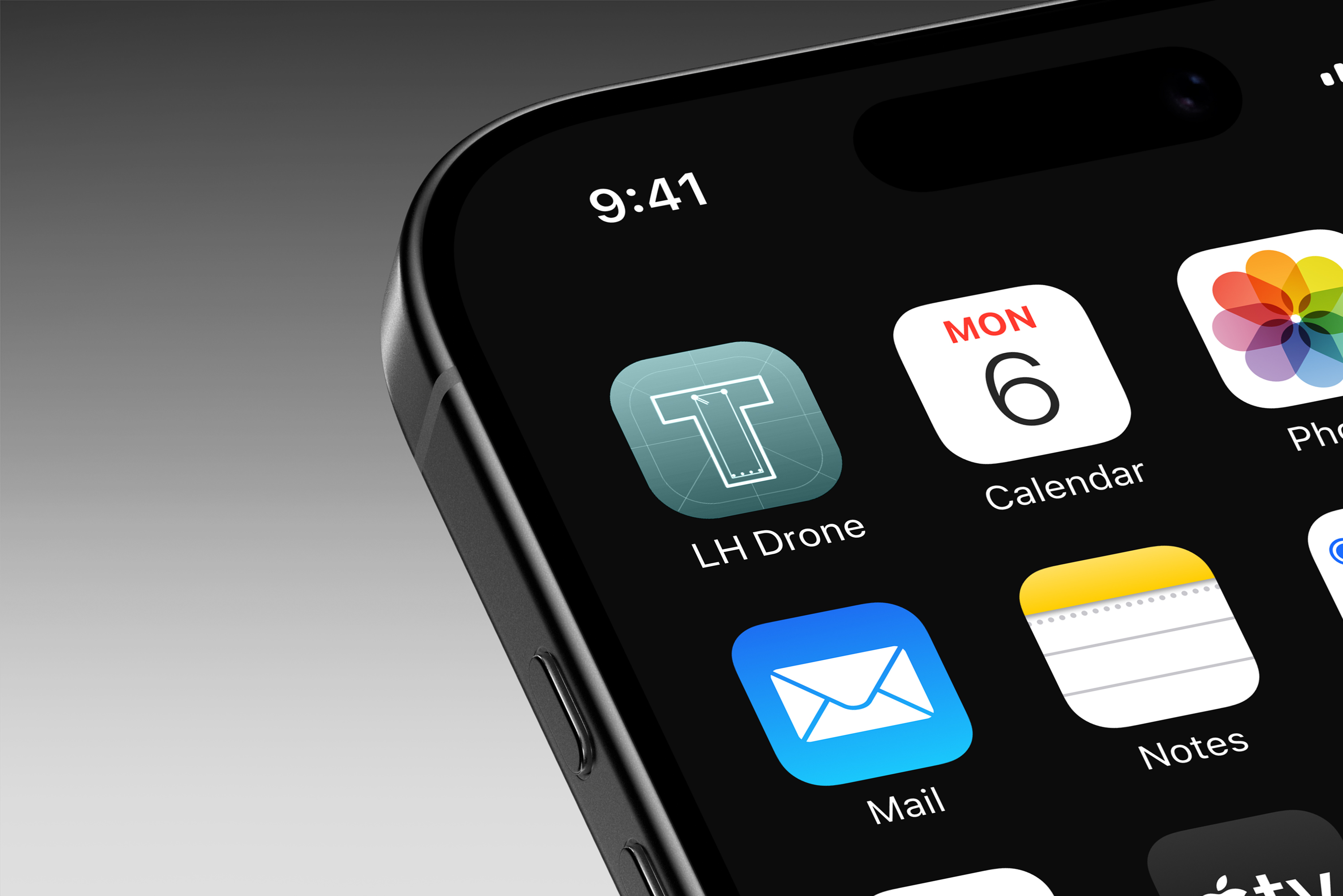
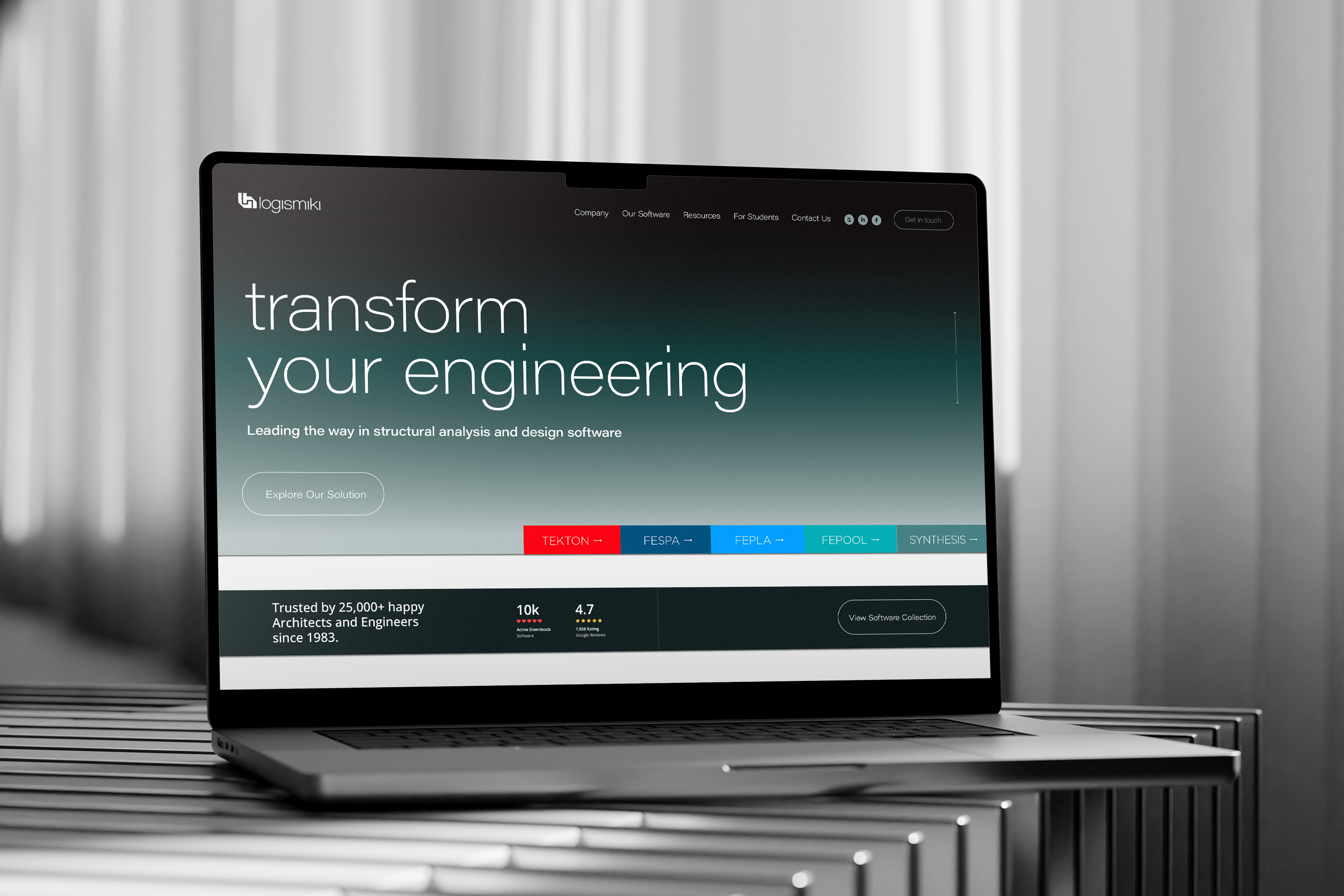
The digital touchpoints focused on making complex technical information easier to navigate. Website layouts, mobile screens and interface elements used the new identity in a more functional way, supporting product discovery, service communication and everyday user interaction. The aim was to create a digital presence that felt professional and technically credible, while allowing engineers, clients and partners to access information with less friction.
Presenting technical expertise with clarity and confidence
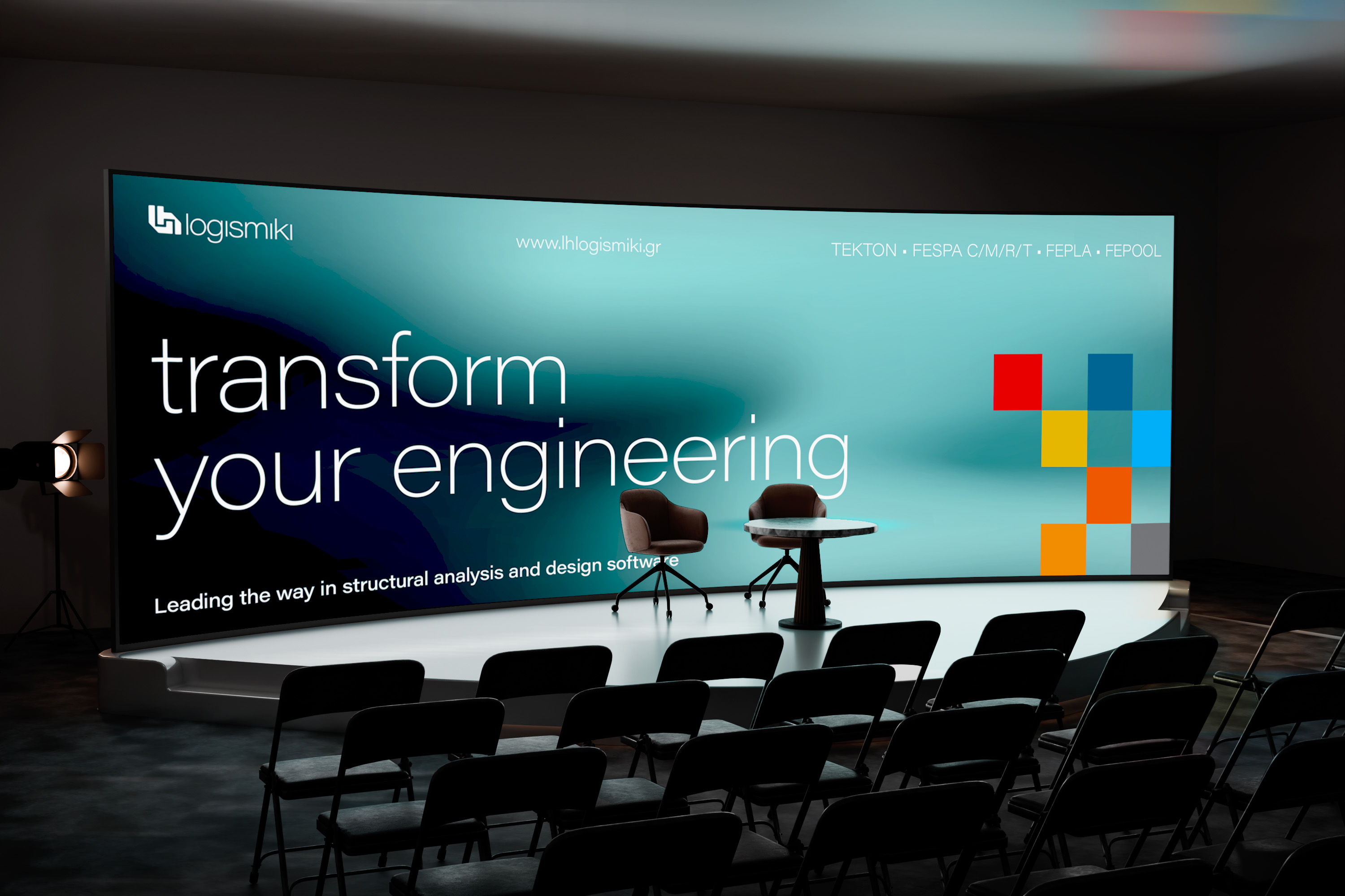
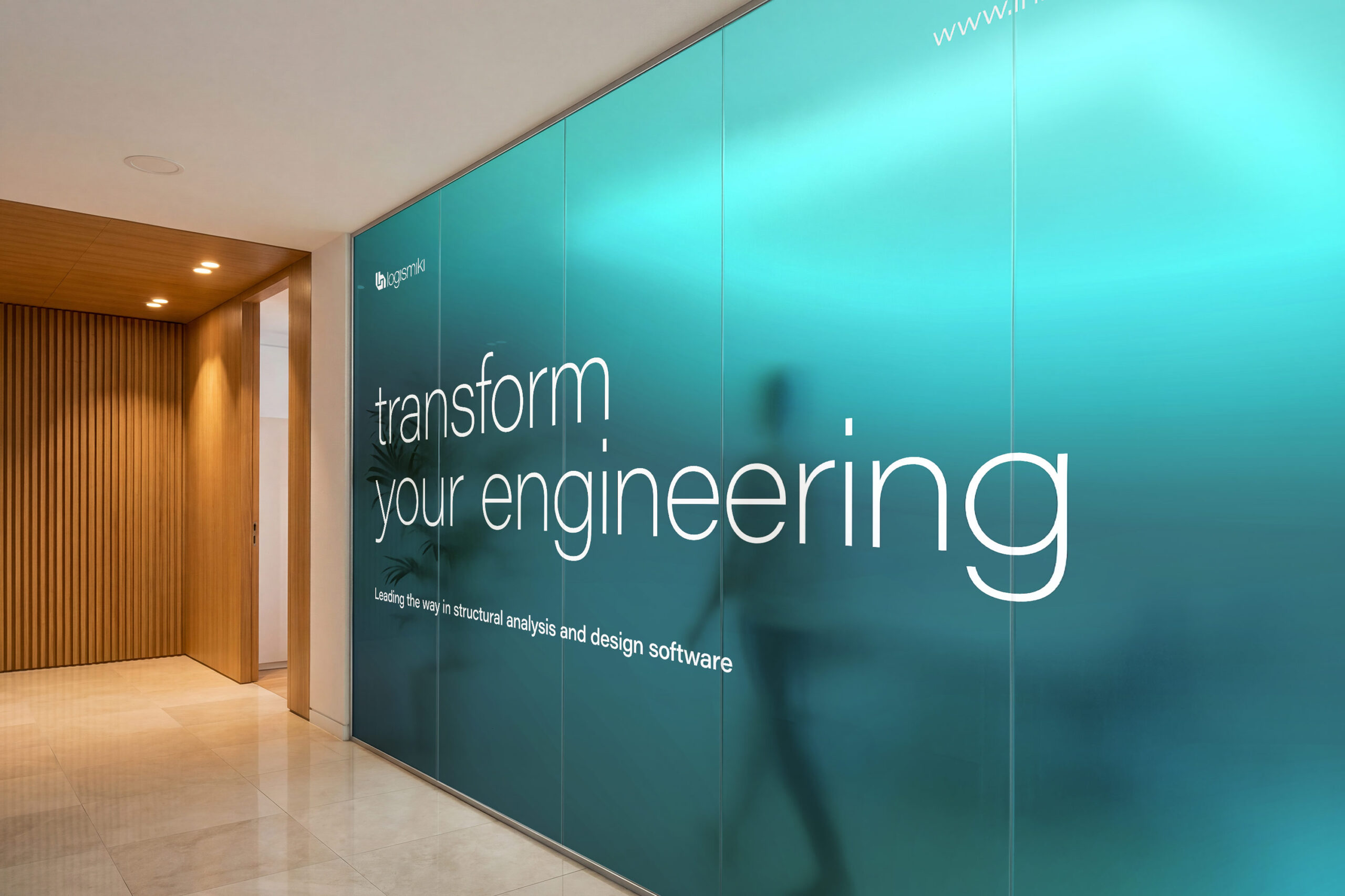
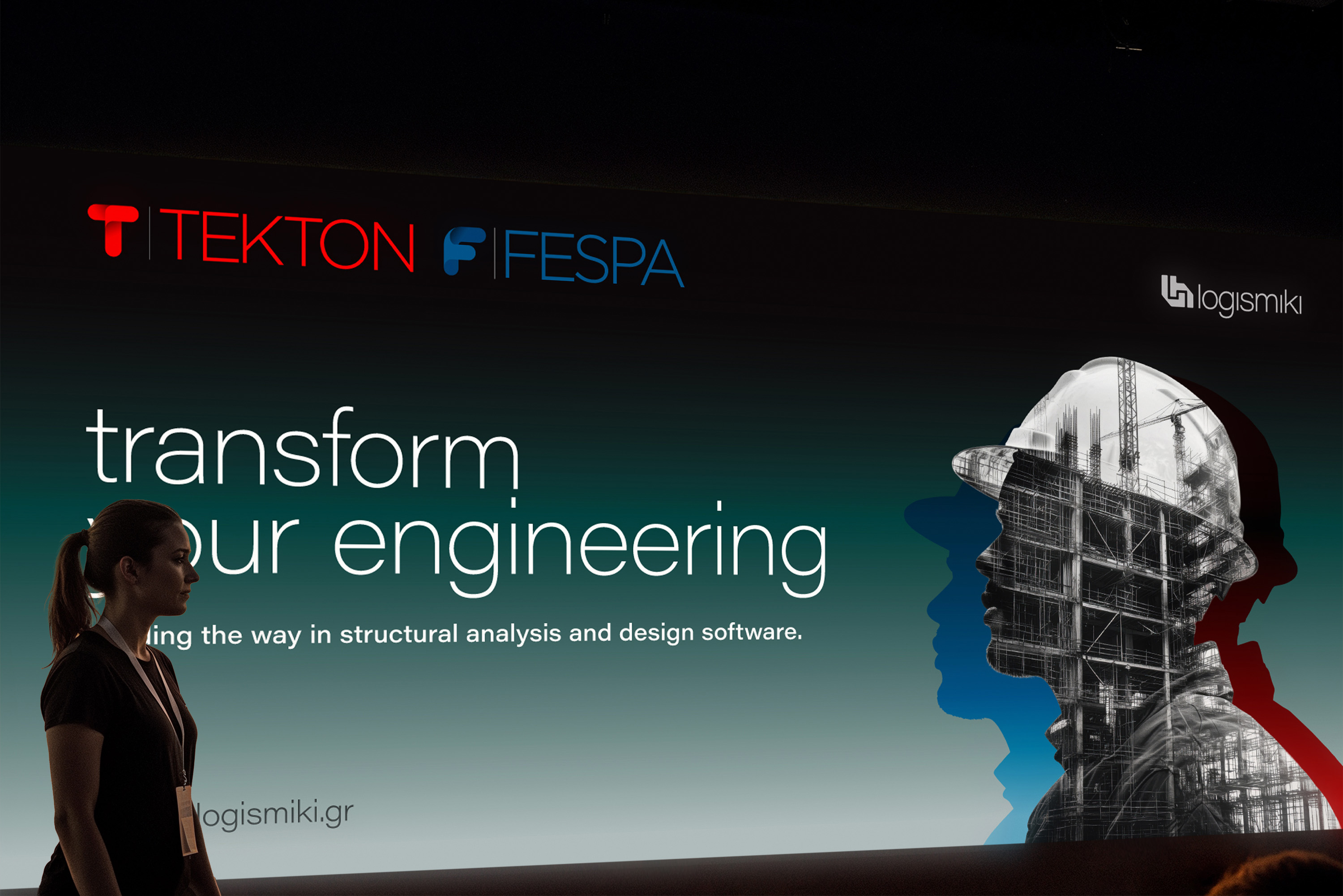
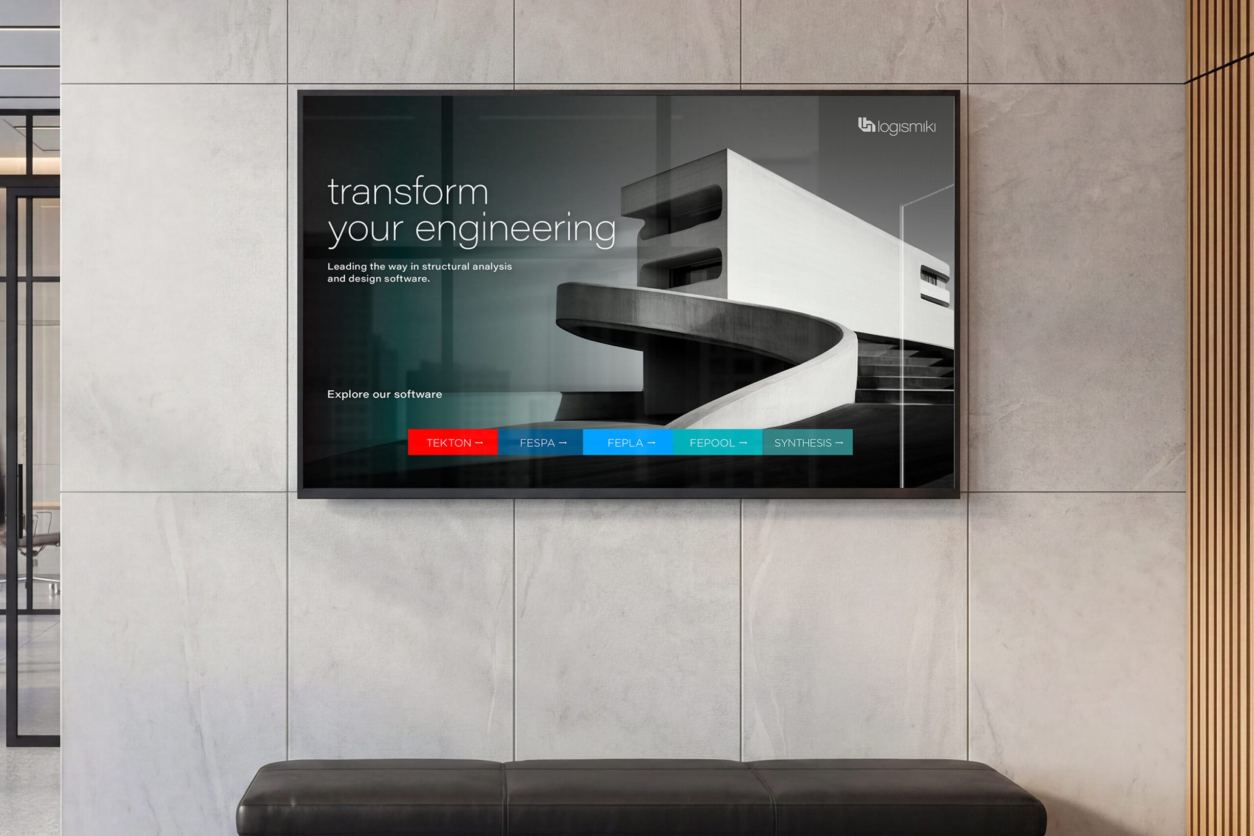
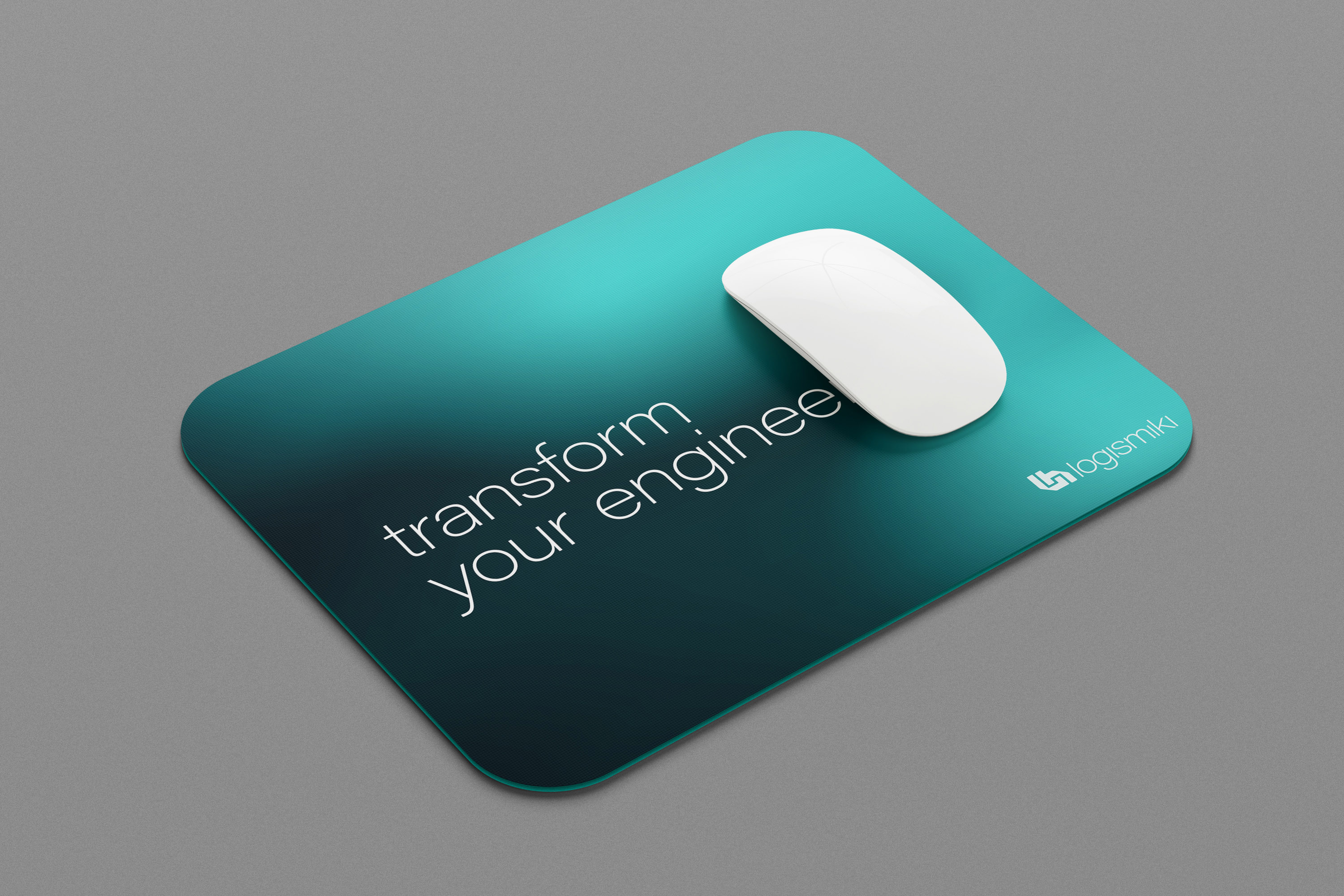
Beyond the core identity, the brand needed to work in situations where the company presented its expertise to clients, partners and professional audiences. Presentation screens, event graphics and sales-oriented material translated the visual system into a more persuasive communication style. The message “transform your engineering” gave the brand a forward-looking voice, positioning LH Logismiki not only as a software provider, but as a partner in modernising engineering workflows.
Organising product information into practical brand tools
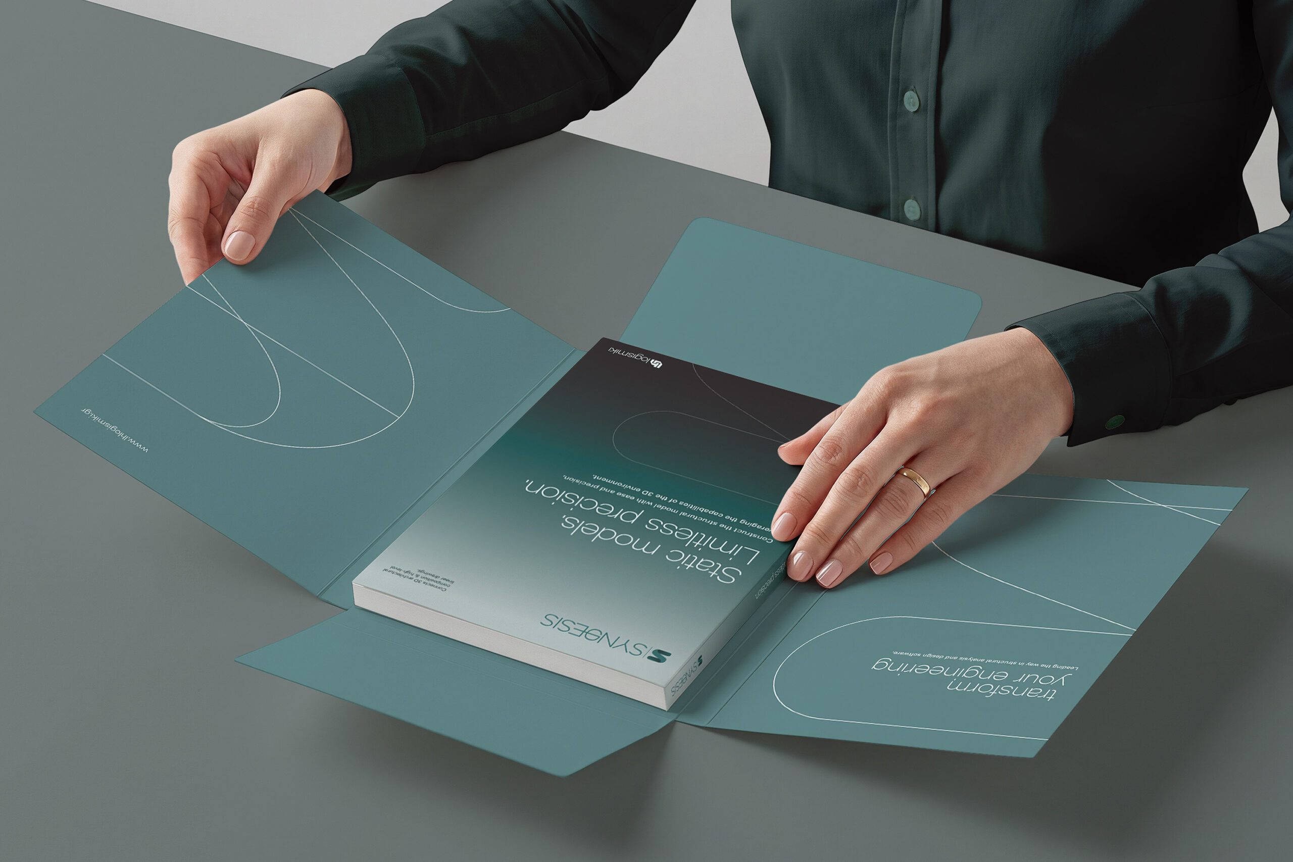
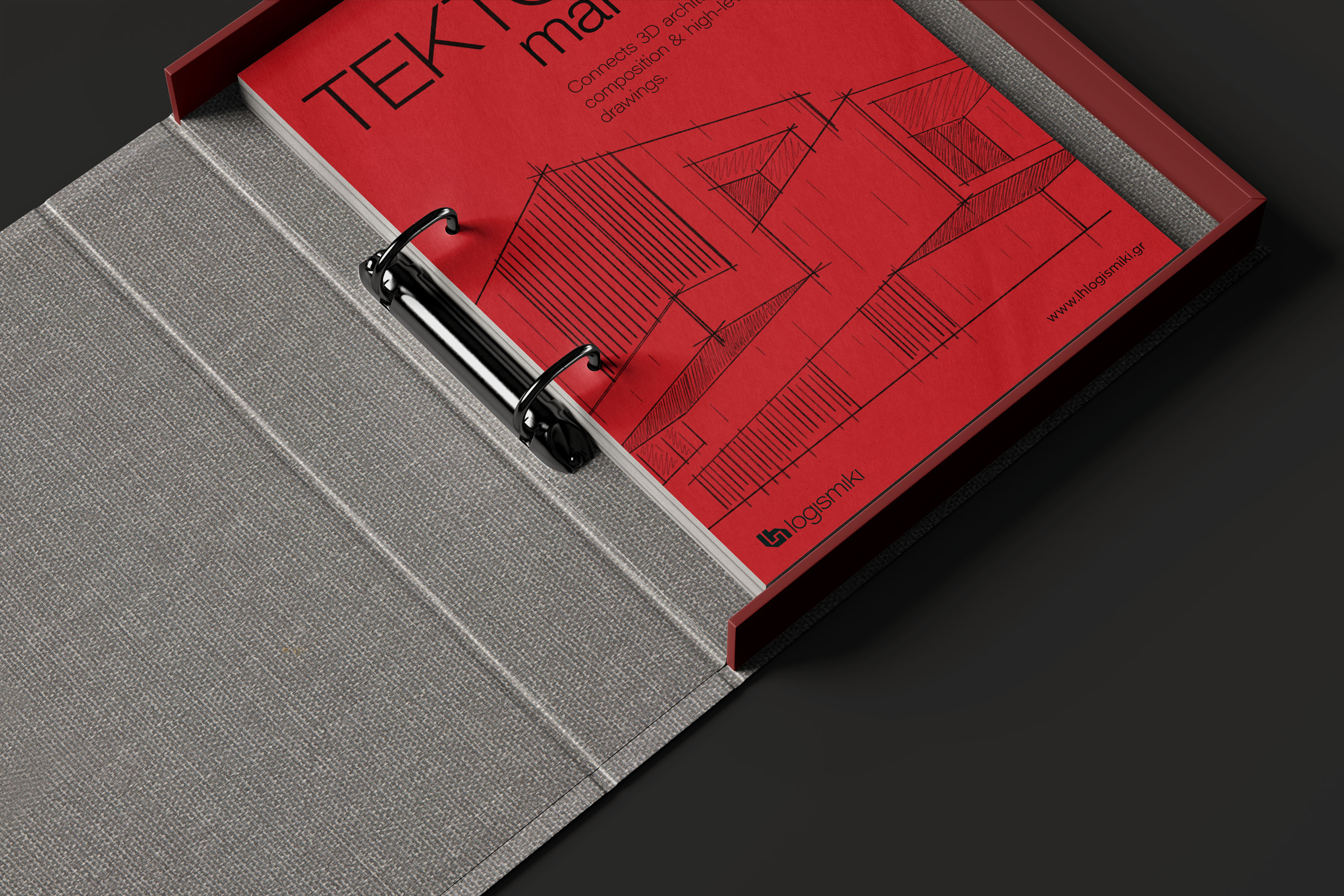
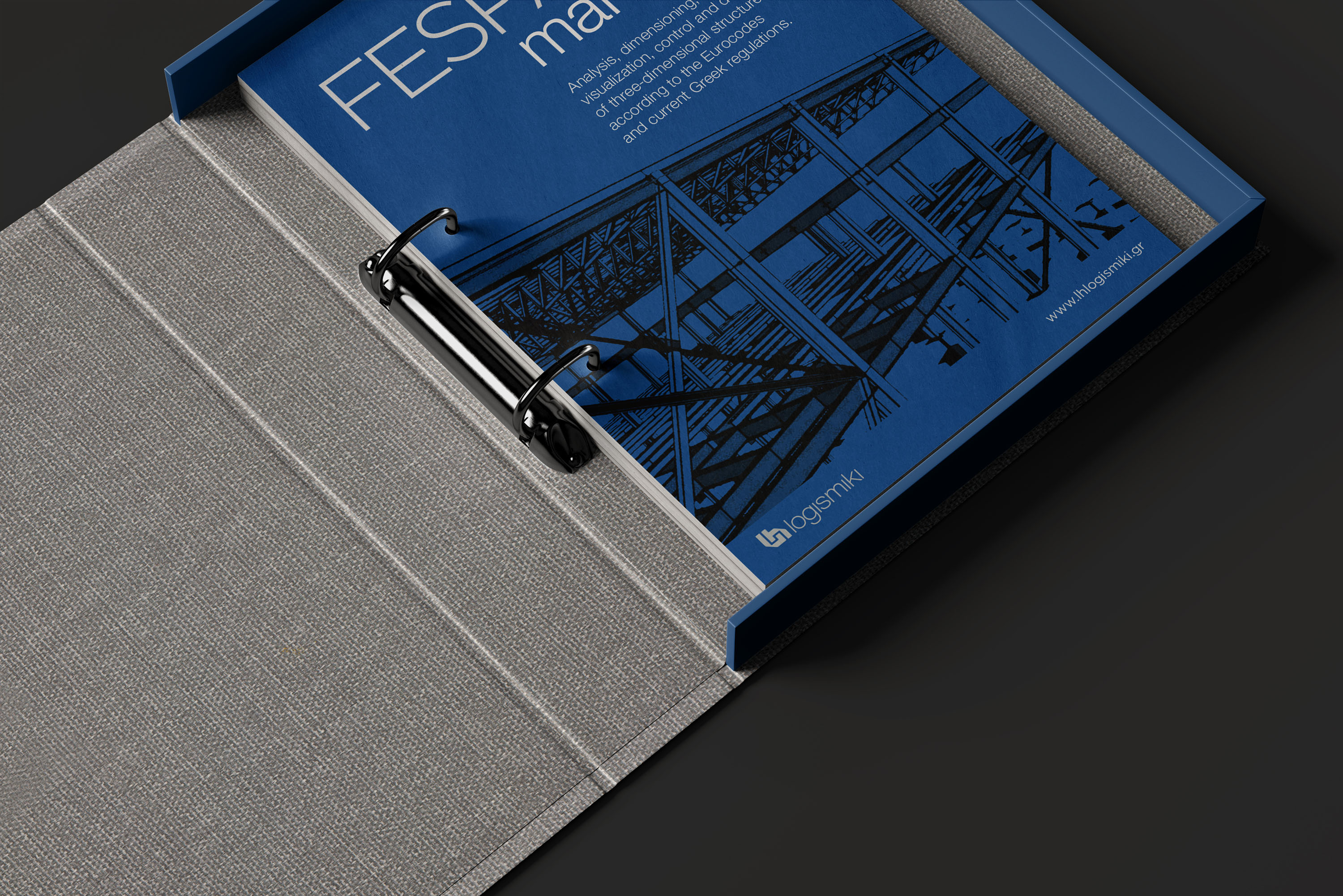
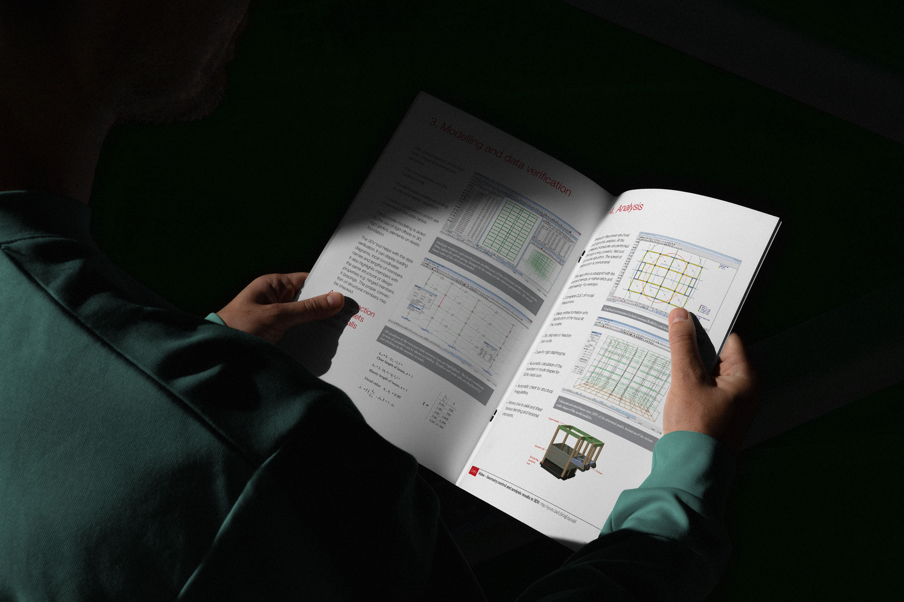
Printed literature played a practical, hands-on role in explaining specialised software products and supporting everyday sales conversations. Brochures, binders, folders and product packaging were designed as tools for presenting technical content in a clearer, more structured and approachable way. The layouts carefully balanced product detail with visual consistency, helping the company communicate complex information clearly without losing the coherence of the wider brand.
A clearer brand platform for engineering software communication
The project gave LH Logismiki a more coherent visual platform for its corporate identity, software products and communication tools. By connecting the parent brand with FESPA and TEKTON through a shared design language, the system made the company’s offering easier to understand across digital, printed, presentation and sales environments. The result was a more professional and recognisable example of engineering software branding for a technical company operating in a specialised market.
Engineering software · Brand identity · Product architecture · Digital design · UI design · Sales material · Presentation design · Print communication