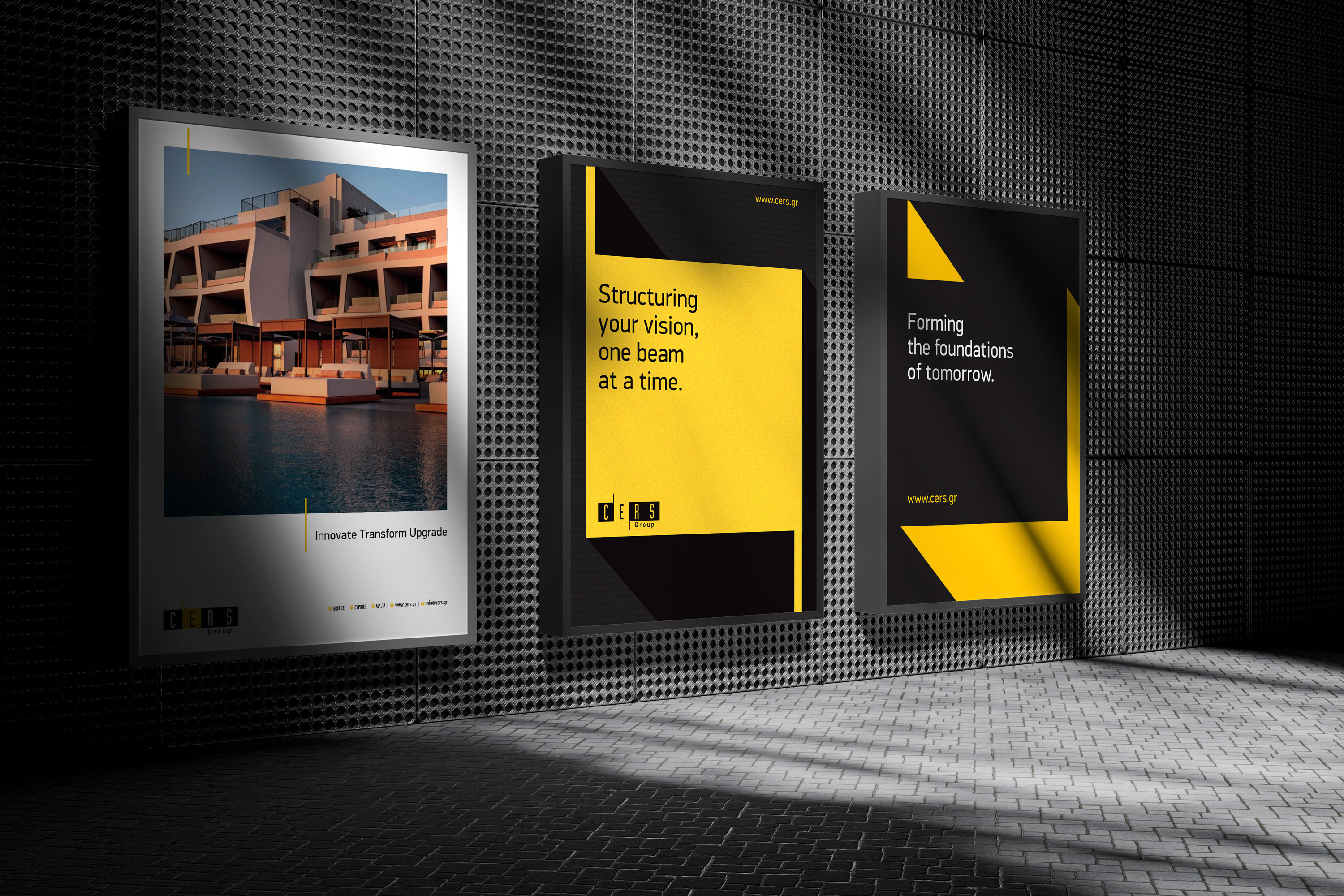
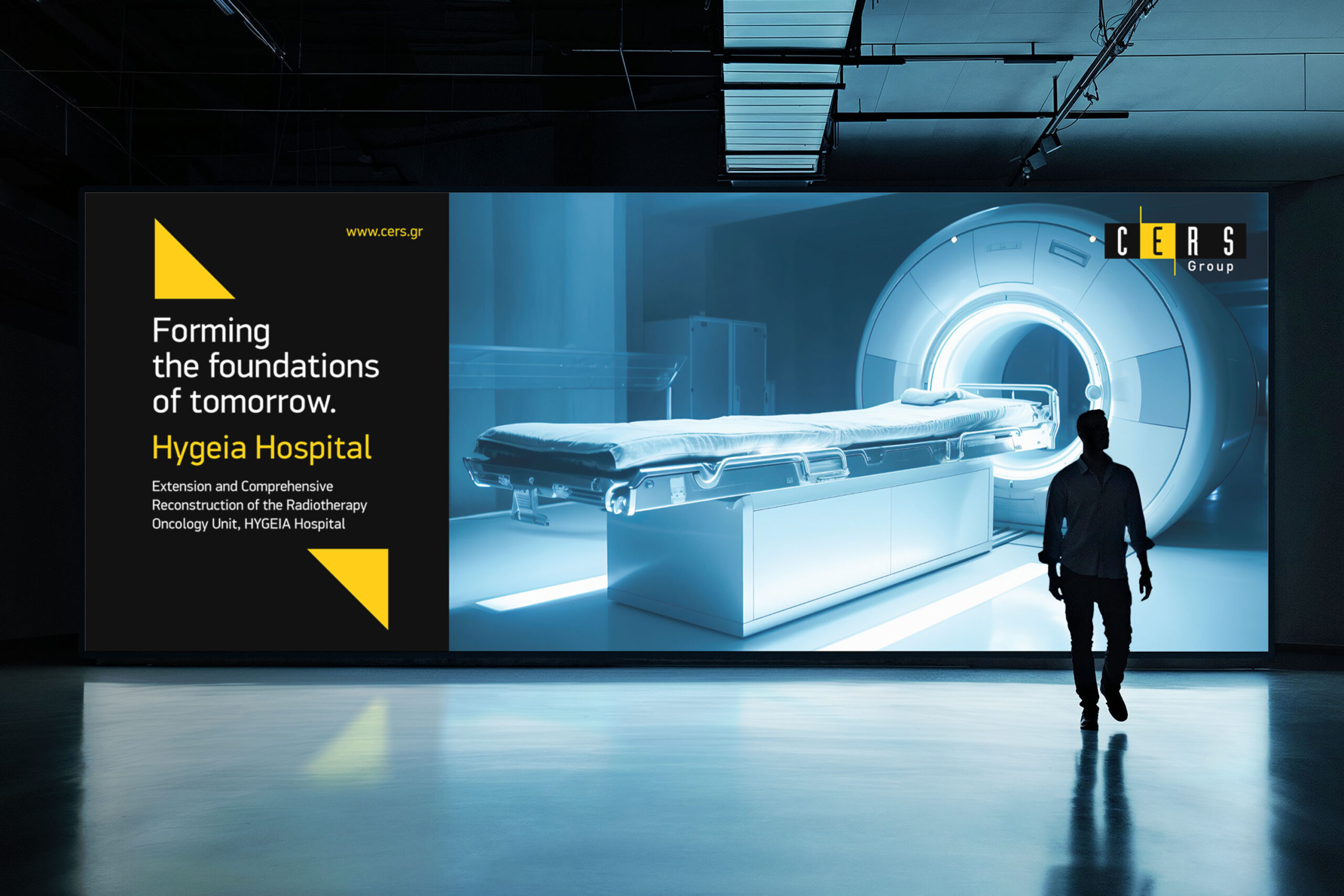
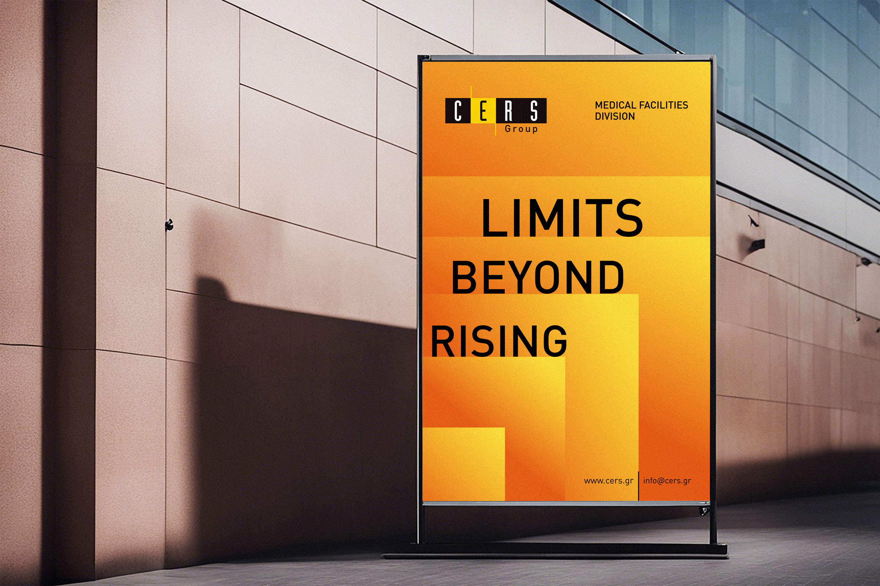
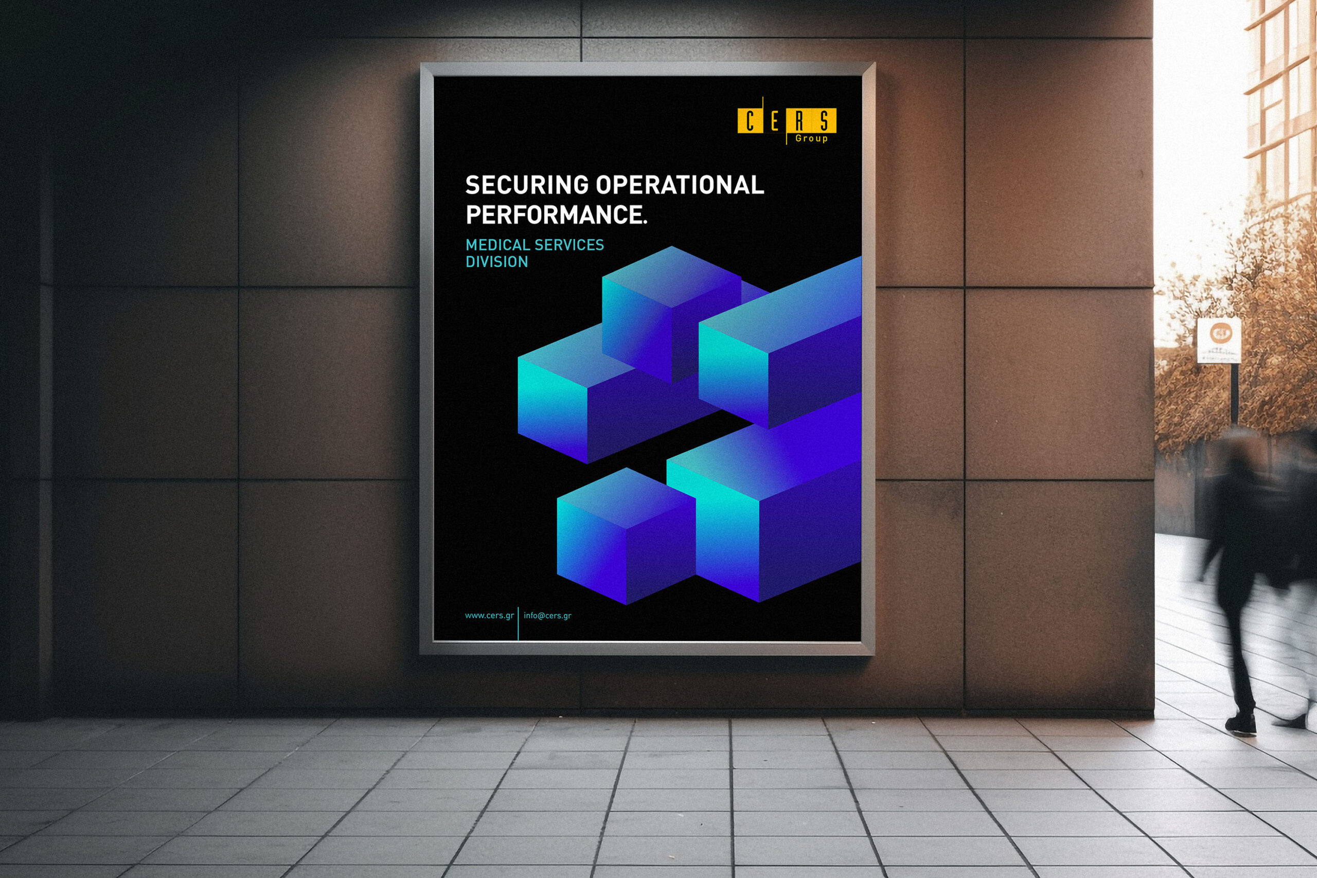
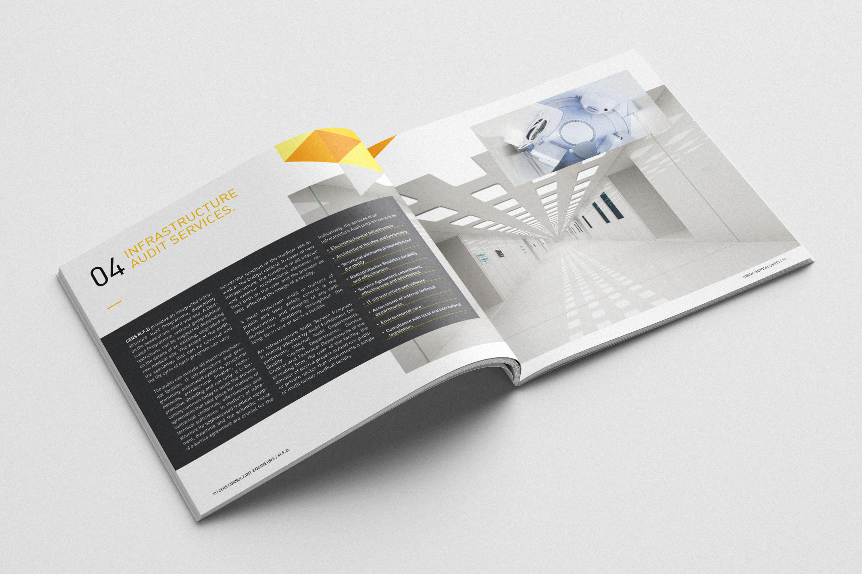
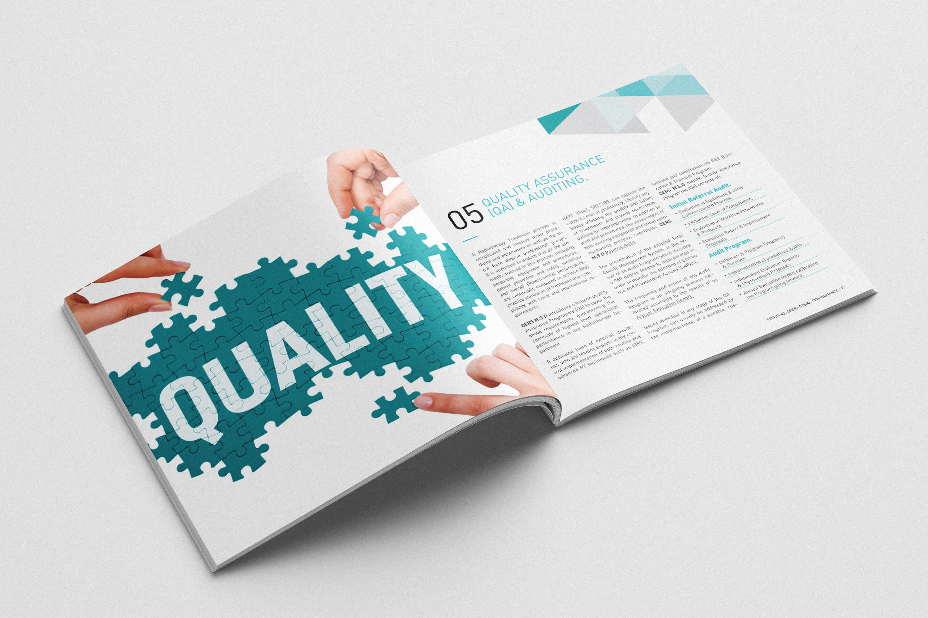
CERS Group promotional posters in subway corridors.

CERS Group

A scalable identity system built to create clarity and consistency across corporate, digital and physical touchpoints

CERS Group needed a visual language that could unify a wide range of communications without becoming rigid. The identity was developed as a practical system—combining strong recognition with enough flexibility to work across campaigns, editorial design, digital platforms, workwear and environmental applications.

Creative Direction · Brand Identity · Visual Systems · Campaign Design · Editorial · Digital · Environmental

Project Snapshot

CERS Group commissioned the development of a complete visual identity system designed to work consistently across corporate communication, campaigns, editorial materials, digital platforms and physical environments. As Creative Director and Art Director, I led the project from concept and identity development through to implementation across multiple brand touchpoints.

Key Deliverables

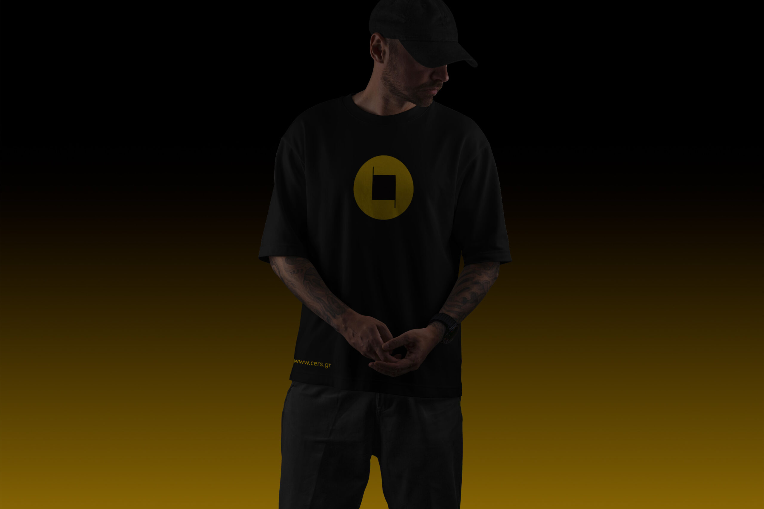
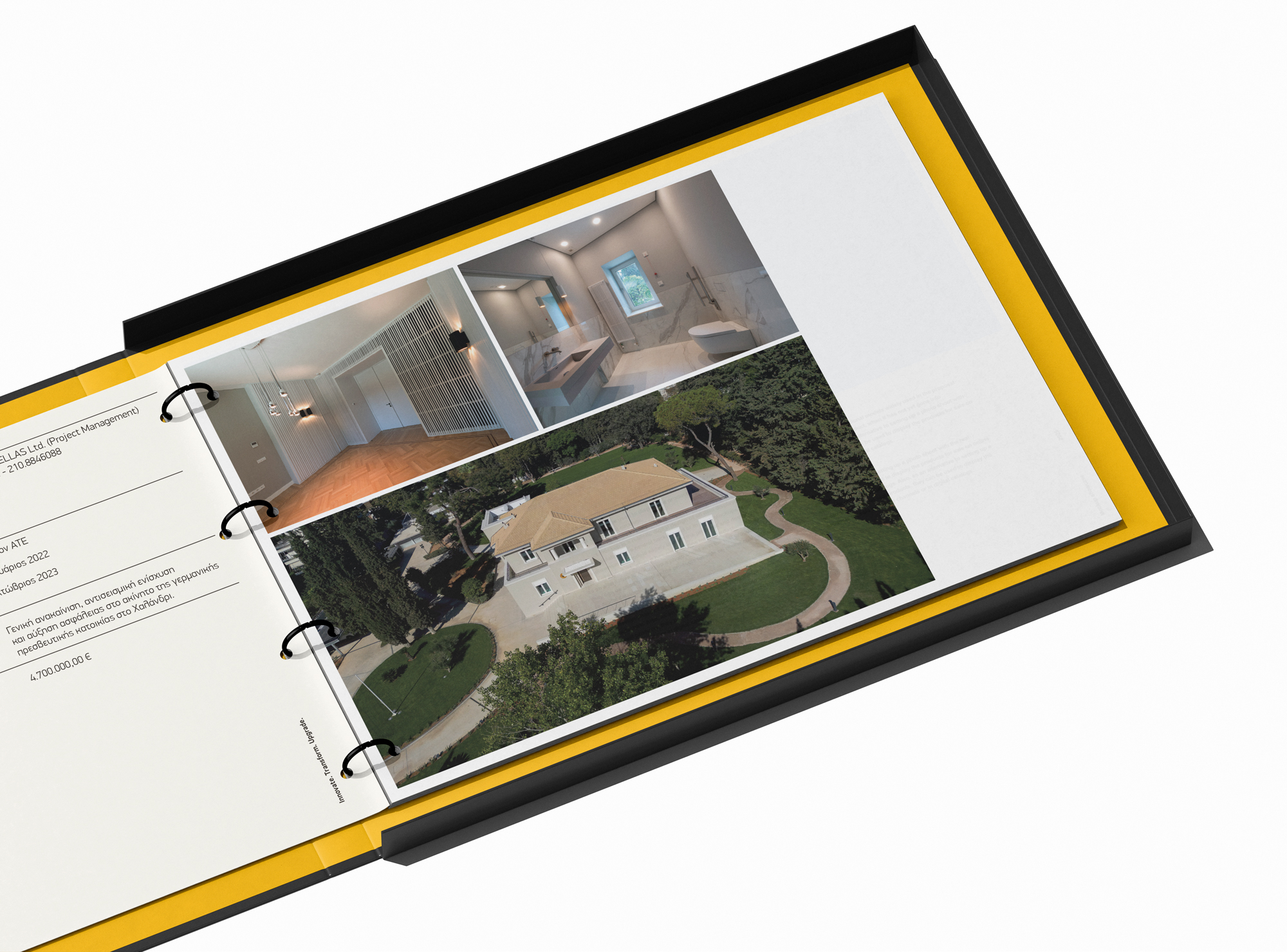
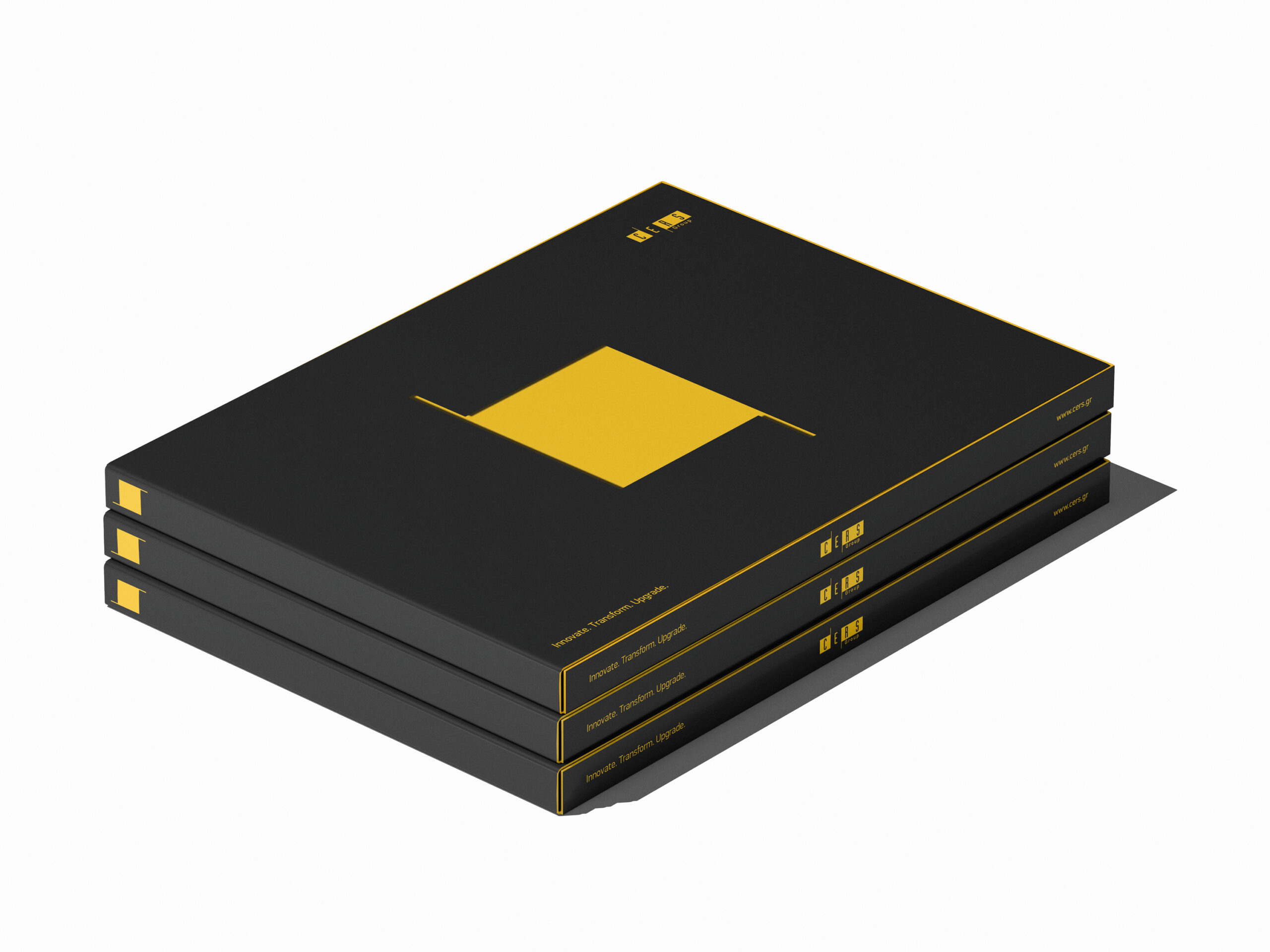
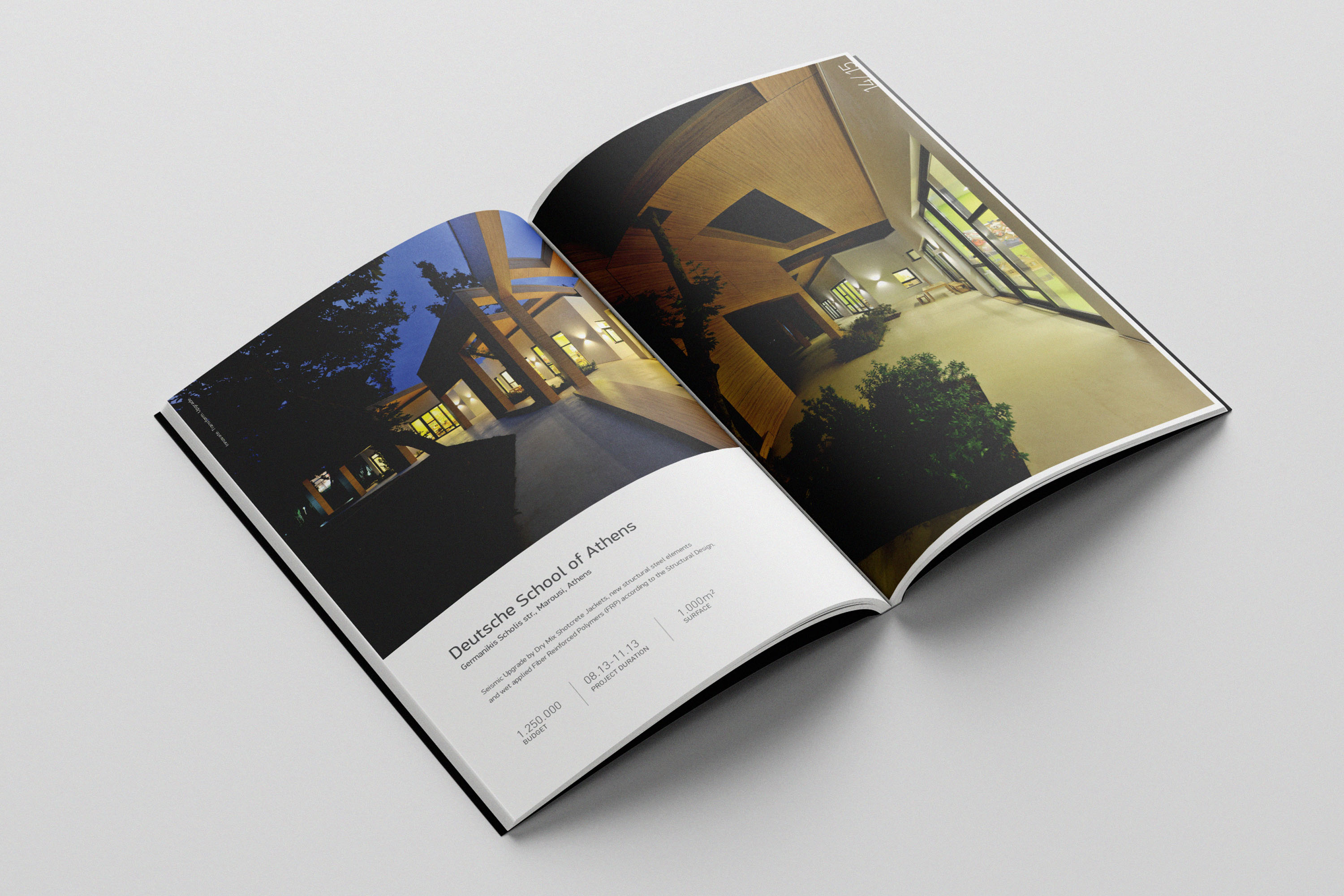
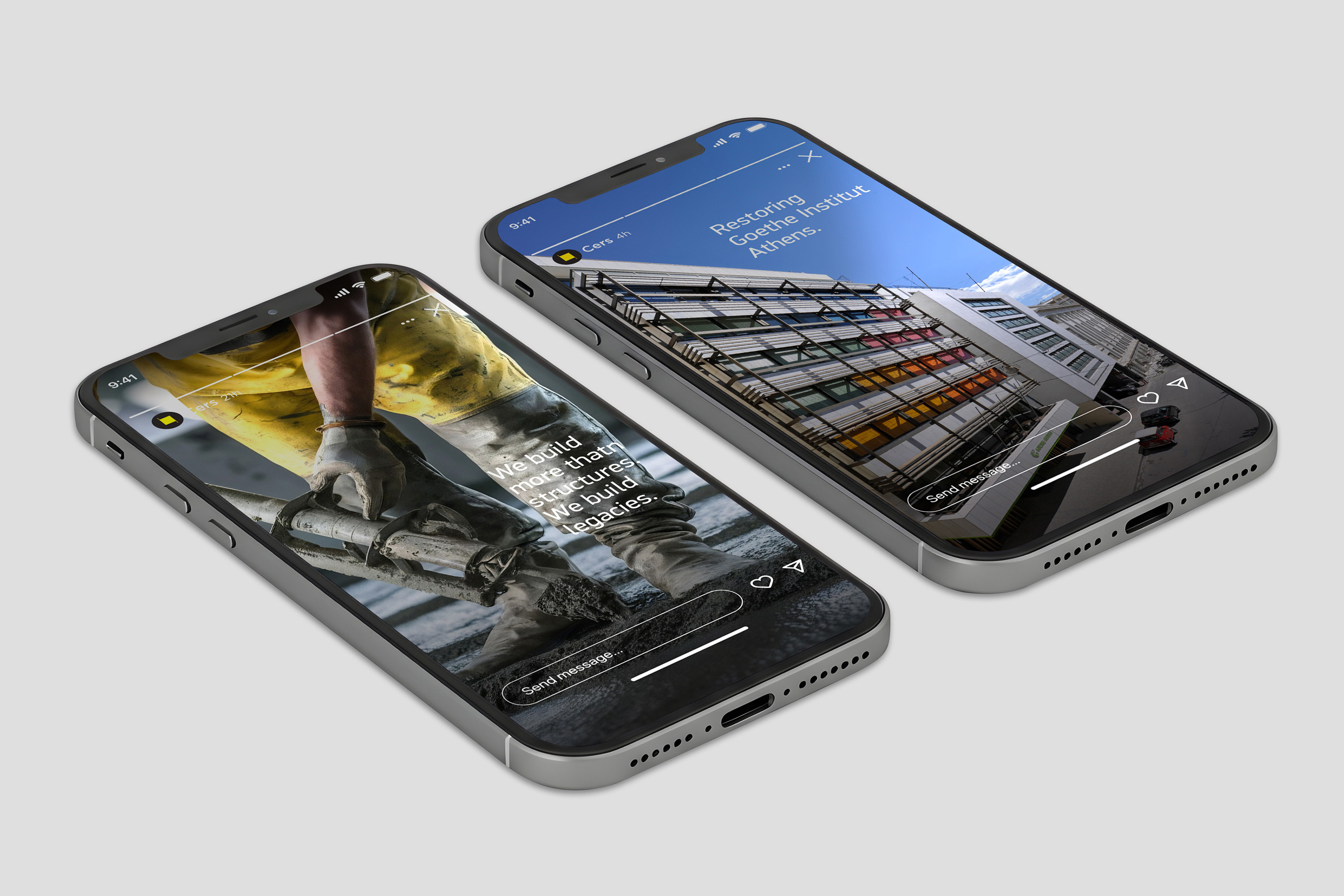
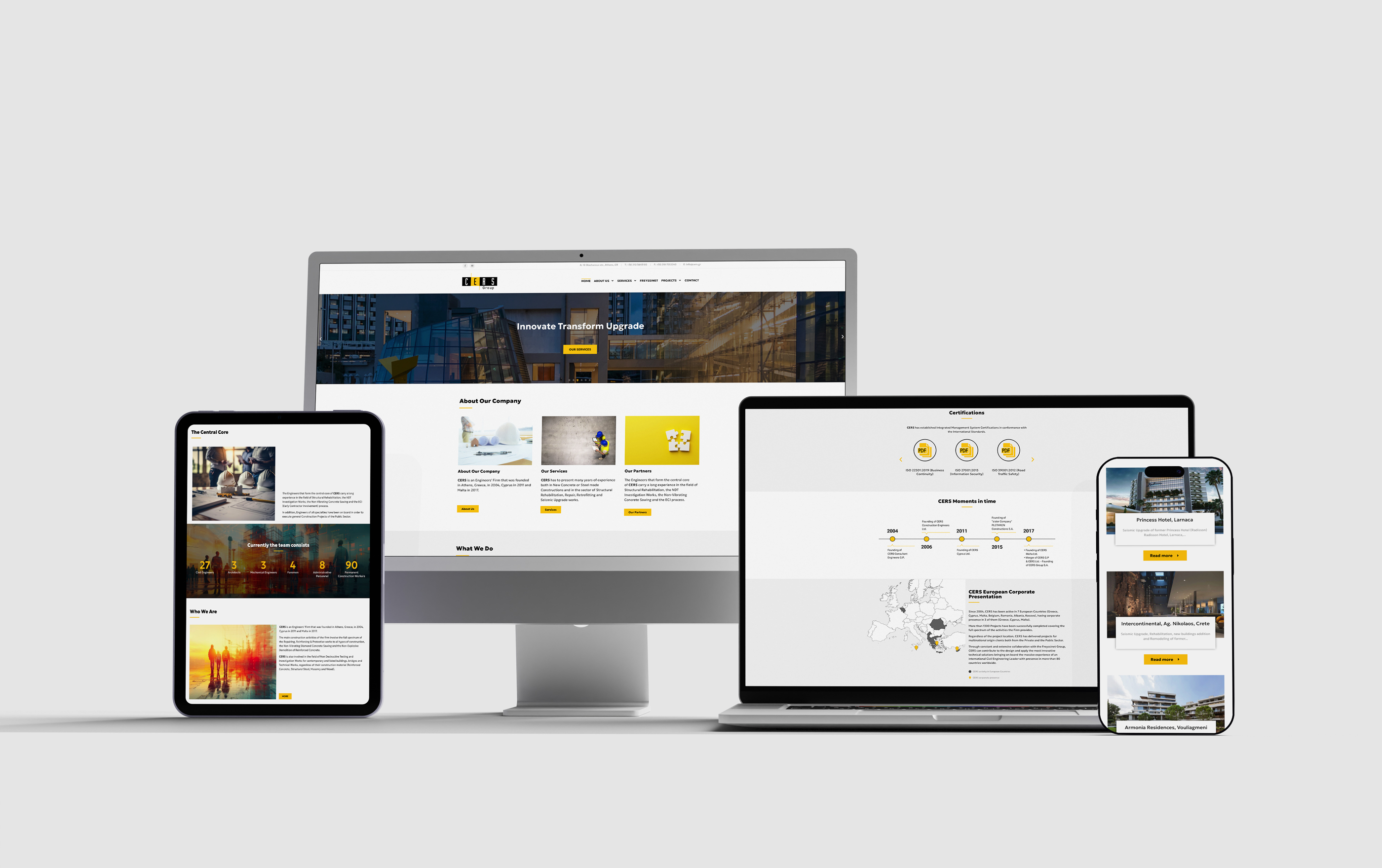
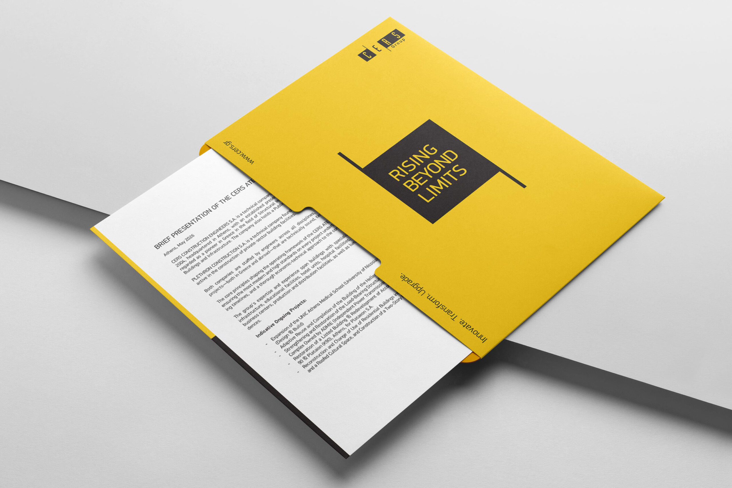
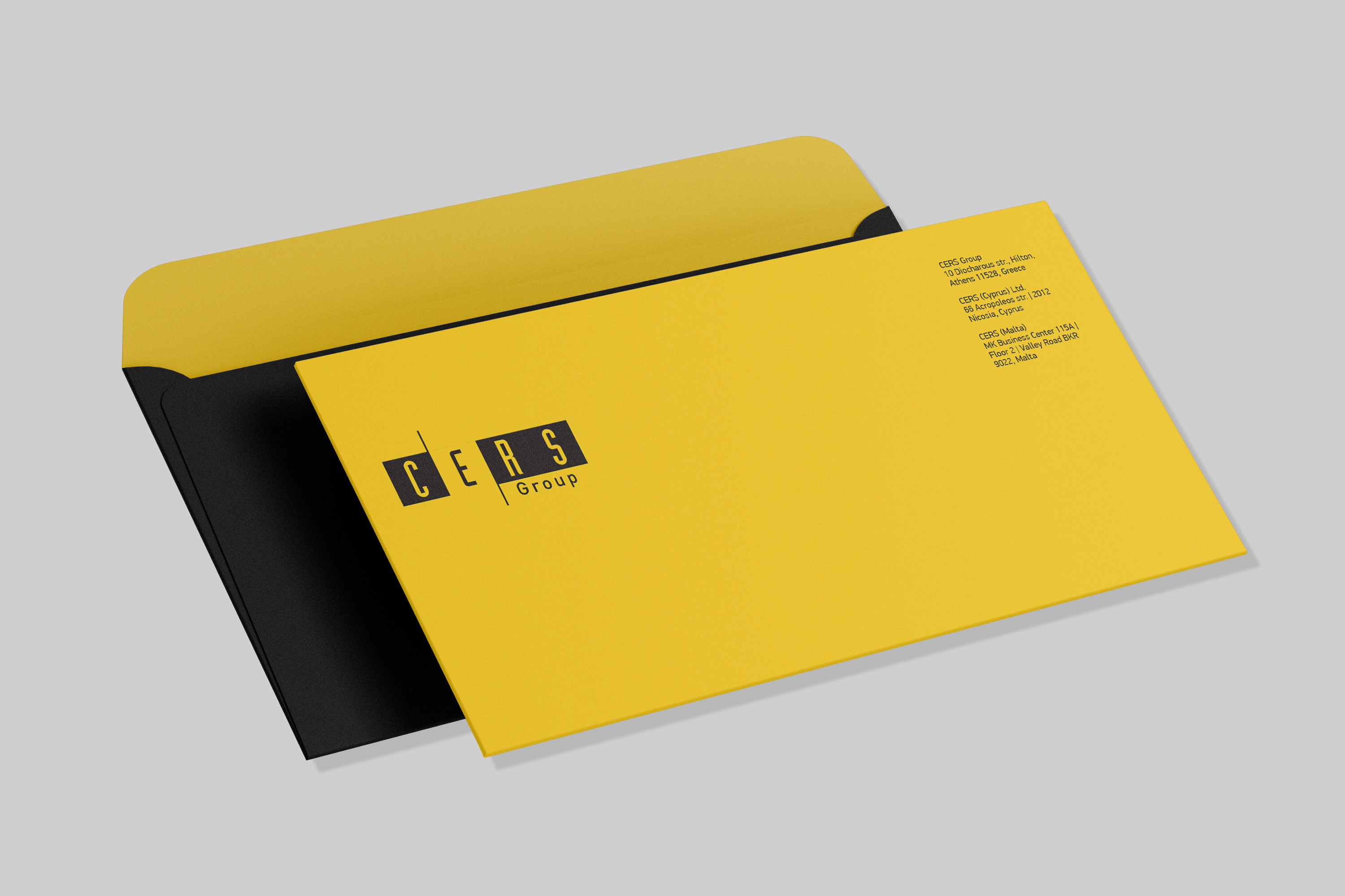
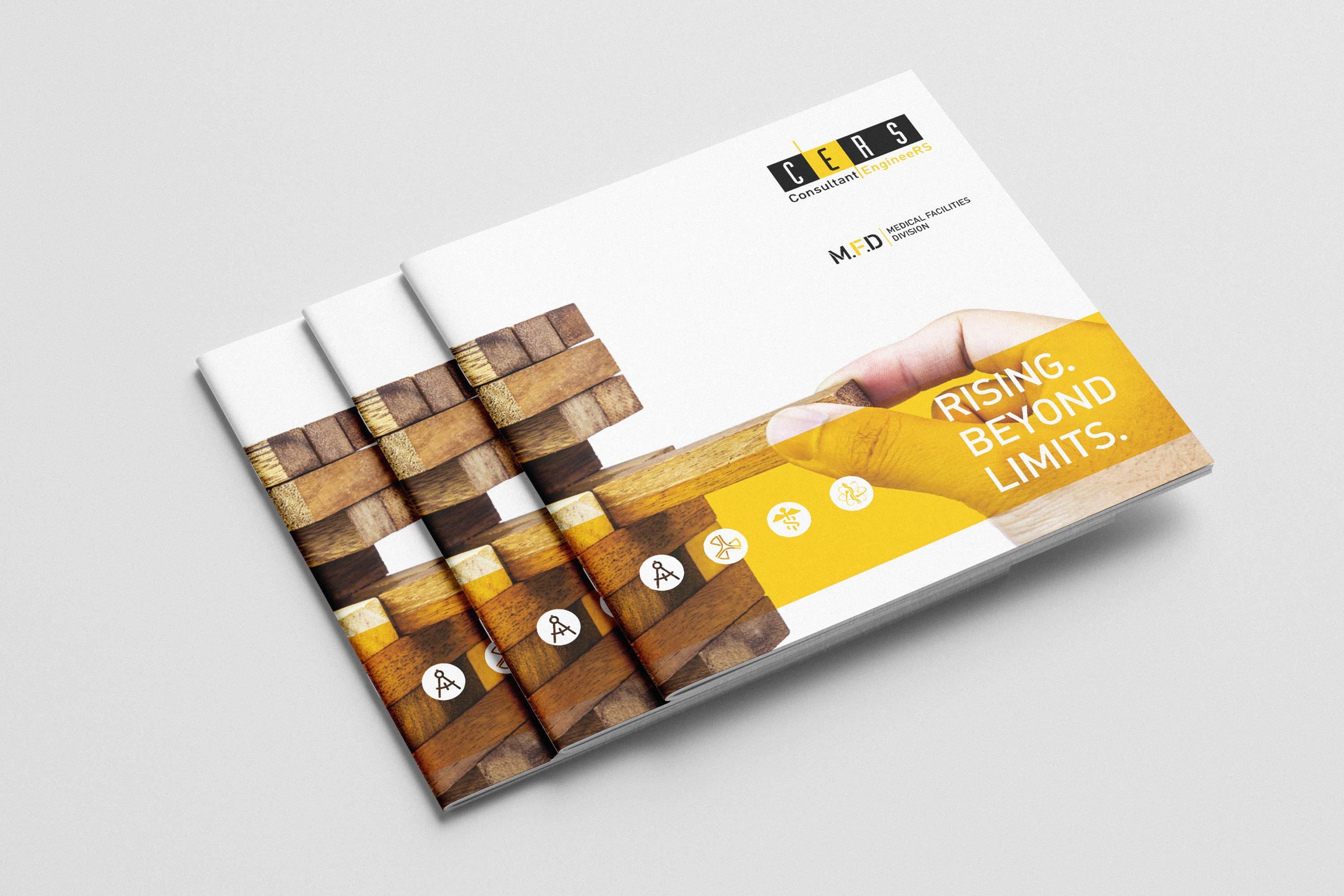
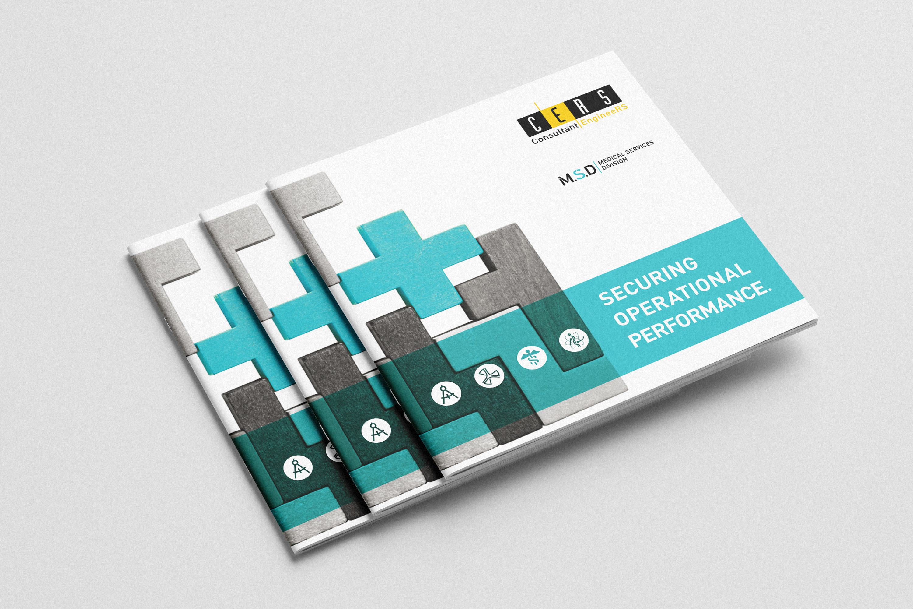
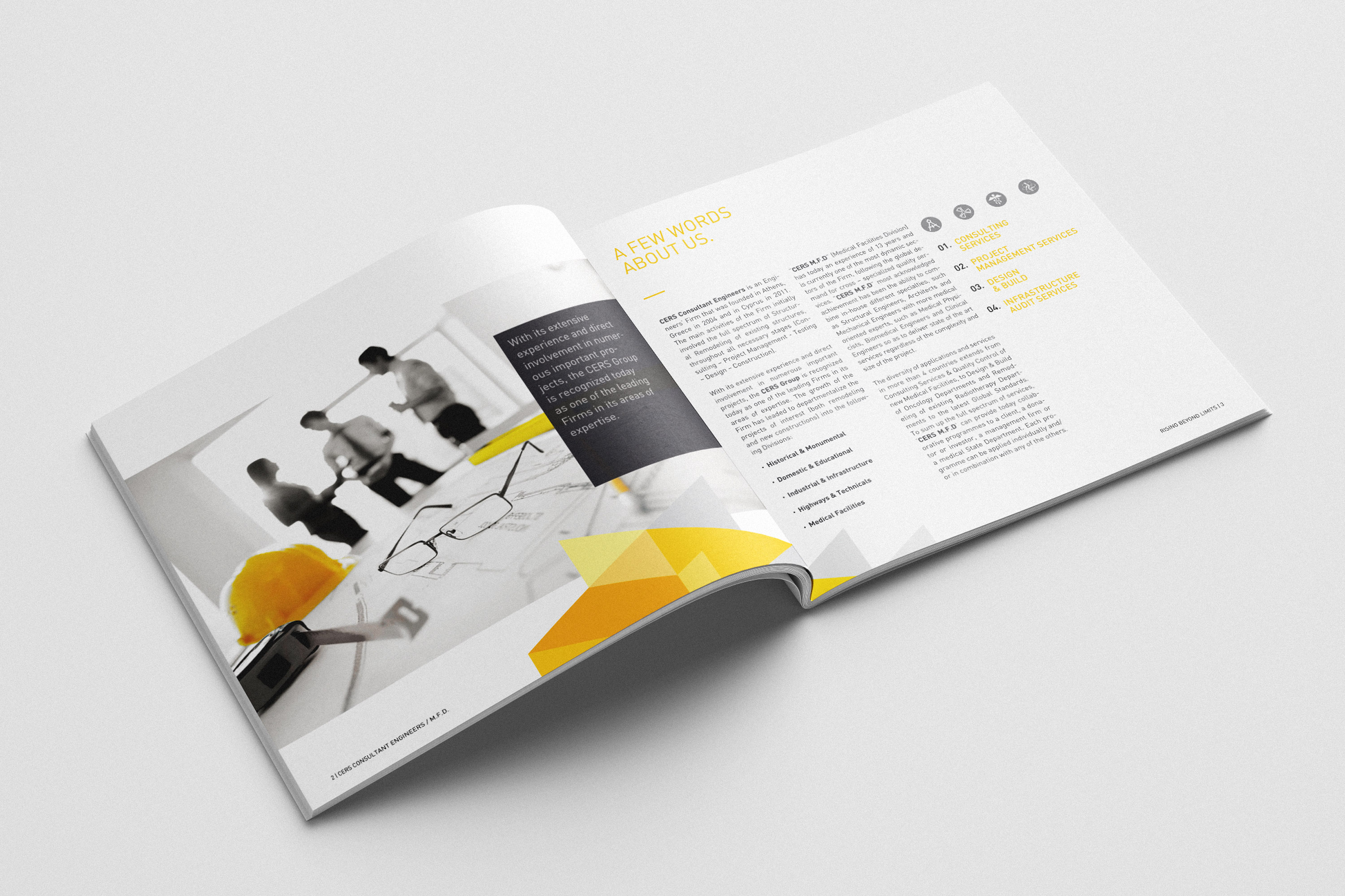
The project included the development of the core brand identity, a flexible campaign and communication toolkit, the website, editorial brochures, corporate stationery, outdoor applications, signage, workwear and branded operational materials. Each deliverable was designed as part of the same visual system, ensuring consistency across both everyday communication and larger public-facing applications.

The Challenge

CERS needed more than a new visual identity. The challenge was to create a clear and recognisable system that could bring together a wide range of services, audiences and communication needs under one brand. It had to work across corporate materials, campaigns, digital platforms and physical environments, while remaining flexible enough to support future growth without losing consistency.
The Approach

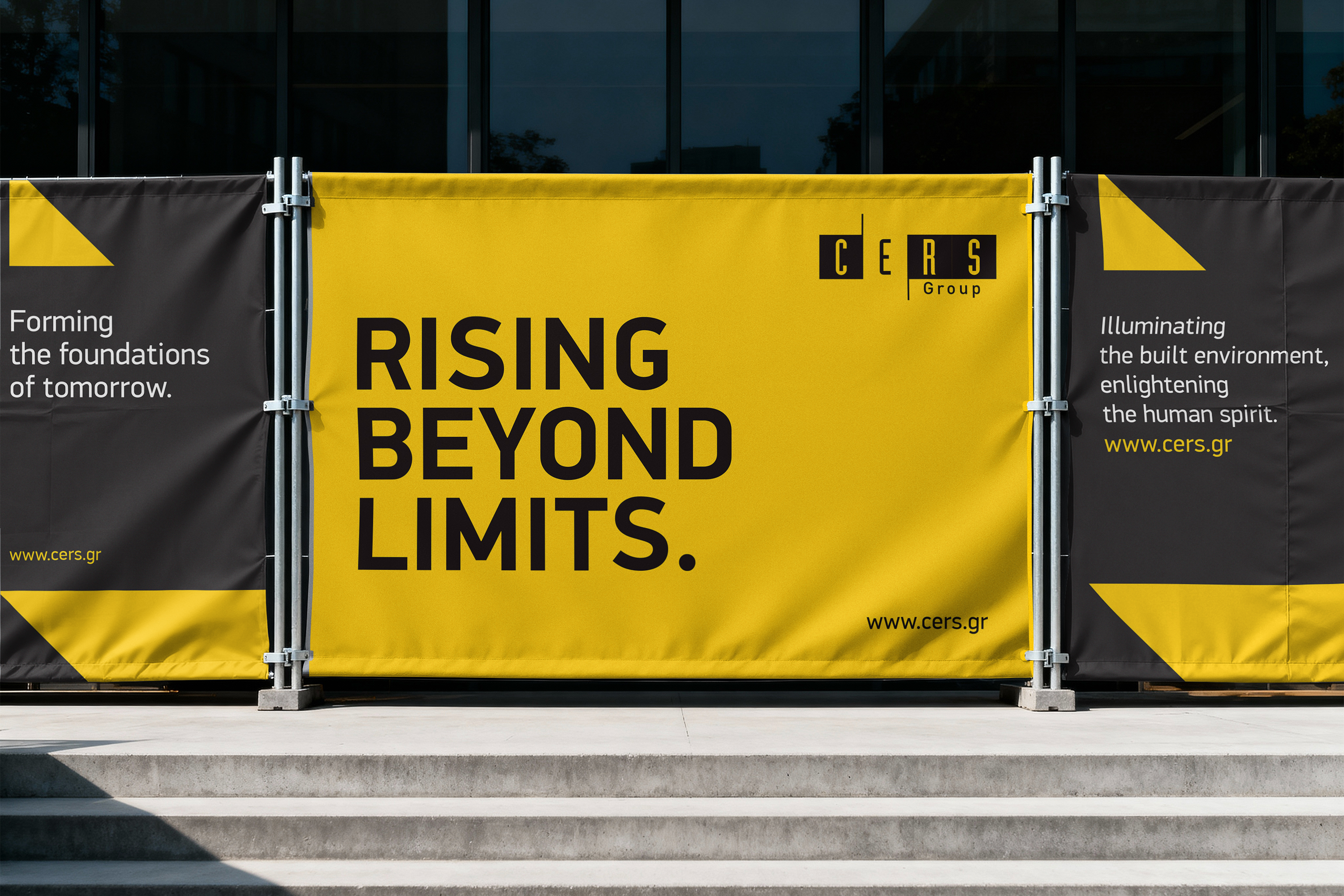
The identity was built around a simple but distinctive visual language: bold typography, a restrained colour palette and a modular system of graphic elements. Rather than designing each application as a separate piece, I developed a flexible framework that could adapt to different content, formats and environments while maintaining a consistent and recognisable brand presence.

The Visual System

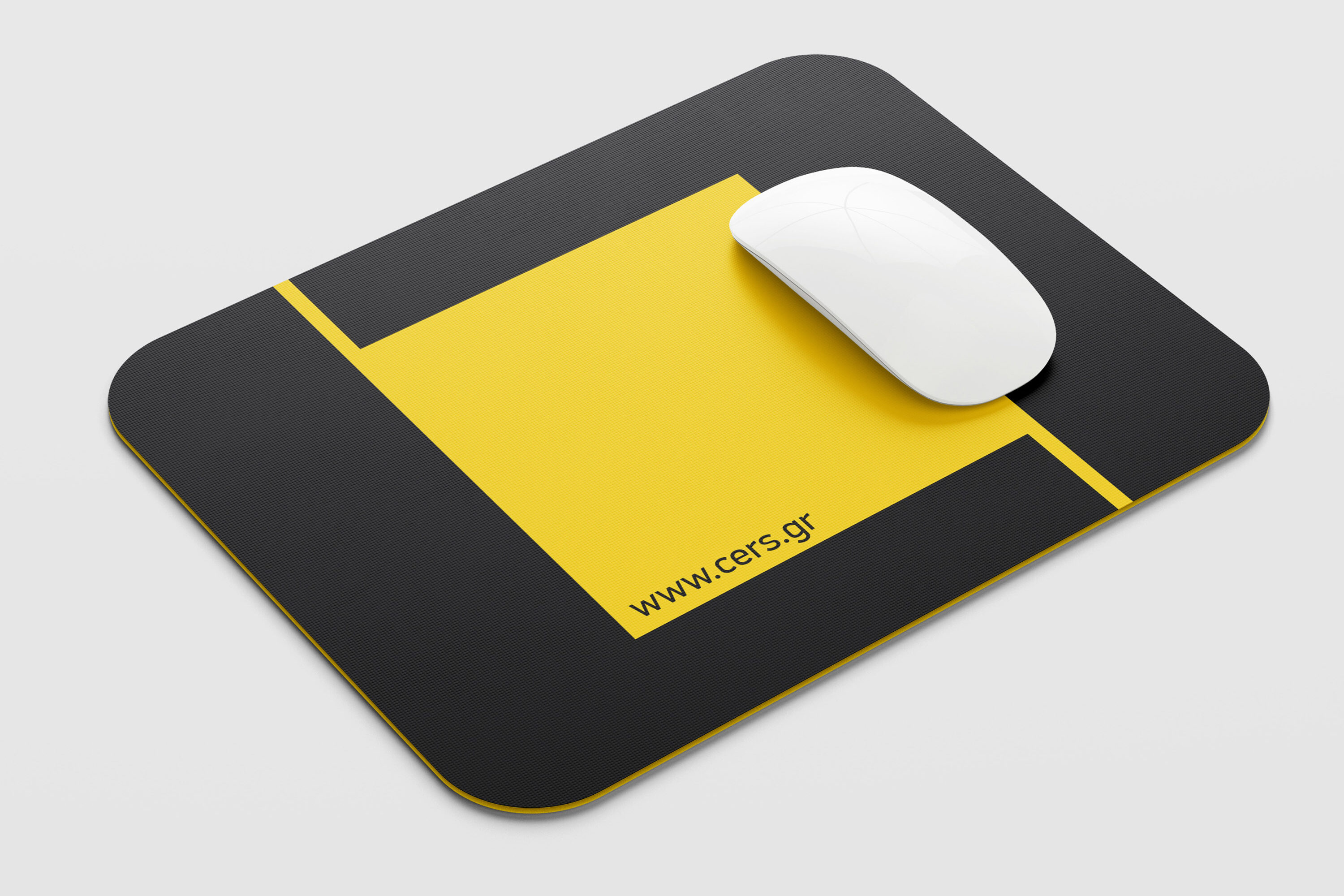
The visual system combines a high-contrast black and yellow palette with strong typography and a clear modular structure. These elements create immediate recognition while allowing the identity to adapt across different scales and contexts—from detailed editorial layouts and digital interfaces to large-format outdoor graphics, signage and workwear.

The Outcome

The result was a cohesive and adaptable identity that gave CERS a stronger, more consistent presence across every touchpoint. The system made it easier to develop new communication materials without losing clarity or recognition, while giving the brand enough flexibility to evolve as its needs expanded.

A brand designed not as a fixed collection of assets, but as a practical system built to grow