9 Agency
Creating a bold visual platform for a modelling agency
9 Agency needed a visual identity with the confidence to stand out in the fashion and modelling industry. The direction centred on striking model photography, assertive typography and a high-contrast yellow and black palette, shaping a brand that could feel both commercial and image-led. The result was a flexible platform for campaigns, digital presence, model promotion, printed material and branded touchpoints.
Brand identity · Art direction · Digital design · Campaign visuals · Print communication · Outdoor · Merchandise
Defining an image-led campaign language
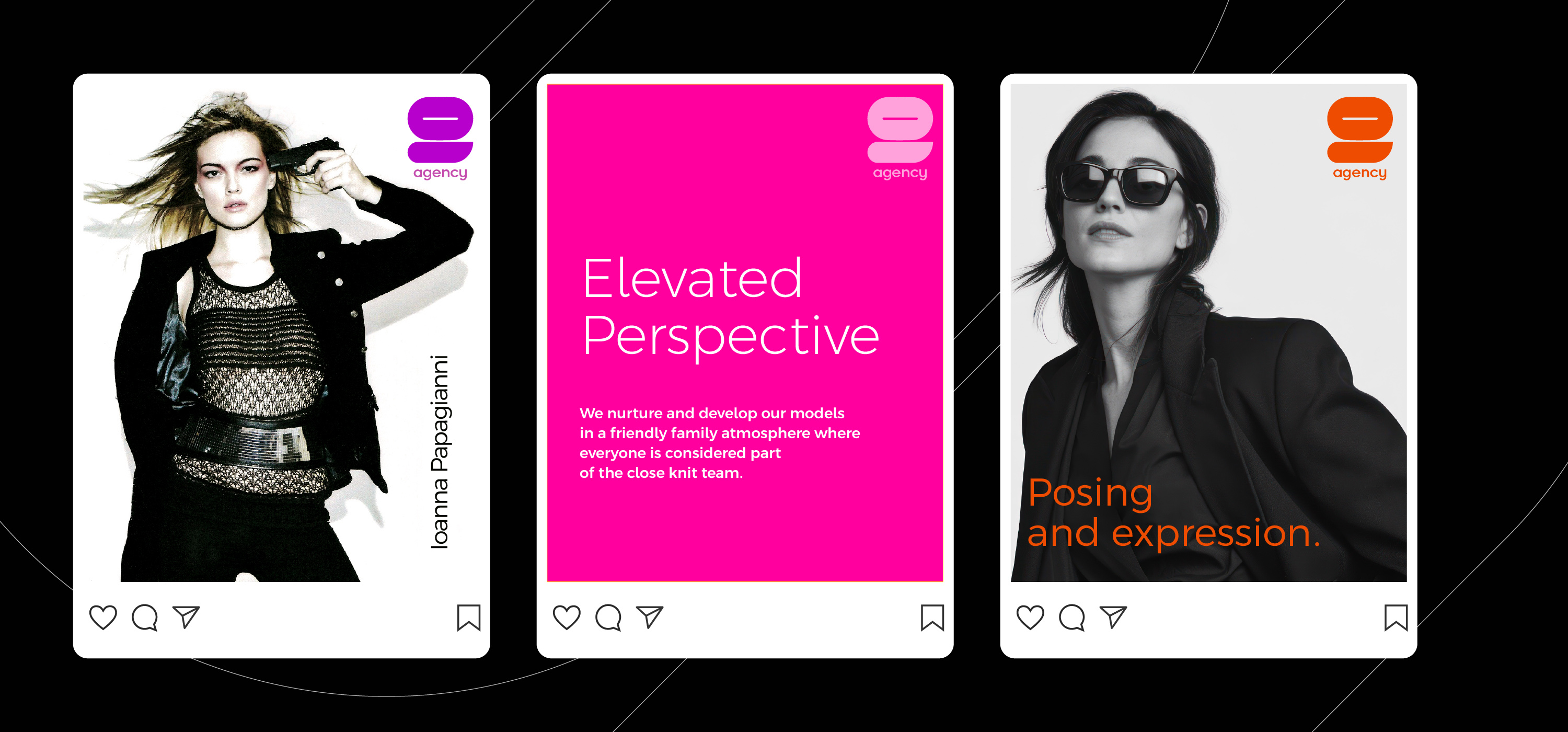
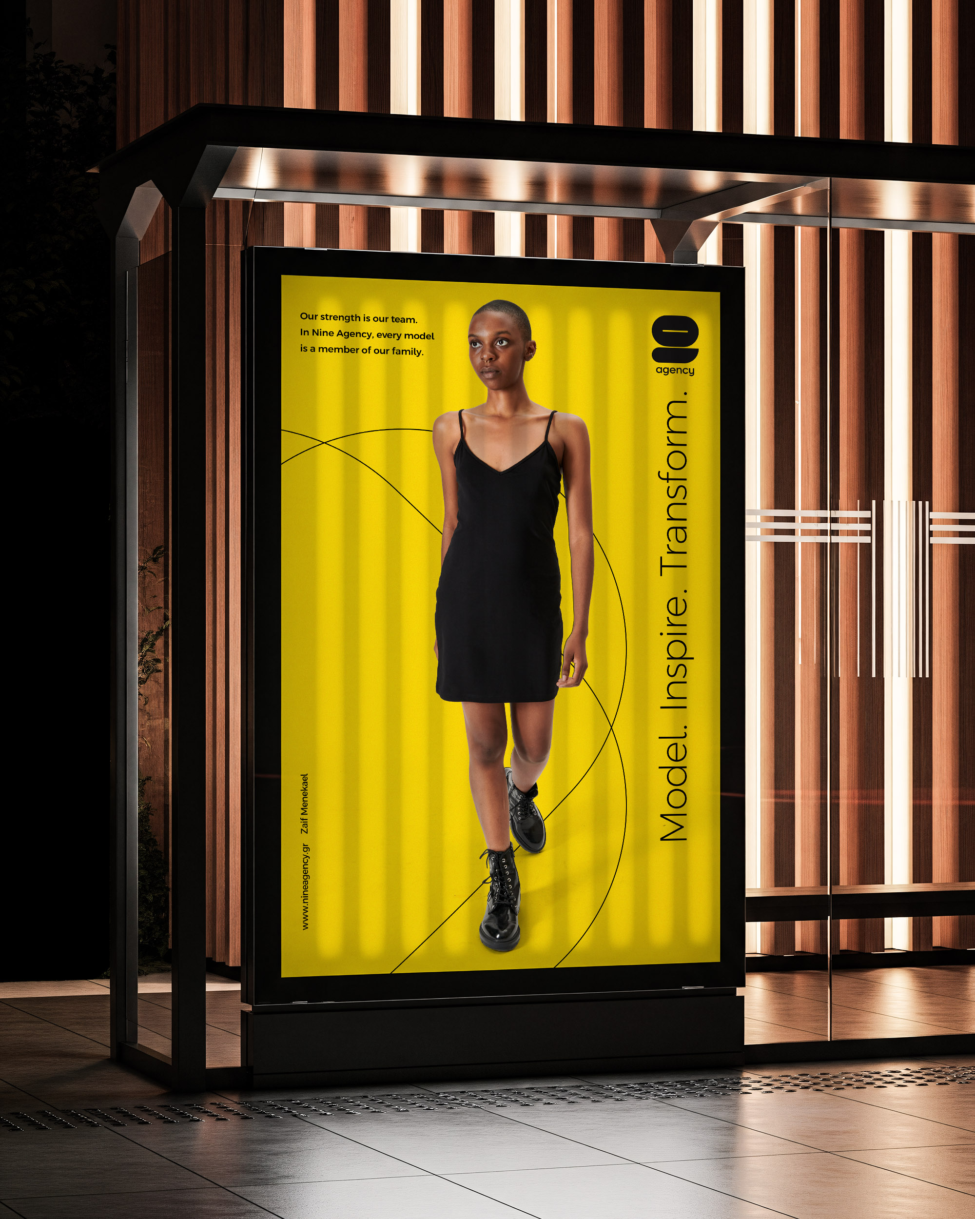
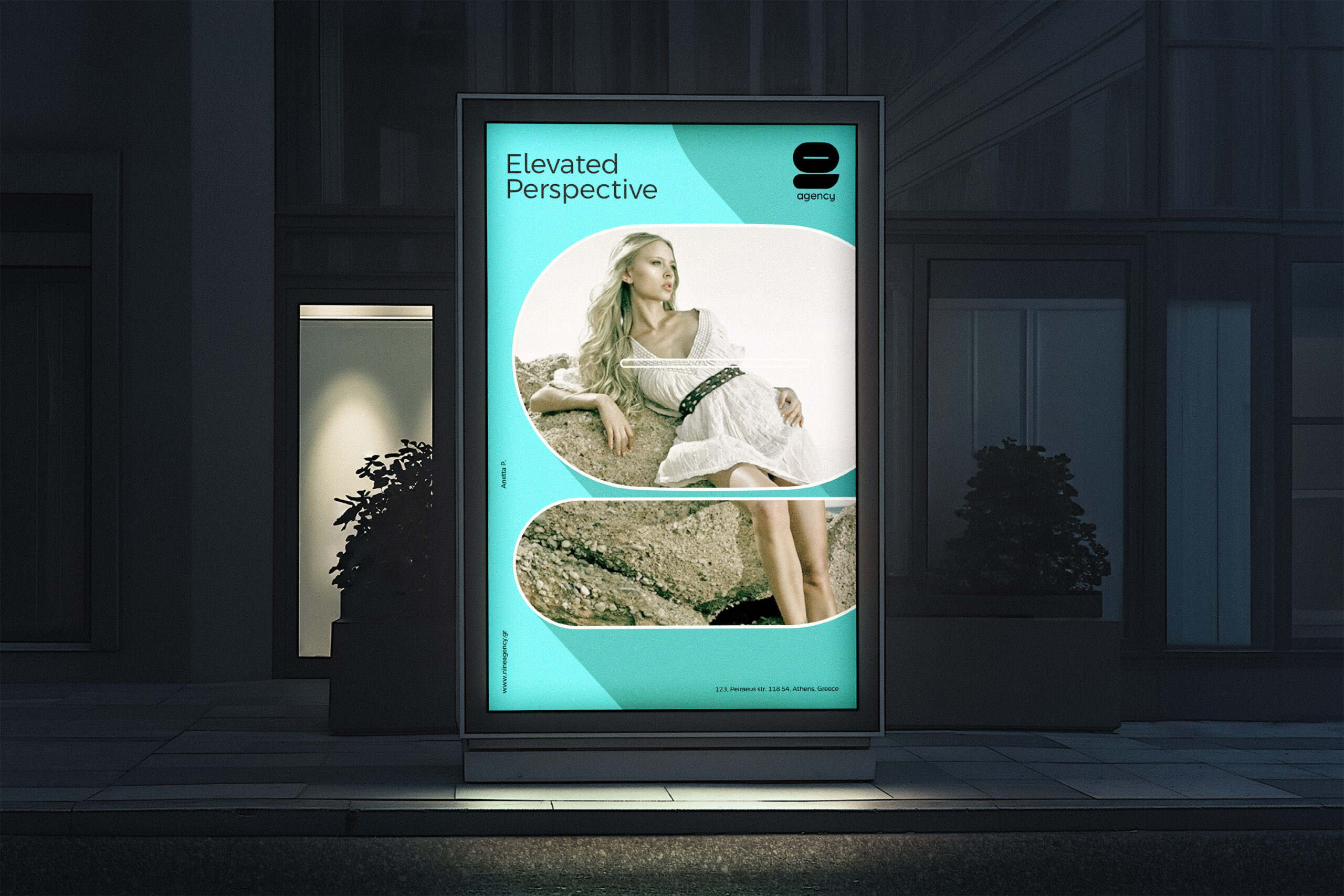
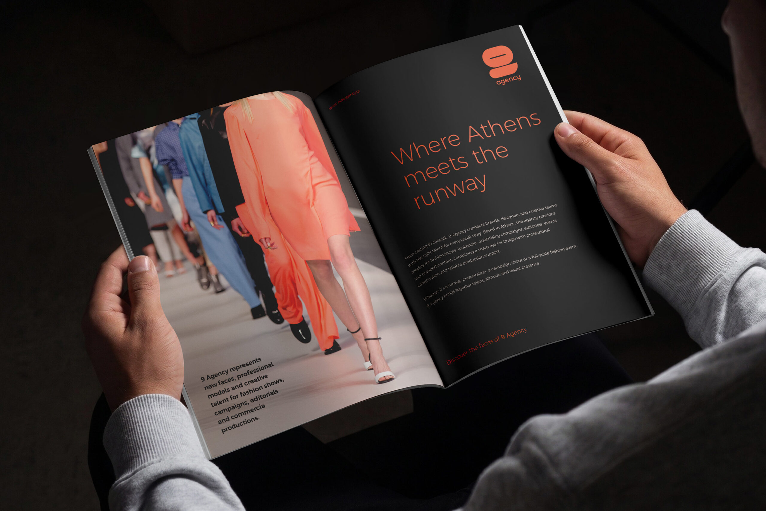
The campaign language was designed to feel immediate, graphic and highly recognisable. Model photography became the main storytelling device, supported by bold layouts and short, memorable messages that could adapt across social posts, posters, magazine advertising and public placements. Rather than treating each format as a separate piece, the identity gave the agency a consistent visual attitude across both fast digital moments and larger visibility-driven media.
Digital Experience
The website brought the brand into a digital environment where the models could remain the main focus. Large imagery, direct navigation and a restrained interface allowed the talent portfolio to lead the experience, while the yellow and black identity added a clear agency signature. The goal was not to over-design the platform, but to create a sharp online presence that made browsing, discovery and model presentation feel simple and visually confident.
Print & Model Promotion
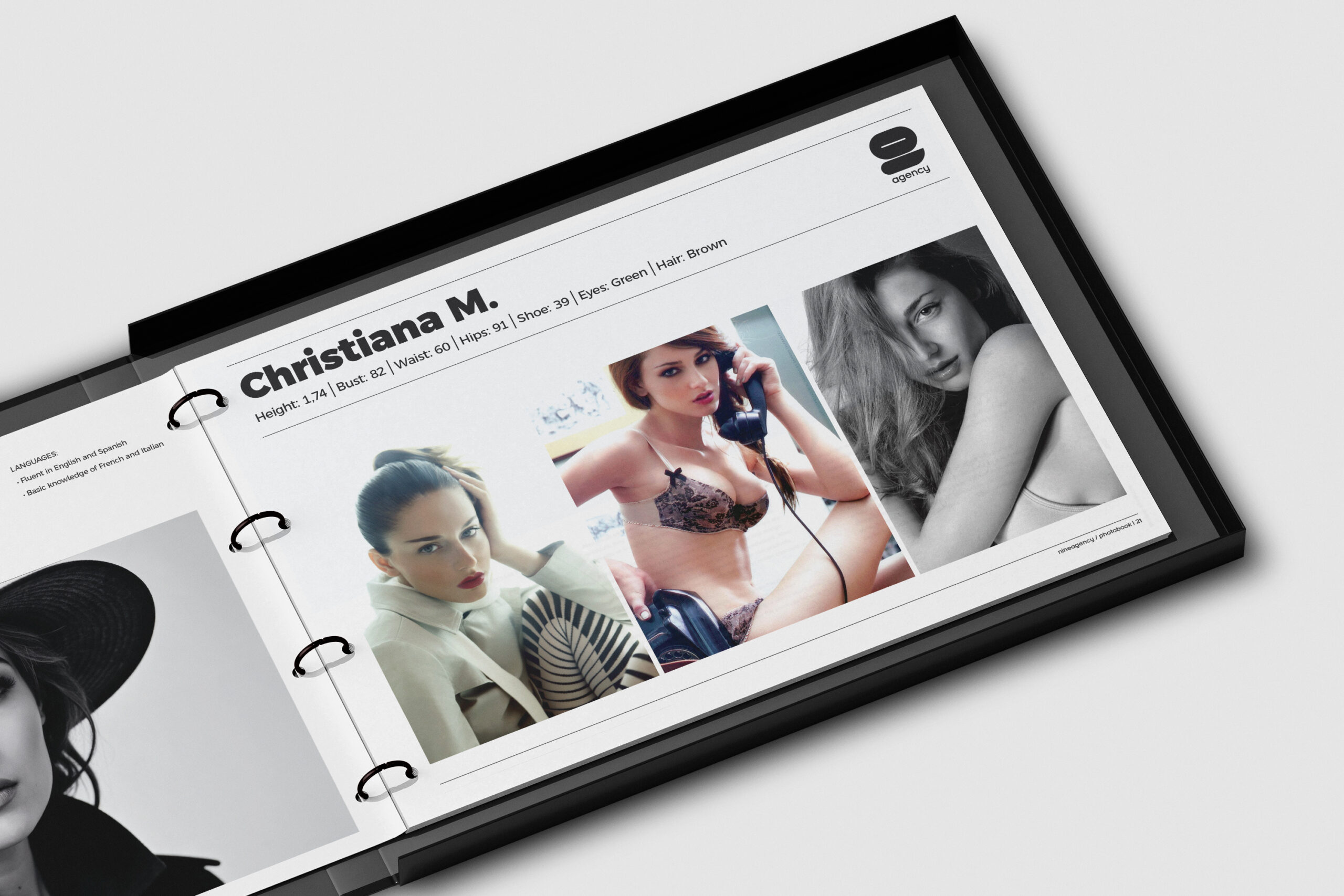
Printed material played a practical role in how the agency presented its talent to clients, brands and creative teams. Model cards, catalogues and promotional pieces were designed to combine strong portraiture with clear information, giving each model space to stand out while keeping the agency’s visual identity present. These materials worked as tools for castings, meetings and outreach, balancing fashion impact with functional communication.
Stationery & Brand Touchpoints
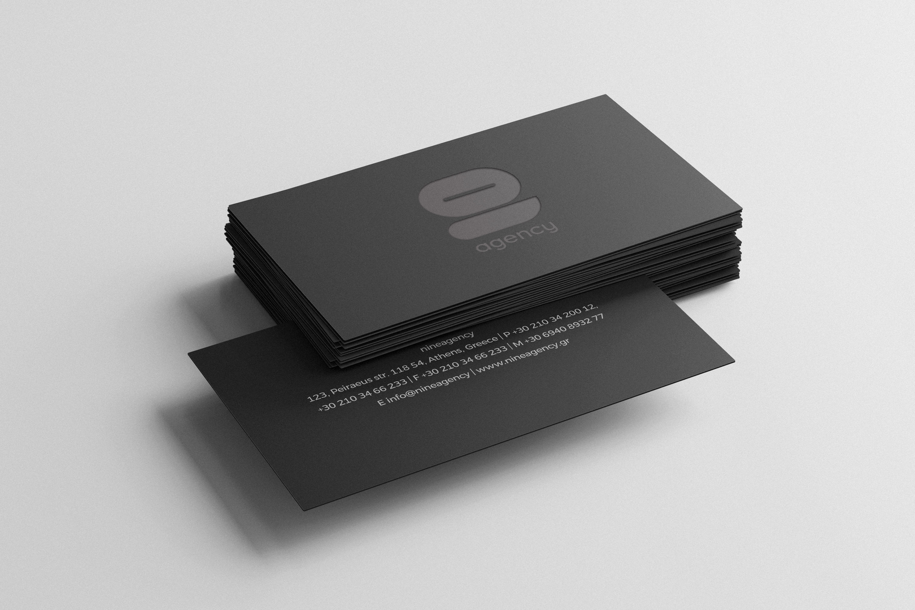
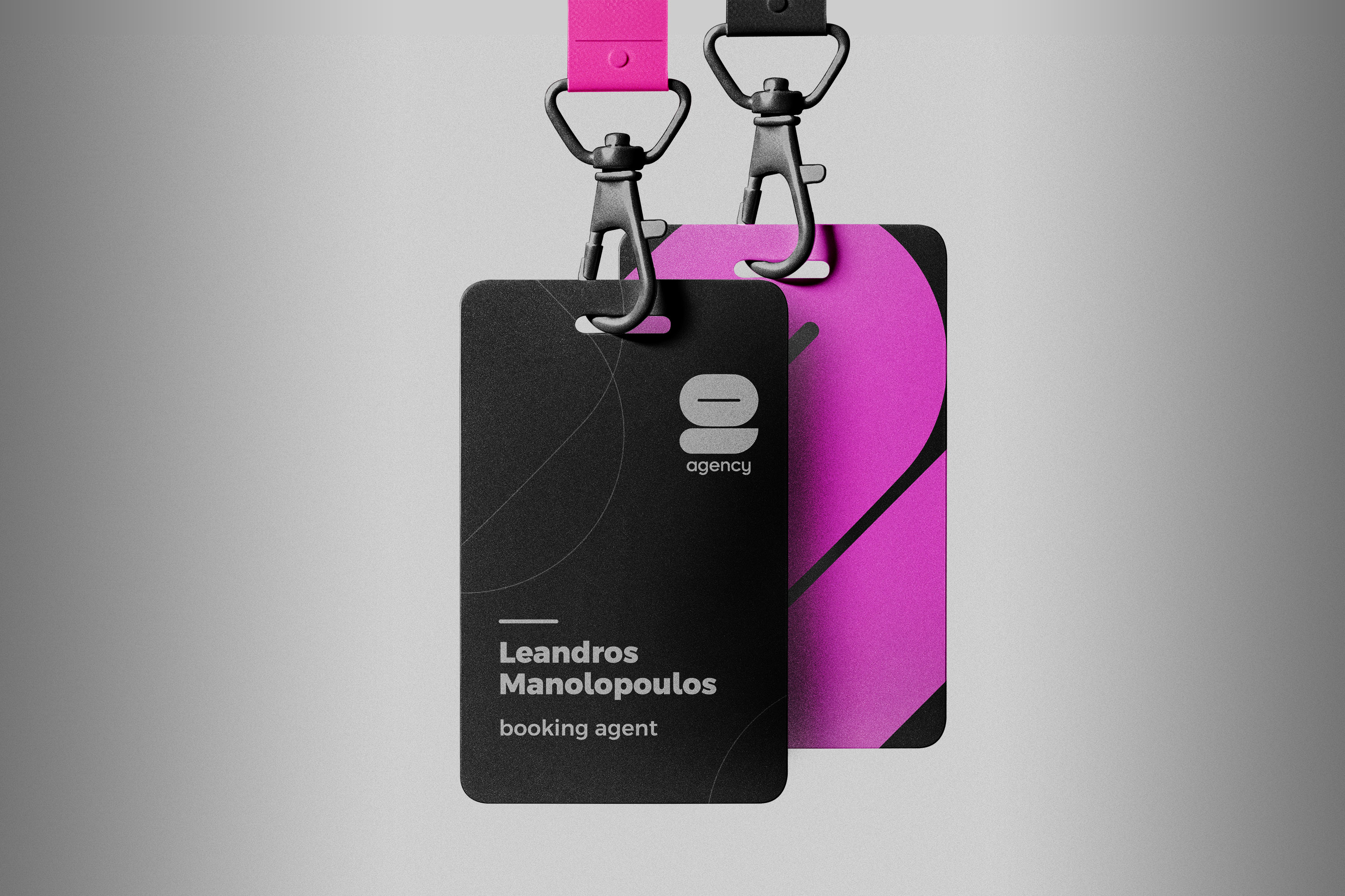
For the agency’s everyday materials, the visual language was refined into a more controlled and professional expression. Business cards, stationery and client-facing documents used the same graphic confidence as the campaigns, but with cleaner layouts and a more restrained pace. This helped the brand feel consistent in formal communication without losing the bold character that defined its public image.
Merchandise & Event Materials
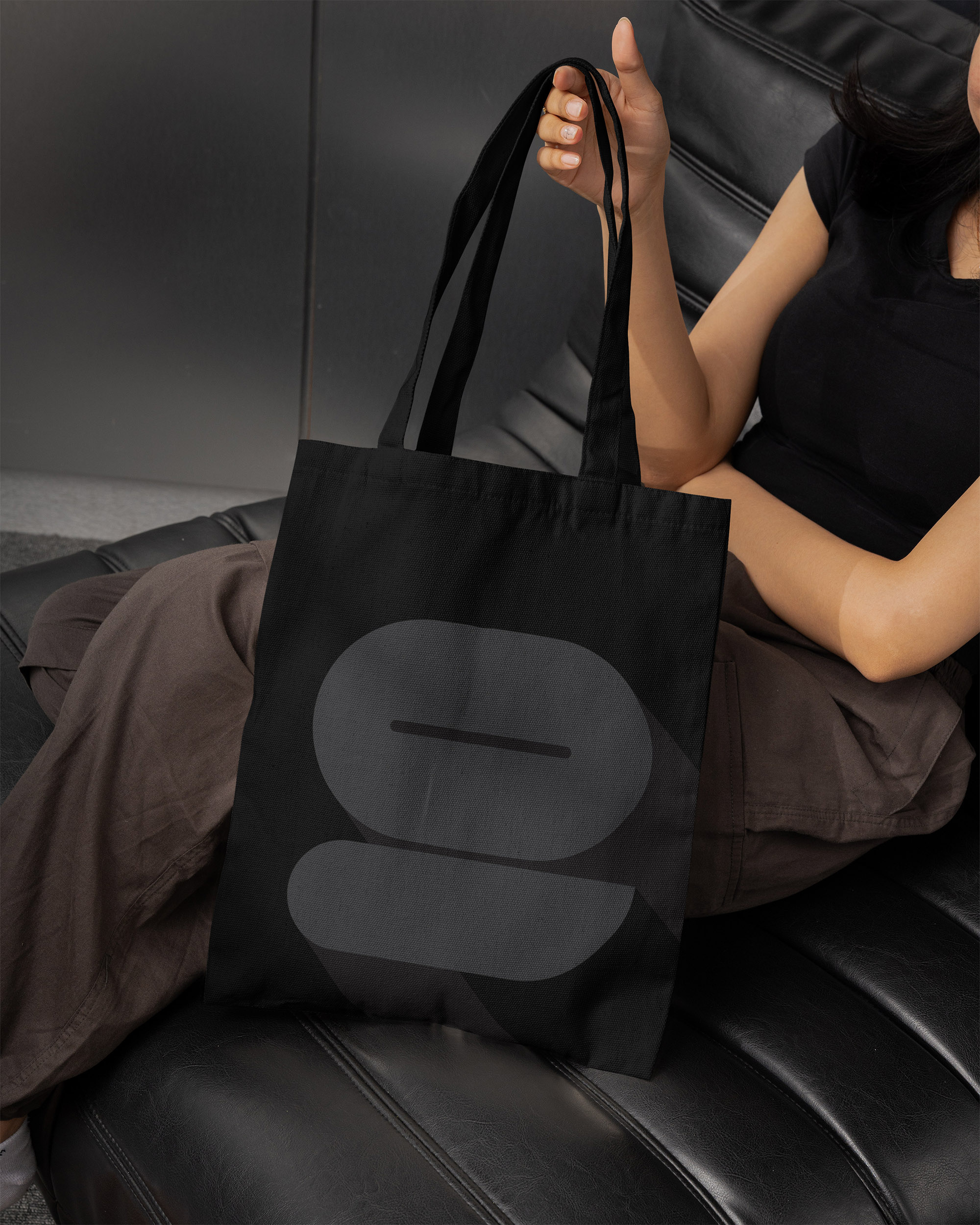
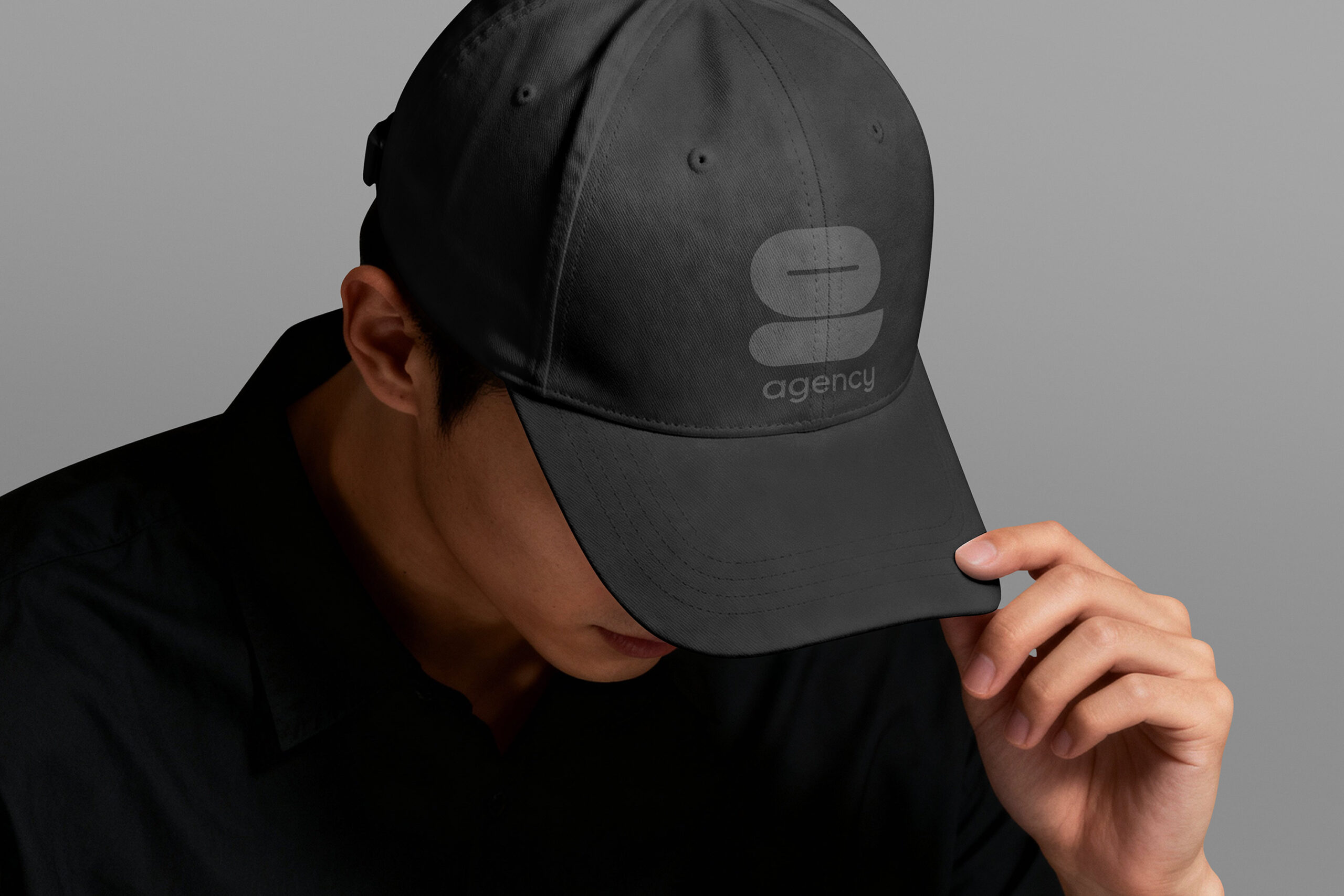
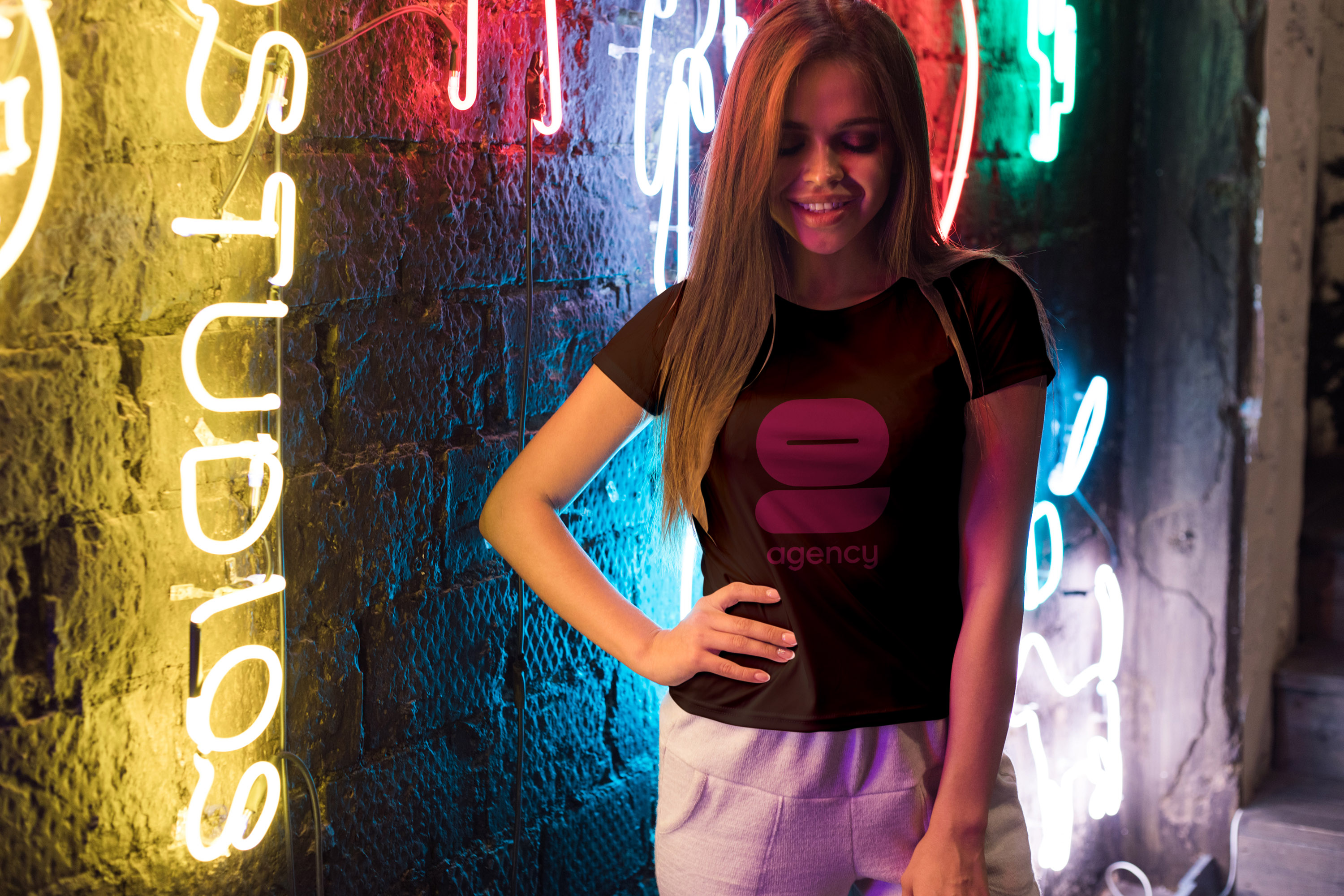
Merchandise and event materials gave the identity a more physical and wearable presence. Tote bags, T-shirts and branded accessories translated the agency’s graphic language into objects that could support events, castings, promotions and everyday visibility. These touchpoints added a more informal layer to the brand, connecting the agency’s fashion attitude with real-world use.
Outcome
The project gave 9 Agency a bold and recognisable visual platform across campaign, digital, print and promotional communication. Built around strong photography, confident typography and a distinctive colour palette, the identity helped the agency present its models, services and brand personality with greater clarity and impact. From public-facing advertising to practical client materials, the system created a coherent presence for a fashion-led modelling agency.
Brand identity · Campaign language · Digital presence · Model promotion · Print design · Public visibility · Merchandise