EFOMP
Building a visual ecosystem for European medical physics
Over a six-year collaboration, I developed a flexible visual ecosystem for EFOMP—the umbrella organisation representing medical physics across 36 European countries. What began as a core identity and set of brand guidelines evolved into a connected family of event, editorial, educational and specialist-community communications, balancing scientific credibility with clarity and a more contemporary voice.
Brand identity · Brand architecture · Guidelines · Campaigns · Event communication · Editorial design · Merchandise
Creating the core identity system
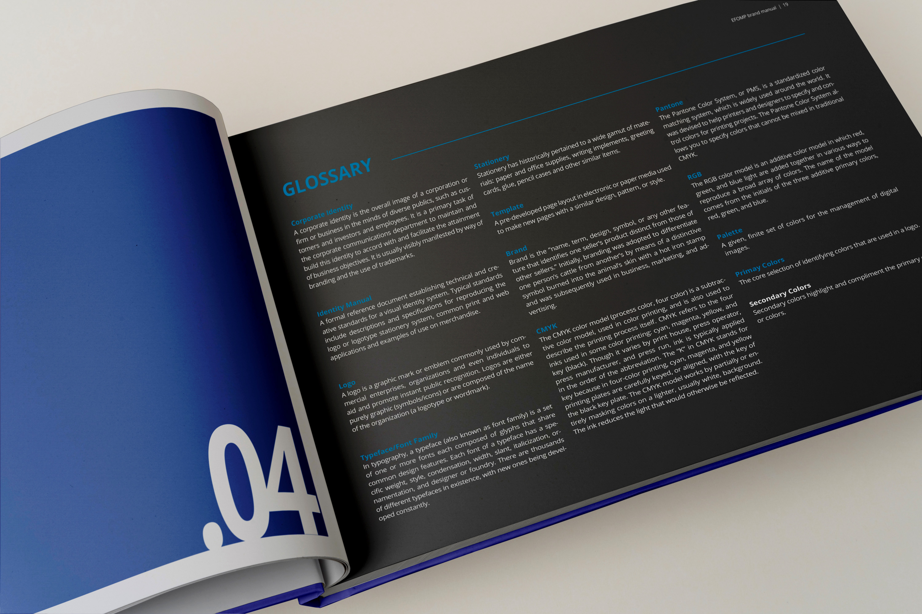
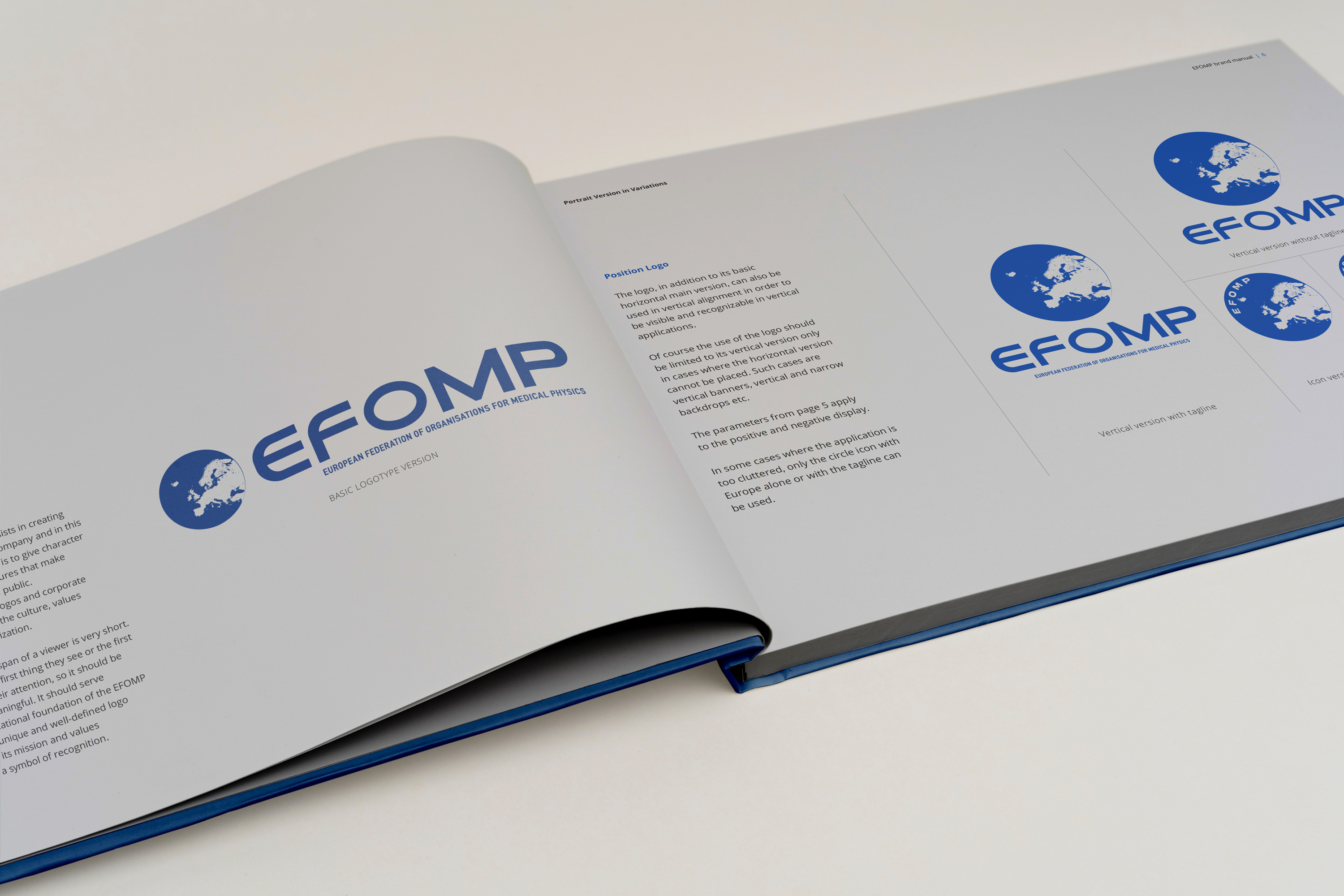
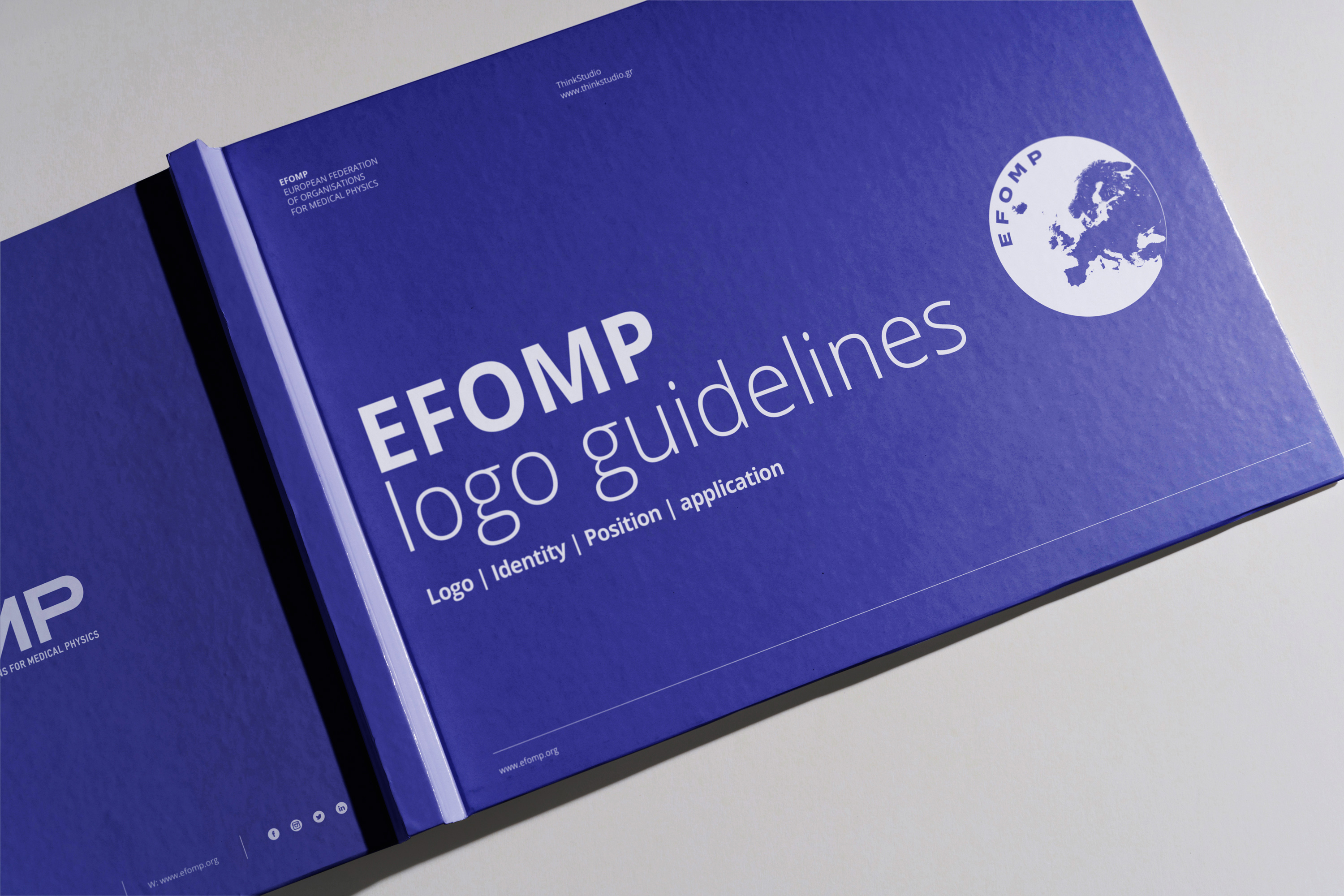
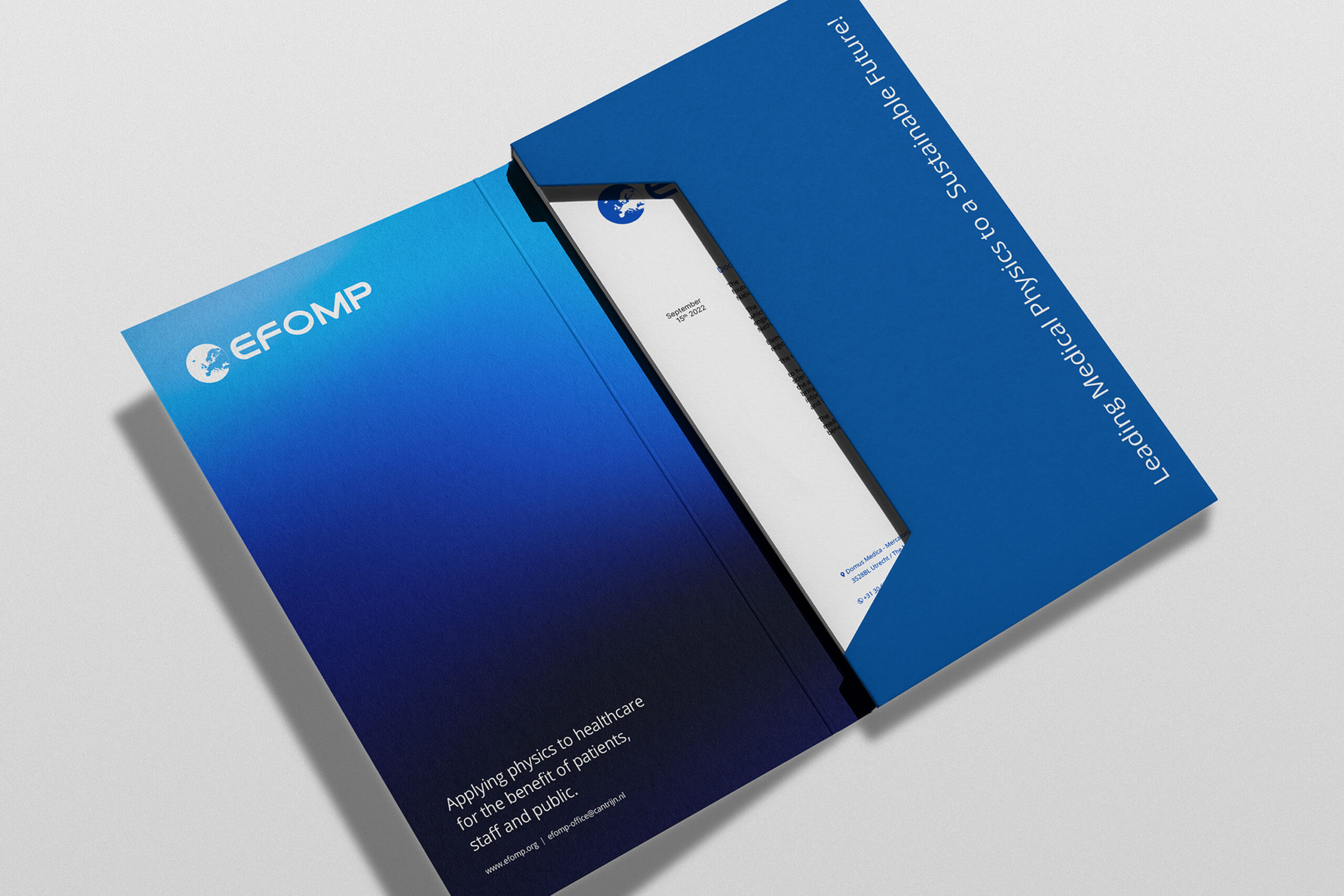
The collaboration began with the development of a coherent visual identity designed to bring clarity and consistency to EFOMP’s communication across Europe. The system combined a contemporary visual language with the credibility expected of a scientific organisation and was documented through practical guidelines covering logo use, colour, typography and core brand applications.
Bringing the identity into everyday communication
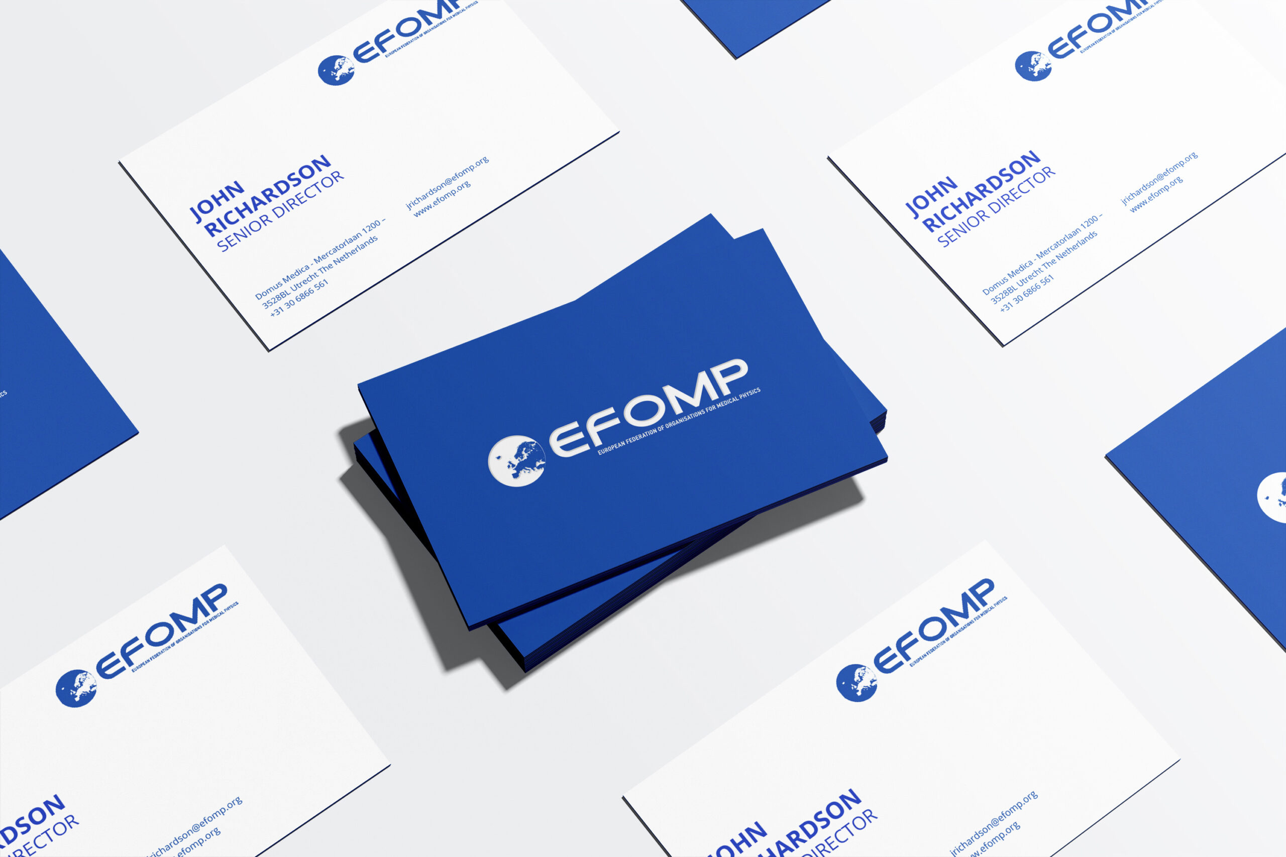
The identity was translated into EFOMP’s essential communication materials, including business cards, letterheads and envelopes. These applications established a consistent and professional presence across administrative correspondence and everyday organisational touchpoints. The restrained use of colour, typography and graphic elements ensured that each format remained functional and clear, while retaining a strong and recognisable connection to the wider EFOMP visual system.
Extending the identity across congresses and events
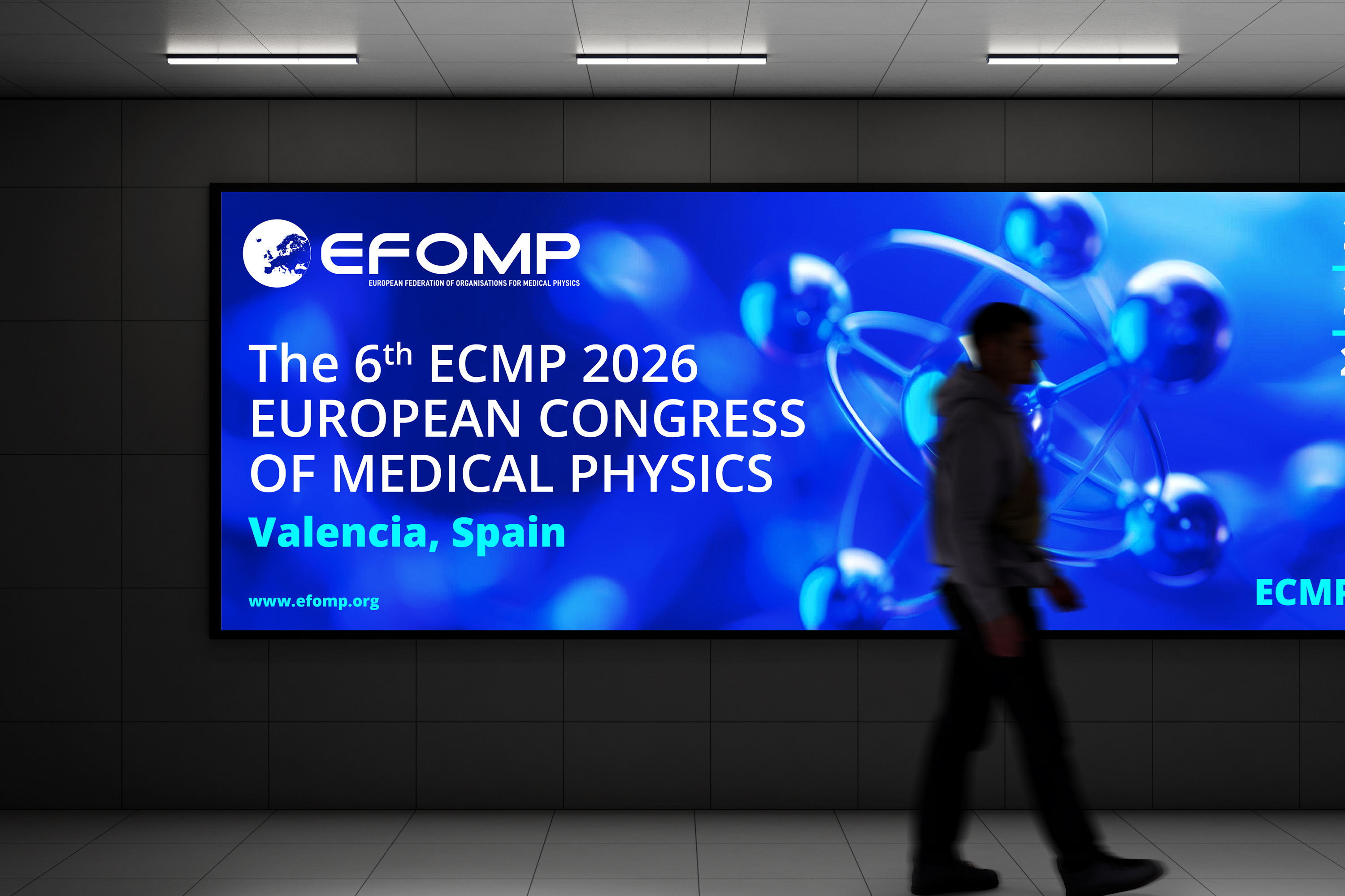
The visual system was extended across EFOMP’s congresses and professional events, creating a consistent framework for campaigns, venue communication and large-scale digital formats. Bold typography, atmospheric imagery and flexible blue gradients allowed each event to establish its own emphasis while remaining clearly connected to the wider EFOMP identity.
Giving specialist communities a distinct voice
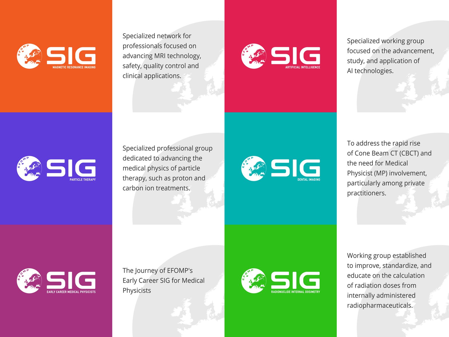
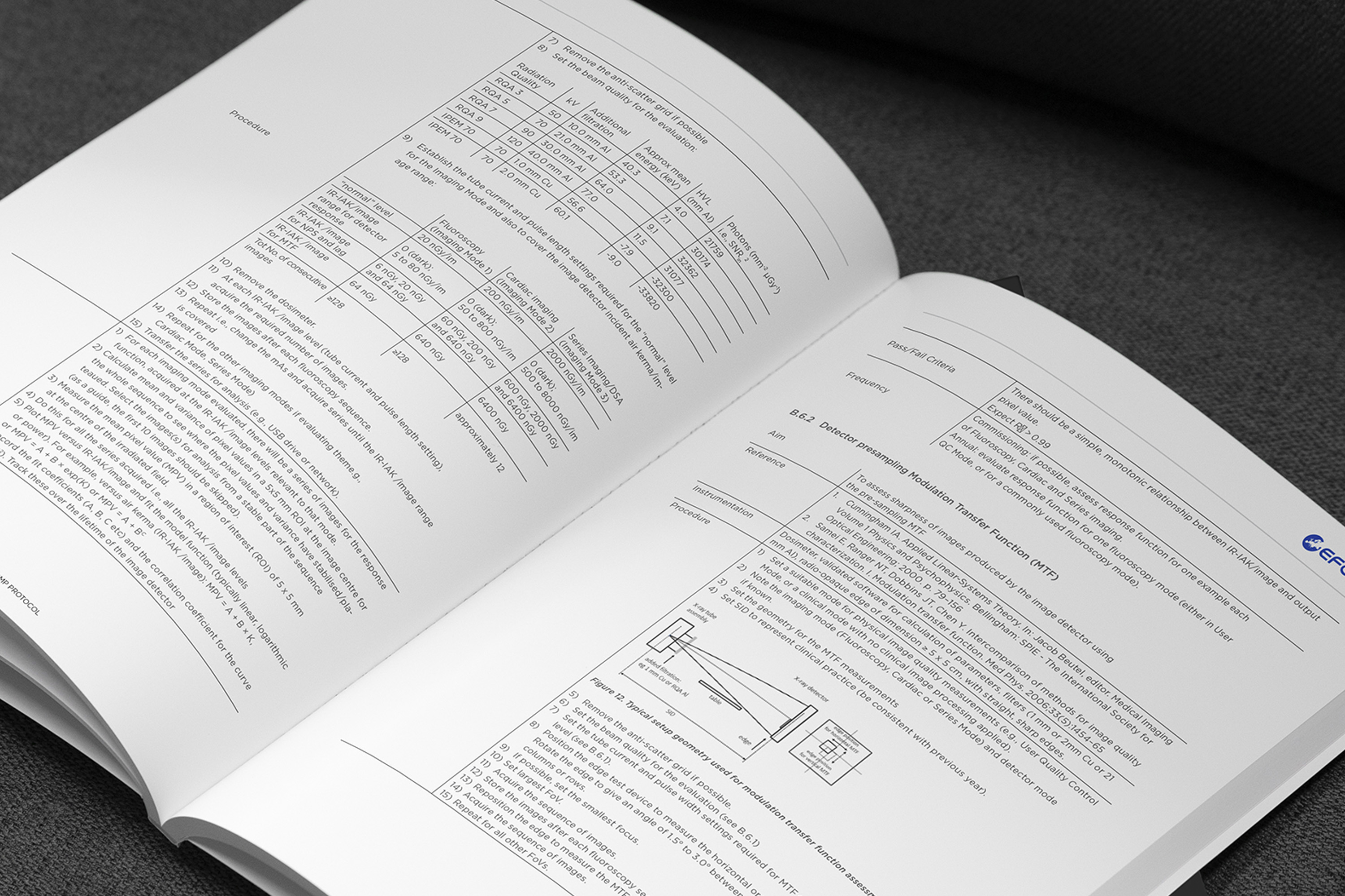
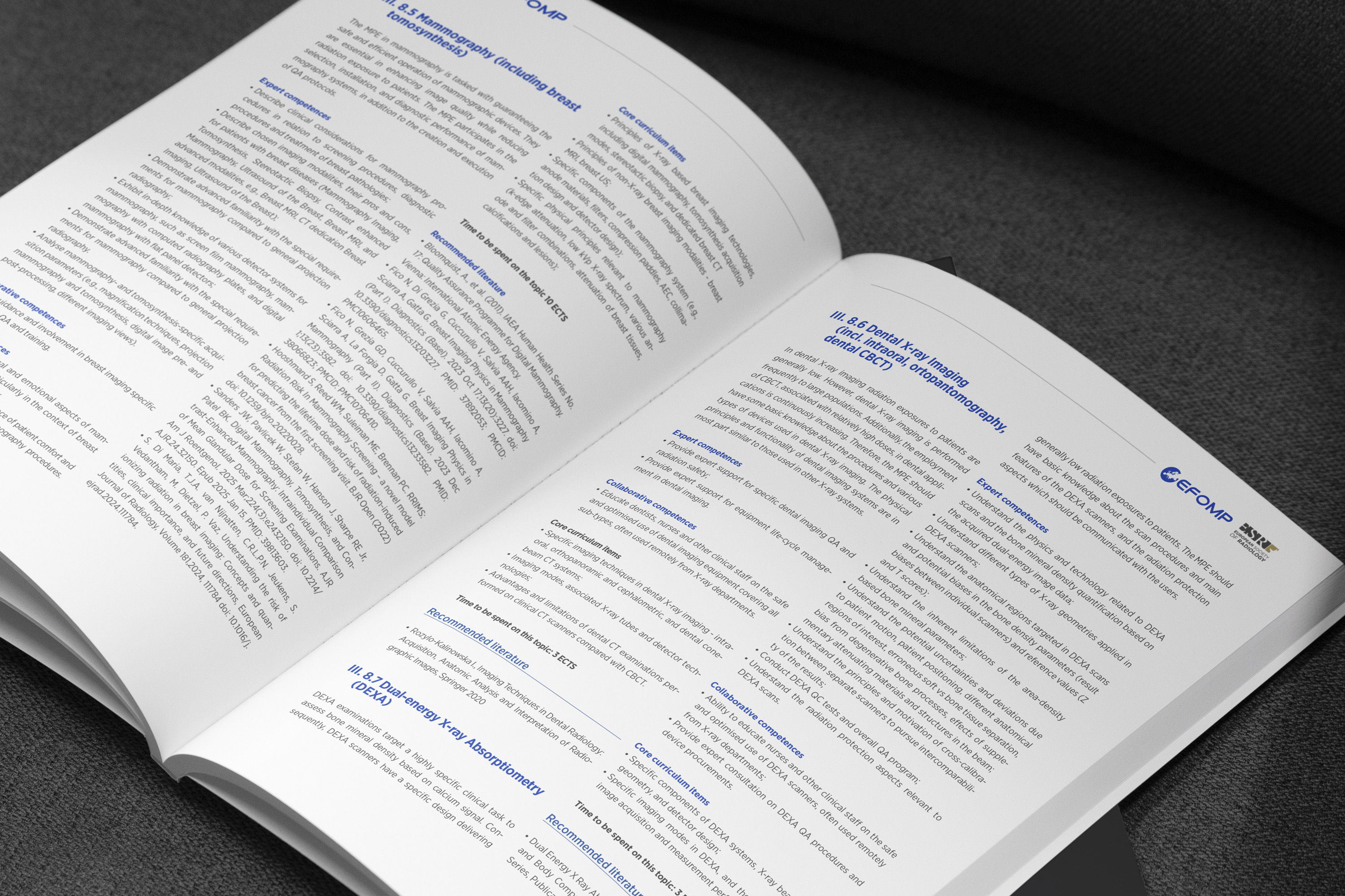
EFOMP’s Special Interest Groups required a more expressive identity that could stand apart from the organisation’s core communications while remaining recognisably connected to the wider brand. A bolder typographic language, high-contrast layouts and a more vibrant colour palette created a flexible system for specialist content, publications and community-led initiatives.
Building a flexible editorial platform
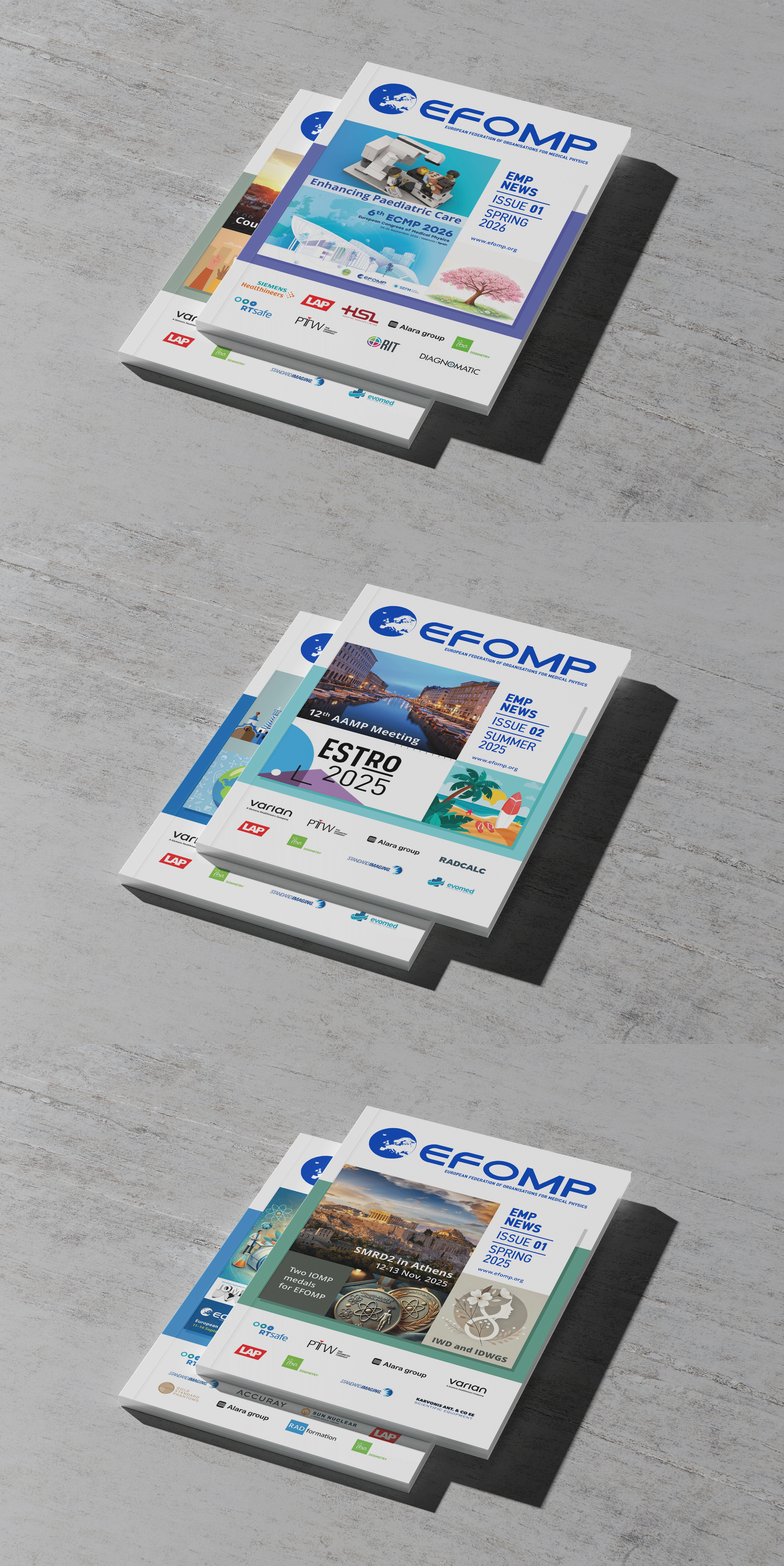
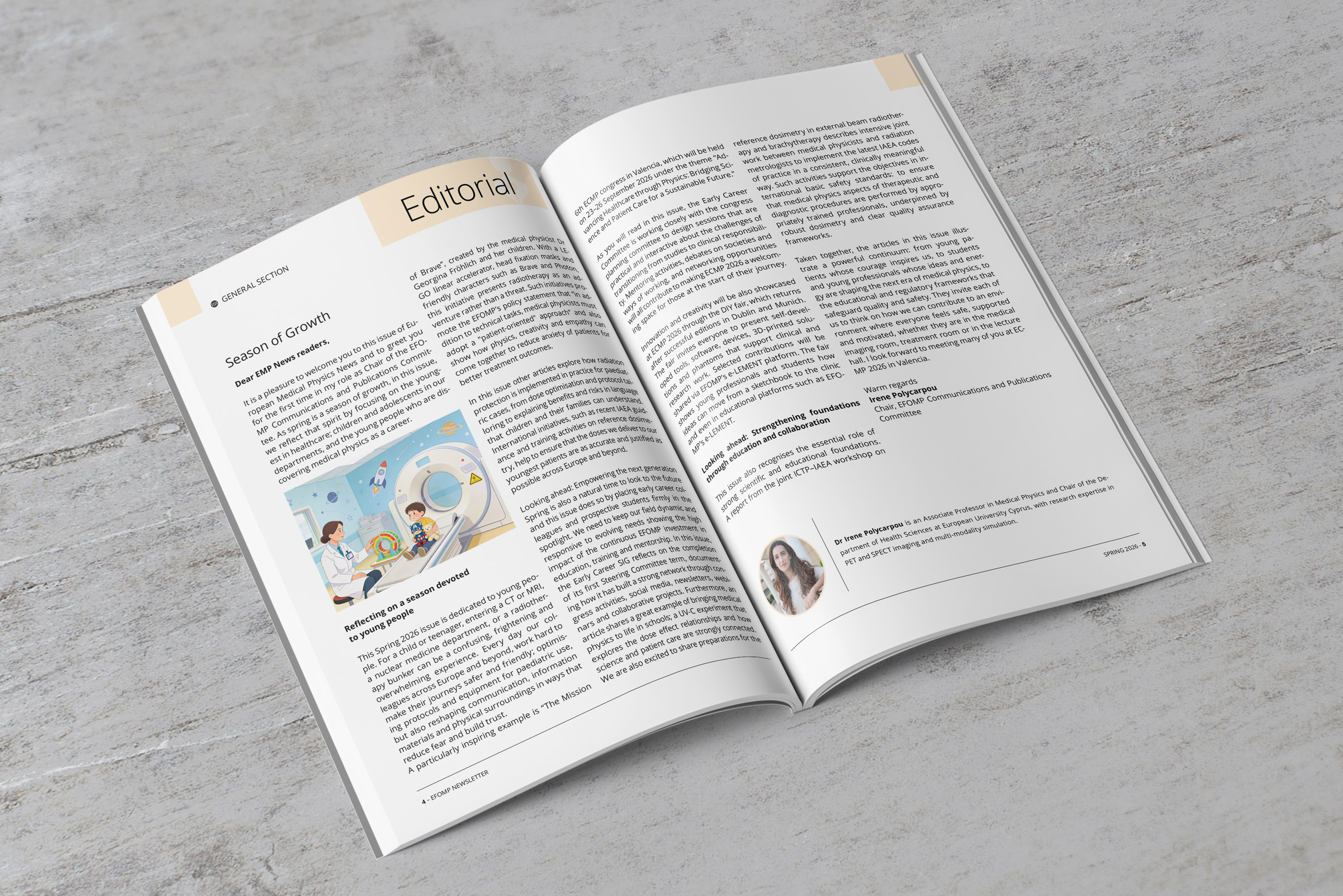
Beyond specialist publications, the identity was extended into a broader editorial system for EMP News, EFOMP’s quarterly publication and a key platform for the European medical physics community. Published four times a year, it combines scientific articles, research, professional studies and expert perspectives with coverage of EFOMP’s activities, congresses and educational programmes. The design needed to support both technical content and broader organisational stories through a consistent grid, clear hierarchy and adaptable cover structure, while maintaining a recognisable editorial character connected to the wider EFOMP identity.

Supporting education and scientific outreach
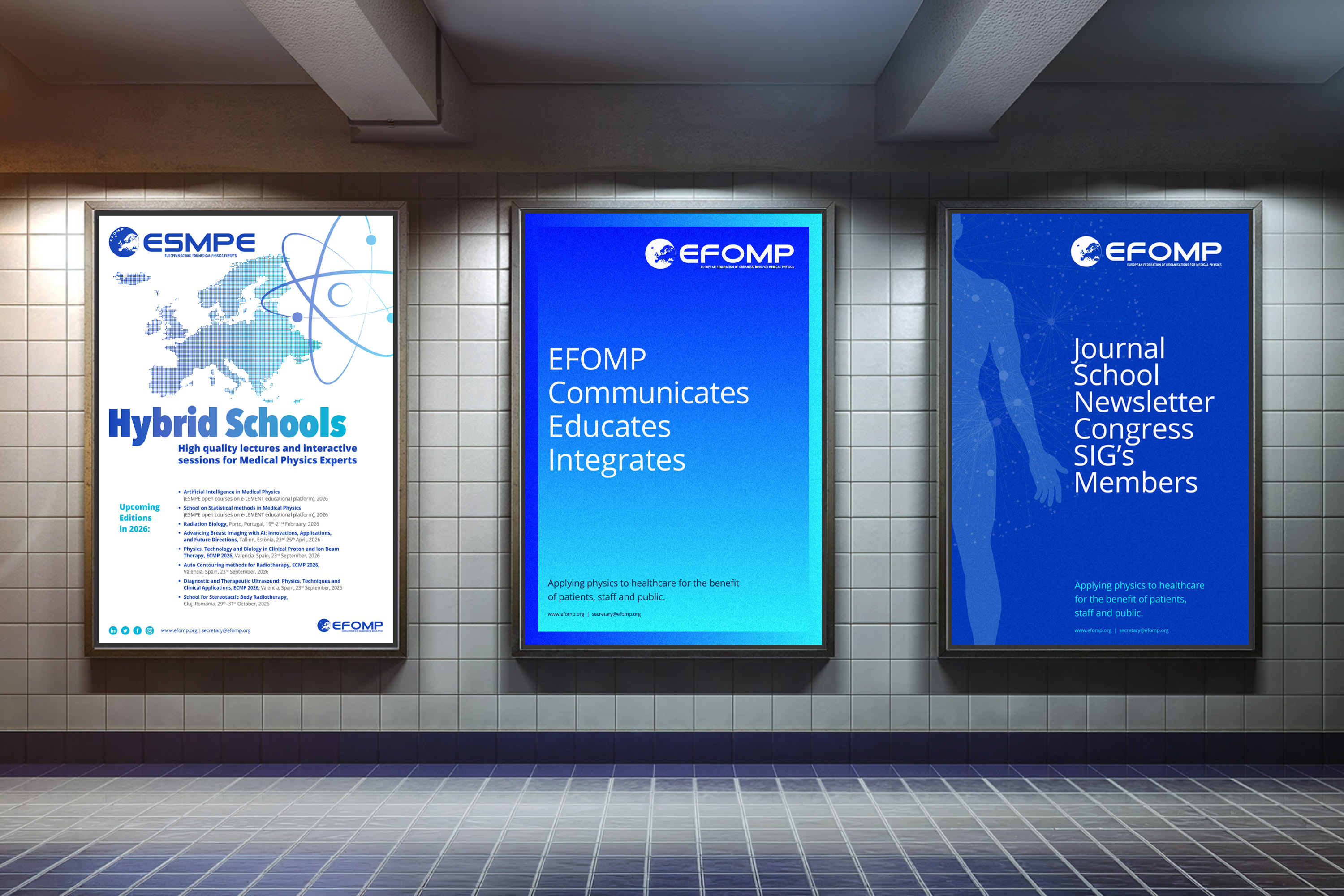
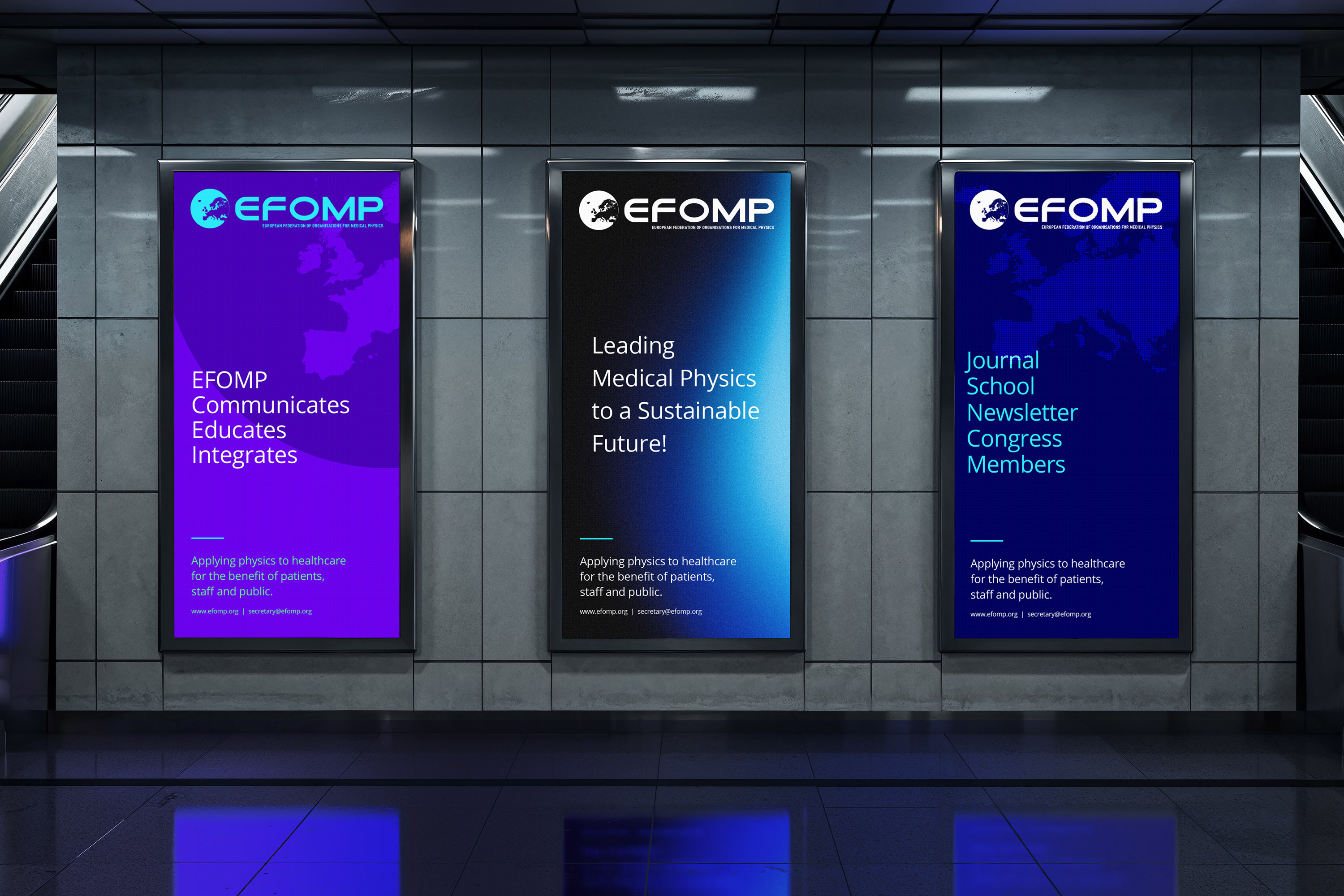
EFOMP’s visual system also supported educational initiatives, scientific awareness and professional development across its European network. Campaigns for training programmes, specialist topics and public-facing activities needed to communicate complex subject matter with clarity while remaining engaging and accessible. The identity was therefore adapted through bold headlines, focused imagery and flexible colour variations, allowing each initiative to develop its own character without losing its connection to the wider EFOMP brand.
Bringing the community closer to the brand
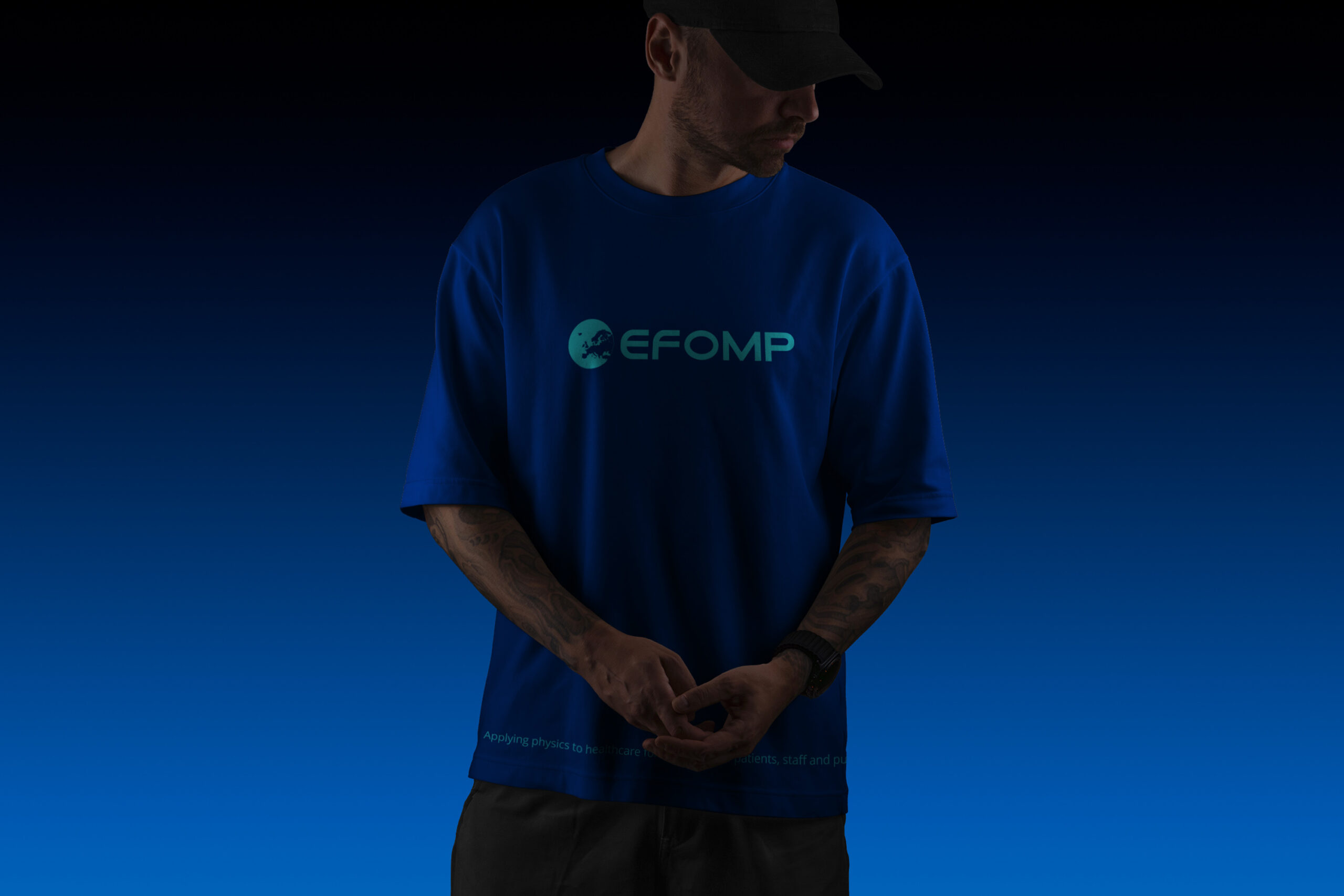
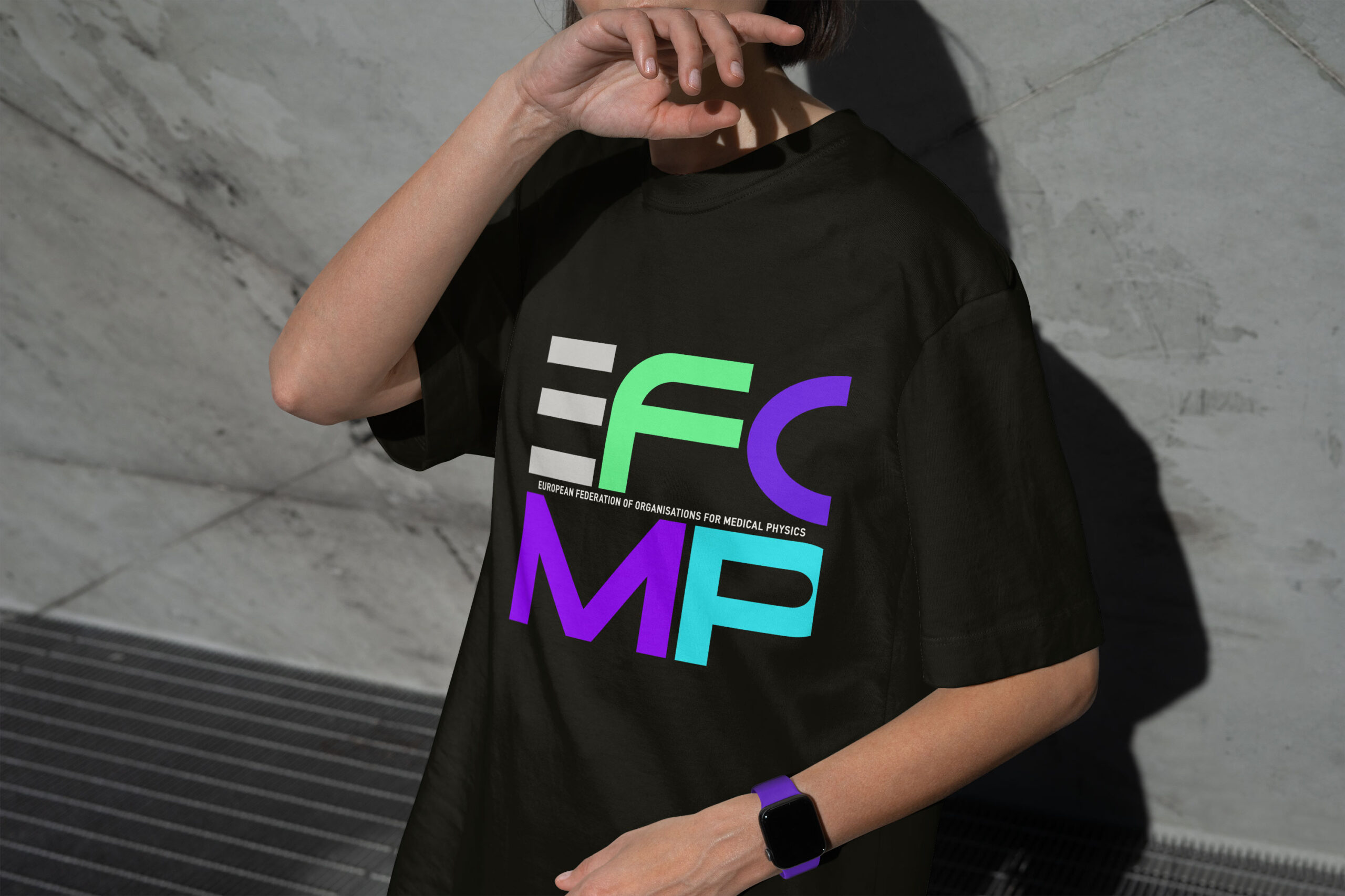
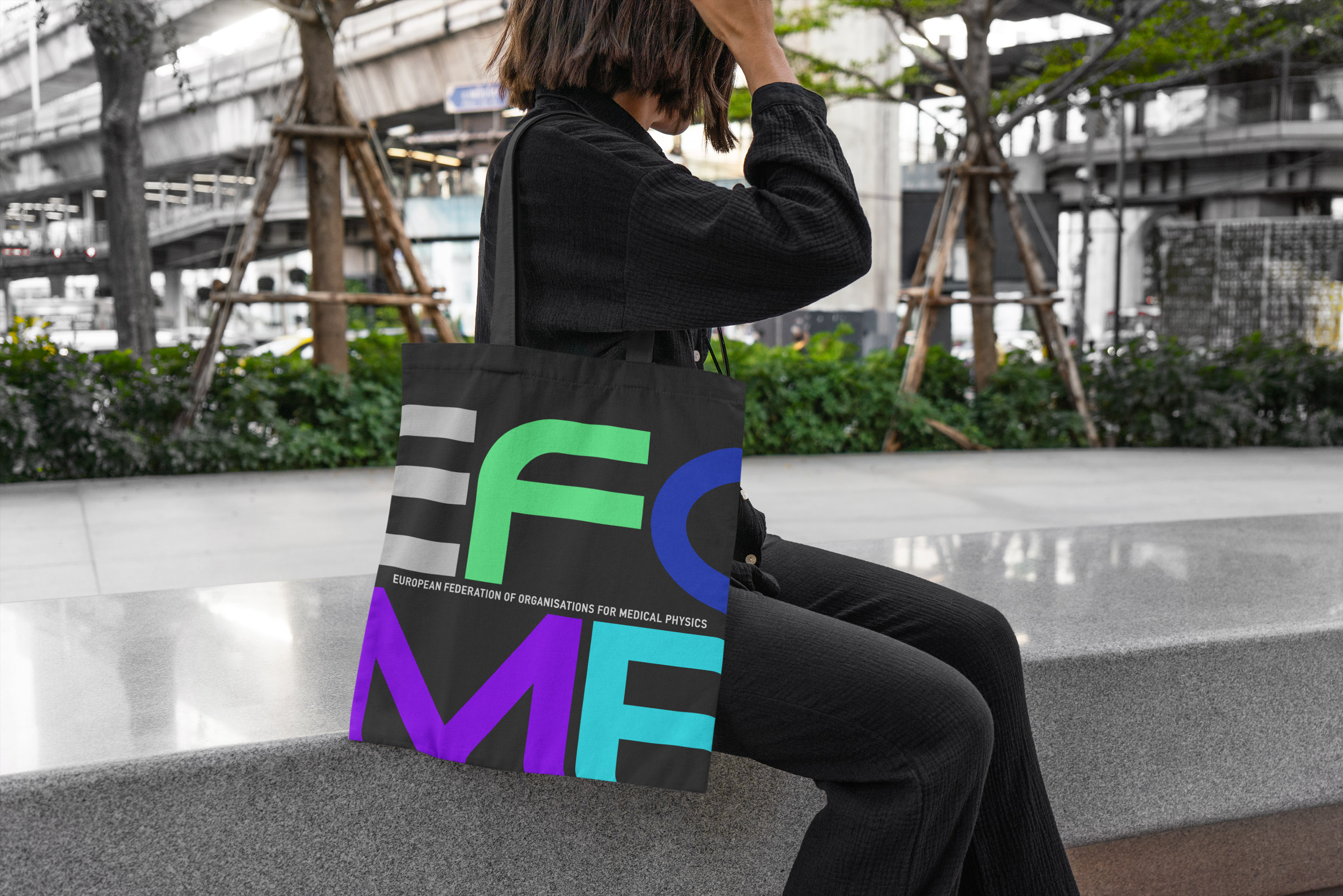
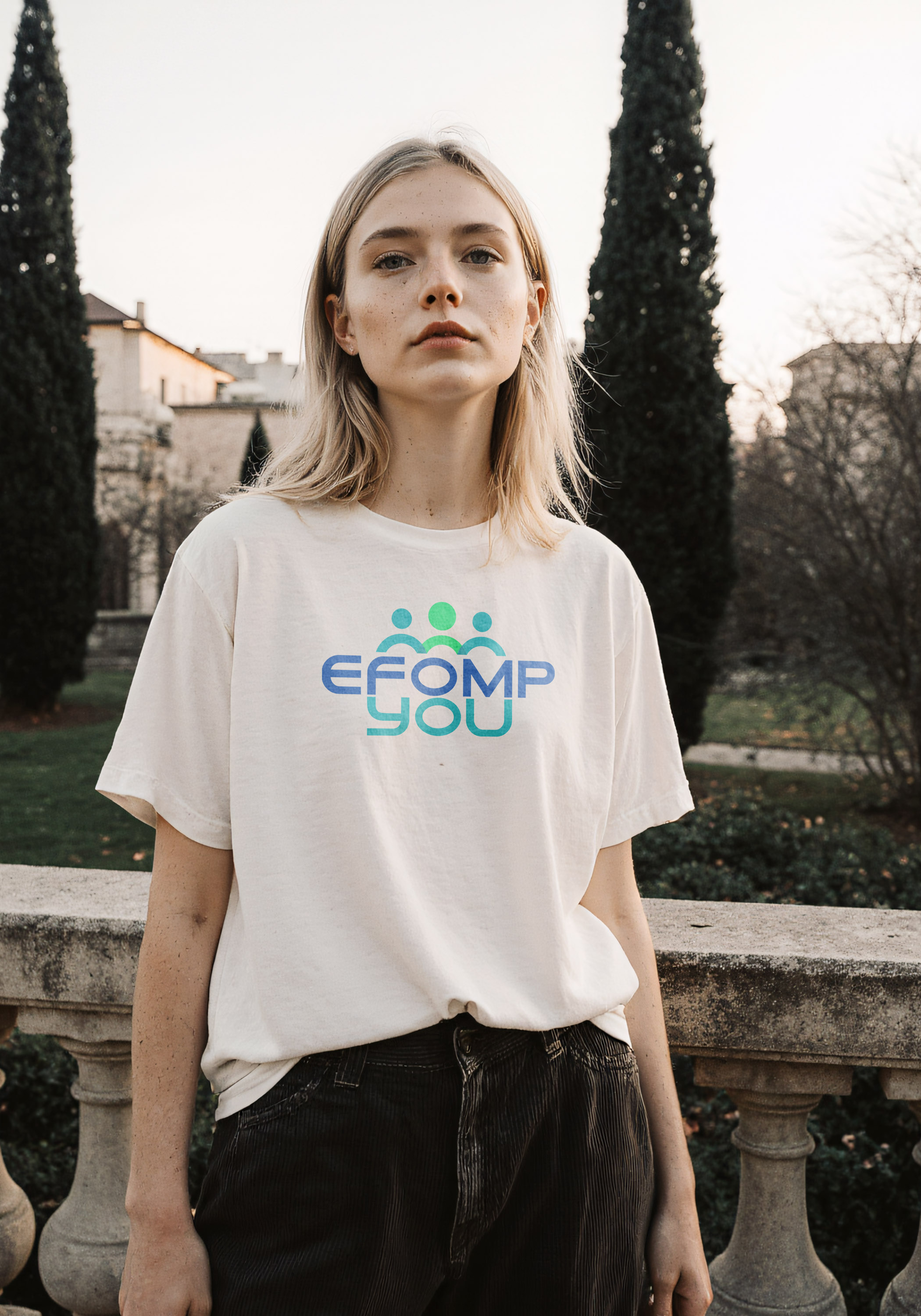
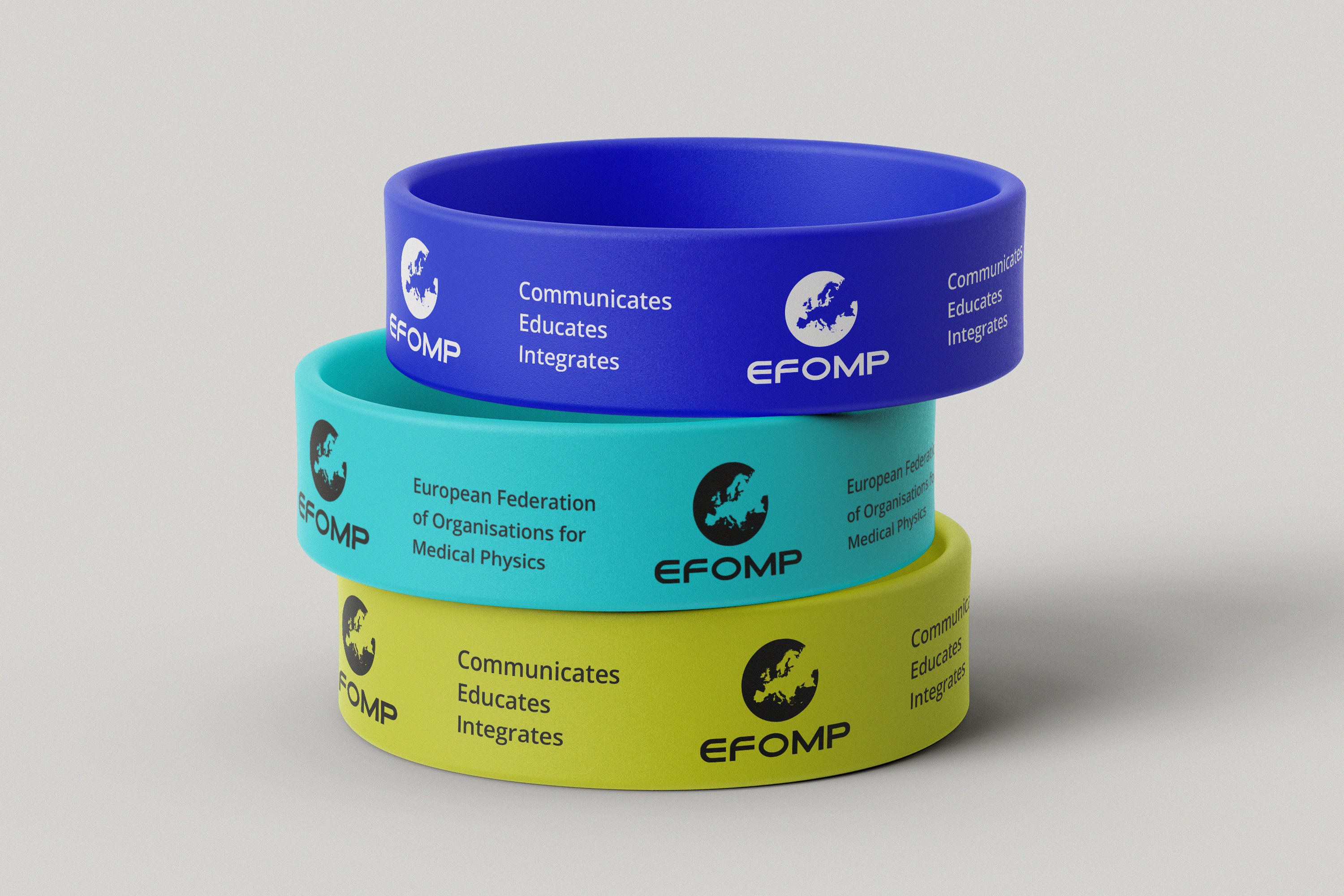
The visual identity was also extended into merchandise and informal community touchpoints, helping EFOMP build a more approachable and recognisable presence beyond its institutional communications. T-shirts, tote bags, stickers and event accessories translated the brand into objects that participants could wear, use and share. These applications introduced a more playful and human expression while preserving the typography, colour and visual consistency of the wider EFOMP system.
A unified system for a growing European community
Over six years, the collaboration evolved EFOMP’s visual communication from a core identity into a flexible brand ecosystem. The system created greater consistency across institutional communication, congresses, scientific publications, education and specialist communities, while allowing each activity to retain its own character. Representing medical physics across 36 European countries, EFOMP gained a more recognisable and contemporary presence across both formal and community-focused touchpoints.
6-year collaboration · 36 European countries · Quarterly publication · Events, education, editorial and community communication